Opacity and AnimatedOpacity
Purpose
See-through by a fixed amount, or fading to each new amount.
Signature
pub struct Opacity<Msg = crate::callback::Callback> { .. }

impl Opacity {
    pub fn new(opacity: f32, child: impl Widget<Msg> + 'static) -> Self;
}
pub struct AnimatedOpacity<Msg = crate::callback::Callback> { .. }

impl AnimatedOpacity {
    pub fn new(
        opacity: f32,
        duration: f32,
        curve: Curve,
        child: impl Widget<Msg> + 'static,
    ) -> Self;
}
Example
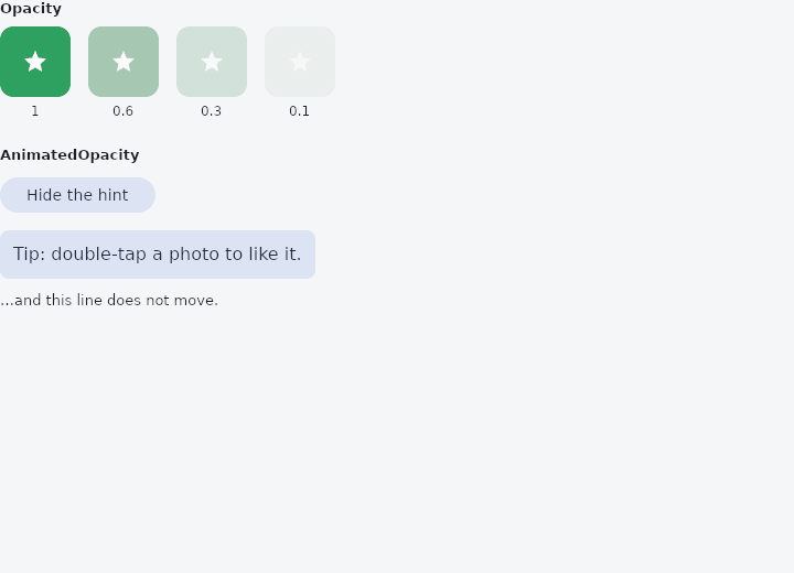
From frus-examples/widgets/src/features/animation/widgets/animated_opacity.rs:
//! `Opacity` and `AnimatedOpacity` — see-through by a fixed amount, or fading to each new
//! amount.
//!
//! Both composite the child **as one group**: overlapping parts do not darken where they
//! overlap, which is the difference between fading a picture and fading each of its parts.

use frus::{
    component, Align, Alignment, AnimatedOpacity, Button, Column, Component, Container, Curve,
    Icon, Icons, Opacity, Row, Text, Variant, Widget, Wrap,
};

use crate::common::shared::{section, sections};

pub fn example() -> Box<dyn Widget> {
    sections(vec![
        // A fixed opacity: a watermark, a placeholder, something deliberately quiet.
        Box::new(section("Opacity", fixed())),
        // A fade: a hint that comes and goes. The child keeps its room while invisible —
        // nothing around it moves.
        Box::new(section("AnimatedOpacity", fading())),
    ])
}

fn fixed() -> Component {
    component(|cx| {
        let scheme = &cx.theme().scheme;
        let swatch = |opacity: f32| {
            Column::new()
                .spacing(6.0)
                .cross_axis_alignment(Align::Center)
                .child(Opacity::new(
                    opacity,
                    Container::new()
                        .width(64.0)
                        .height(64.0)
                        .radius(12.0)
                        .color(scheme.primary)
                        .alignment(Alignment::CENTER)
                        .child(Icon::new(Icons::STAR).color(scheme.on_primary)),
                ))
                .child(Text::new(format!("{opacity}")).size(12.0))
        };
        Box::new(
            Wrap::new()
                .gap(16.0)
                .run_gap(12.0)
                .child(swatch(1.0))
                .child(swatch(0.6))
                .child(swatch(0.3))
                .child(swatch(0.1)),
        )
    })
}

fn fading() -> Component {
    component(|cx| {
        let shown = cx.use_state(|| true);
        let visible = shown.get();
        let scheme = &cx.theme().scheme;

        let toggle = shown.clone();
        Box::new(
            Column::new()
                .spacing(12.0)
                .cross_axis_alignment(Align::Start)
                .child(
                    Row::new().child(
                        Button::new(if visible {
                            "Hide the hint"
                        } else {
                            "Show the hint"
                        })
                        .variant(Variant::Tonal)
                        .on_press(move || toggle.update(|shown| *shown = !*shown)),
                    ),
                )
                // Opacity goes from 1 to 0 over 0.3 s; the box stays where it was.
                .child(AnimatedOpacity::new(
                    if visible { 1.0 } else { 0.0 },
                    0.3,
                    Curve::ease_in_out(),
                    Container::new()
                        .padding(12.0)
                        .radius(8.0)
                        .color(scheme.secondary_container)
                        .child(
                            Text::new("Tip: double-tap a photo to like it.")
                                .color(scheme.on_secondary_container),
                        ),
                ))
                .child(Text::new("…and this line does not move.").size(13.0)),
        )
    })
}
Properties
No builder methods: everything is set through the constructor.
Behaviour
Opacity
Applies a fixed group opacity [0,1] to its child, as one block. See Container::opacity.
AnimatedOpacity
Fades its child toward opacity on every change. See Container::animated_opacity.
See also
- AnimatedContainer: a box whose colour, size, corners and opacity glide to each new value.
- AnimatedAlign: slides a child to a new anchor inside its box.
- AnimatedPadding: insets a child by an amount that moves to each new value.
- AnimatedPositioned: a stack layer whose pins move: panels that slide in, cards that travel.
- The guide: Animation
- API reference:
Opacity - API reference:
AnimatedOpacity
Source: crates/frus-widgets/src/animated.rs, crates/frus-widgets/src/animated.rs @ e6fba33f5b42