AnimatedPositioned
Purpose
A stack layer whose pins move: panels that slide in, cards that travel.
Signature
pub struct AnimatedPositioned<Msg = crate::callback::Callback> { .. }

impl AnimatedPositioned {
    pub fn new(duration: f32, curve: Curve, child: impl Widget<Msg> + 'static) -> Self;
}
Example
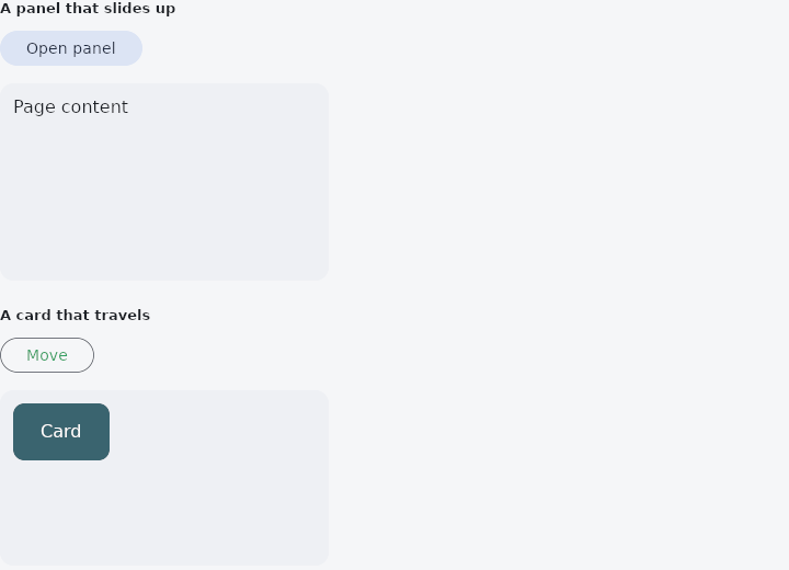
From frus-examples/widgets/src/features/animation/widgets/animated_positioned.rs:
//! `AnimatedPositioned` — a `Stack` layer whose pins (left, top, right, bottom, width,
//! height) move to each new value: a panel that slides in, a card that travels.
//!
//! Only a pin set on **both** sides of a change travels: an edge that appears or disappears
//! is a different arrangement, and takes effect at once. So say where the layer is in both
//! states.

use frus::{
    component, Align, Alignment, AnimatedPositioned, Button, Column, Component, Container, Curve,
    Row, Stack, StackFit, Text, Variant, Widget,
};

use crate::common::shared::{section, sections};

const STAGE_HEIGHT: f32 = 180.0;
const PANEL_HEIGHT: f32 = 110.0;

pub fn example() -> Box<dyn Widget> {
    sections(vec![
        // A bottom panel: pinned left, right and bottom at a fixed height; its bottom pin
        // is what moves, from below the stage's edge to just inside it.
        Box::new(section("A panel that slides up", panel())),
        // A card: its left and top pins change, so it travels diagonally.
        Box::new(section("A card that travels", travelling_card())),
    ])
}

fn panel() -> Component {
    component(|cx| {
        let open = cx.use_state(|| false);
        let is_open = open.get();
        let scheme = &cx.theme().scheme;

        let sheet = Container::new()
            .radius(12.0)
            .padding(12.0)
            .color(scheme.primary_container)
            .child(Text::new("Details panel").color(scheme.on_primary_container));

        let stage = Stack::new()
            .width(300.0)
            .height(STAGE_HEIGHT)
            // `Expand`: the layers that are not positioned fill the stack — the page behind.
            .fit(StackFit::Expand)
            .layer(
                Container::new()
                    .radius(12.0)
                    .color(scheme.surface_container_high)
                    .padding(12.0)
                    .child(Text::new("Page content")),
            )
            .layer(
                // Closed, the panel waits just below the stage: a stack clips its layers
                // to its own edges, so it is out of sight there. Animating a height to zero instead would squeeze its padding and text
                // into nothing, and they would spill out of the shrinking box.
                AnimatedPositioned::new(0.3, Curve::ease_out(), sheet)
                    .left(8.0)
                    .right(8.0)
                    .bottom(if is_open { 8.0 } else { -PANEL_HEIGHT })
                    .height(PANEL_HEIGHT),
            );

        let toggle = open.clone();
        Box::new(
            Column::new()
                .spacing(12.0)
                .cross_axis_alignment(Align::Start)
                .child(
                    Button::new(if is_open { "Close panel" } else { "Open panel" })
                        .variant(Variant::Tonal)
                        .on_press(move || toggle.update(|open| *open = !*open)),
                )
                .child(stage),
        )
    })
}

fn travelling_card() -> Component {
    component(|cx| {
        let moved = cx.use_state(|| false);
        let far = moved.get();
        let scheme = &cx.theme().scheme;

        let card = Container::new()
            .radius(10.0)
            .color(scheme.tertiary)
            .alignment(Alignment::CENTER)
            .child(Text::new("Card").color(scheme.on_tertiary));

        let stage = Stack::new()
            .width(300.0)
            .height(160.0)
            .fit(StackFit::Expand)
            .layer(
                Container::new()
                    .radius(12.0)
                    .color(scheme.surface_container_high),
            )
            .layer(
                AnimatedPositioned::new(0.6, Curve::ease_in_out(), card)
                    .left(if far { 200.0 } else { 12.0 })
                    .top(if far { 96.0 } else { 12.0 })
                    .width(88.0)
                    .height(52.0),
            );

        let toggle = moved.clone();
        Box::new(
            Column::new()
                .spacing(12.0)
                .cross_axis_alignment(Align::Start)
                .child(
                    Row::new().child(
                        Button::new("Move")
                            .variant(Variant::Outlined)
                            .on_press(move || toggle.update(|far| *far = !*far)),
                    ),
                )
                .child(stage),
        )
    })
}
Properties
| Method | Argument | Effect |
|---|---|---|
.left() | px: f32 | Distance from the stack's left edge. |
.top() | px: f32 | Distance from the stack's top edge. |
.right() | px: f32 | Distance from the stack's right edge. |
.bottom() | px: f32 | Distance from the stack's bottom edge. |
.start() | px: f32 | Distance from the stack's start edge: the left in a left-to-right script, the right in a right-to-left one (milestone 589). A left or a right set as well wins on its own side. |
.end() | px: f32 | Distance from the stack's end edge: the right in a left-to-right script, the left in a right-to-left one. |
.width() | px: f32 | An explicit width, used when only one horizontal edge is pinned. |
.height() | px: f32 | An explicit height, used when only one vertical edge is pinned. |
Behaviour
Moves a stack layer between two sets of pins instead of letting it appear at the new ones.
A panel that slides in from an edge, a sheet that grows to fill the page, a card that travels to a corner: each is a layer of a crate::Stack whose distances from the stack's own edges change, and each of them jumped before this.
use frus_core::Curve;
use frus_widgets::{AnimatedPositioned, Container, Stack};

let open = true;
let _sheet: Stack<()> = Stack::new().layer(
    AnimatedPositioned::new(0.25, Curve::ease_out(), Container::new())
        .left(0.0)
        .right(0.0)
        .bottom(0.0)
        .height(if open { 320.0 } else { 0.0 }),
);
A pin that is unset does not animate. None on an edge is not nought there: it is a layer not pinned on that side, sized by itself and placed by the stack's alignment, which is a different arrangement rather than a different number. So an edge arriving takes hold at once, an edge leaving lets go at once, and only an edge set at both ends travels. Where a movement is wanted, both ends must say where they are.
The six pins share one timeline, as a scale and a turn do: a layer changing two of its edges arrives on both at the same moment rather than on two clocks that happen to agree.
Unlike crate::Positioned, which is a transparent wrapper, this is a node of its own with the child beneath it. An animated value belongs to a node, and a wrapper that fused with its child would put the layer's timeline and the child's on the same one — the rule the whole of this module is built on.
See also
- AnimatedAlign: slides a child to a new anchor inside its box.
- AnimatedPadding: insets a child by an amount that moves to each new value.
- AnimatedScale, AnimatedRotation & AnimatedSlide: grow, turn or shift a child to each new value without moving its neighbours.
- AnimatedDefaultTextStyle: the text style handed down to a subtree, moving to each new style.
- AnimatedFractionallySizedBox: a fraction of the room, moving to each new fraction.
- The guide: Animation
- API reference:
AnimatedPositioned
Source: crates/frus-widgets/src/animated.rs @ e6fba33f5b42