DecoratedBoxTransition and DefaultTextStyleTransition
Purpose
A whole decoration or text style, part of the way from one to another.
Signature
pub struct DecoratedBoxTransition<Msg = crate::callback::Callback> { .. }

impl DecoratedBoxTransition {
    pub fn new(decoration: BoxDecoration, child: impl Widget<Msg> + 'static) -> Self;
    pub fn between(
        from: BoxDecoration,
        to: BoxDecoration,
        progress: f32,
        child: impl Widget<Msg> + 'static,
    ) -> Self;
}
pub struct DefaultTextStyleTransition<Msg = crate::callback::Callback> { .. }

impl DefaultTextStyleTransition {
    pub fn new(style: TextStyle, child: impl Widget<Msg> + 'static) -> Self;
    pub fn between(
        from: TextStyle,
        to: TextStyle,
        progress: f32,
        child: impl Widget<Msg> + 'static,
    ) -> Self;
}
Example
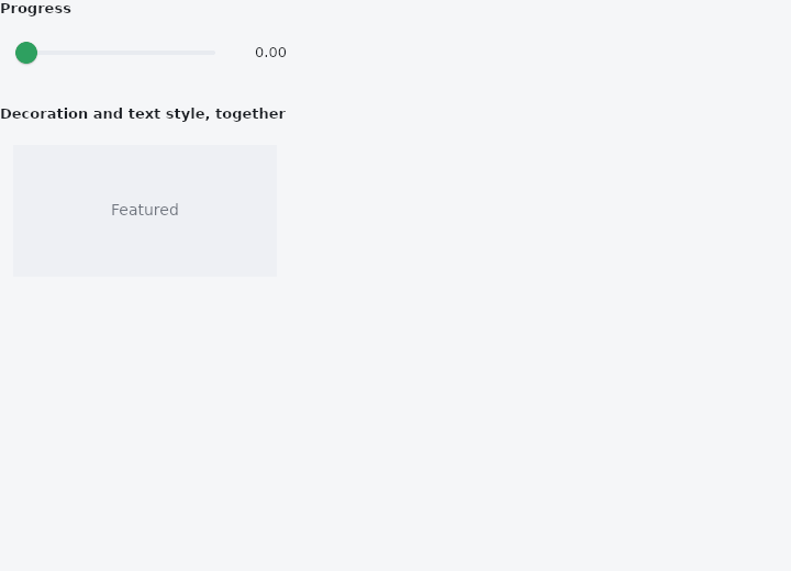
From frus-examples/widgets/src/features/animation/widgets/decorated_transitions.rs:
//! `DecoratedBoxTransition` and `DefaultTextStyleTransition` — a whole decoration, or a
//! whole text style, a given fraction of the way from one to another.
//!
//! Every part moves by its own rule: colours blend, corners round, shadows grow, sizes and
//! weights step through. Here a slider owns the progress; a controller or a gesture would
//! do as well.

use frus::{
    component, Align, Alignment, BorderRadius, BoxDecoration, BoxShadow, Color, Container,
    DecoratedBoxTransition, DefaultTextStyleTransition, FontWeight, Row, Slider, Text, TextStyle,
    Widget,
};

use crate::common::shared::{section, sections};

pub fn example() -> Box<dyn Widget> {
    Box::new(component(|cx| {
        let progress = cx.use_state(|| 0.0_f32);
        let t = progress.get();
        let scheme = &cx.theme().scheme;

        // Two complete decorations: a flat square and a raised, rounded card.
        let flat =
            BoxDecoration::filled(scheme.surface_container_high).radius(BorderRadius::uniform(0.0));
        let raised = BoxDecoration::filled(scheme.primary_container)
            .radius(BorderRadius::uniform(28.0))
            .shadow(BoxShadow::new(
                0.0,
                8.0,
                24.0,
                Color::rgba(0.0, 0.0, 0.0, 0.25),
            ));

        // Two text styles; the text below names none of these properties itself, so it
        // wears whatever is handed down.
        let quiet = TextStyle::NONE
            .size(14.0)
            .weight(FontWeight::Regular)
            .color(scheme.on_surface_variant);
        let loud = TextStyle::NONE
            .size(24.0)
            .weight(FontWeight::Bold)
            .color(scheme.on_primary_container);

        let set = progress.clone();
        let slider = Row::new()
            .spacing(12.0)
            .cross_axis_alignment(Align::Center)
            .child(
                Slider::new(t)
                    .width(220.0)
                    .on_change(move |value| set.set(value)),
            )
            .child(Text::new(format!("{t:.2}")).size(13.0));

        sections(vec![
            Box::new(section("Progress", slider)),
            Box::new(section(
                "Decoration and text style, together",
                Container::new()
                    .padding(12.0)
                    .child(DecoratedBoxTransition::between(
                        flat,
                        raised,
                        t,
                        Container::new()
                            .width(240.0)
                            .height(120.0)
                            .alignment(Alignment::CENTER)
                            .child(DefaultTextStyleTransition::between(
                                quiet,
                                loud,
                                t,
                                Text::new("Featured"),
                            )),
                    )),
            )),
        ])
    }))
}
Properties
| Type | Method | Argument | Effect |
|---|---|---|---|
DecoratedBoxTransition | .position() | position: DecorationPosition | Paints the decoration over the child instead of behind it. |
DefaultTextStyleTransition | .align() | align: TextAlign | Where the lines sit inside their box. Not animated. |
DefaultTextStyleTransition | .soft_wrap() | wrap: bool | Whether the text wraps at the width it is given. Not animated. |
DefaultTextStyleTransition | .overflow() | overflow: TextOverflow | What becomes of text that does not fit. Not animated. |
DefaultTextStyleTransition | .max_lines() | lines: usize | At most this many lines. Not animated. |
Behaviour
DecoratedBoxTransition
Paints a decoration that moves by a value the caller owns — its fill, gradient, border, corners and shadow, each travelling by its own rule (see BoxDecoration::lerp).
use frus_core::{Border, BoxDecoration, Color};
use frus_widgets::{DecoratedBoxTransition, Text};

let selected = 0.6_f32; // the application's own progress
let _row: DecoratedBoxTransition<()> = DecoratedBoxTransition::between(
    BoxDecoration::default().radius(4.0),
    BoxDecoration::filled(Color::rgb(0.2, 0.4, 0.9))
        .radius(12.0)
        .border(Border::new(2.0, Color::rgb(0.1, 0.2, 0.6))),
    selected,
    Text::new("Reminders"),
);
Unlike the other three here, this is a node of its own, with the child beneath it: a decoration is something painted, and something painted has a box. A border that must not overlap the content wants padding the caller chooses.
For a decoration that should catch up with a target on the framework's clock instead, crate::AnimatedContainer is the implicit half.
DefaultTextStyleTransition
Hands a text style that moves down to everything below it, by a value the caller owns. The explicit half of crate::AnimatedDefaultTextStyle.
use frus_core::TextStyle;
use frus_widgets::{DefaultTextStyleTransition, Text};

let arriving = 0.3_f32; // the application's own progress
let _title: DefaultTextStyleTransition<()> = DefaultTextStyleTransition::between(
    TextStyle::NONE.size(20.0),
    TextStyle::NONE.size(24.0),
    arriving,
    Text::new("Groceries"),
);
What travels, what holds and what swaps half-way is TextStyle::lerp's business. Alignment, wrapping, overflow and the line count take effect at once, as they do on the implicit one: they are arrangements, not quantities.
It is a transparent wrapper, which its implicit twin cannot be. An implicit animation keeps a timeline in the runtime, and a timeline belongs to a node, so two of those nested have to be two nodes or they would share one. This keeps nothing — the caller's number is the whole of its state — so two nested fuse into one node and simply hand down both of what they say, the inner one asked by the outer as a nested theme is.
A text that names a field for itself keeps it: an inherited style answers a question, it does not overrule an answer.
See also
- AnimatedCrossFade: cross-fades between two known children, the box moving between their sizes.
- Fade, Slide, Scale & Size transitions: explicit transitions driven by a number the app owns: an AnimationController.
- Curve: the shape of a motion, separate from its duration.
- Icon::animated & AnimatedIcons: an icon that morphs between two marks: menu and close, play and pause.
- Hero & page transitions: a shared element that flies between two pages during a transition.
- The guide: Animation
- API reference:
DecoratedBoxTransition - API reference:
DefaultTextStyleTransition
Source: crates/frus-widgets/src/transitions.rs, crates/frus-widgets/src/transitions.rs @ e6fba33f5b42