SegmentedButton
Purpose
One outlined control with a few segments, exactly one of them chosen.
Signature
pub struct SegmentedButton<Msg = crate::callback::Callback> { .. }

impl SegmentedButton {
    pub fn new<R1: crate::callback::IntoMsg<Msg>>(
        selected: usize,
        on_select: impl Fn(usize) -> R1 + 'static,
    ) -> Self;
}
Example
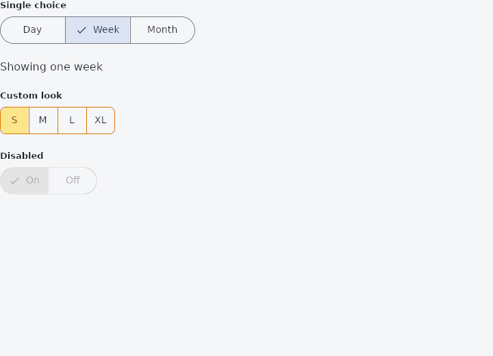
From frus-examples/widgets/src/features/buttons/widgets/segmented_button.rs:
//! `SegmentedButton` — one outlined control with a few segments, exactly one of them
//! chosen. For switching between views or modes (day / week / month).

use frus::{Color, SegmentedButton, State, StateContext, StatefulWidget, Text, Widget};

use crate::common::shared::{section, sections};

pub fn example() -> Box<dyn Widget> {
    Box::new(SegmentedDemo.into_widget())
}

const PERIODS: [&str; 3] = ["Day", "Week", "Month"];

struct SegmentedDemo;

struct SegmentedDemoState {
    period: usize,
    size: usize,
}

impl StatefulWidget for SegmentedDemo {
    type State = SegmentedDemoState;

    fn create_state(&self) -> SegmentedDemoState {
        SegmentedDemoState { period: 1, size: 0 }
    }
}

impl State for SegmentedDemoState {
    type Widget = SegmentedDemo;

    fn build(&self, cx: &StateContext<Self>) -> Box<dyn Widget> {
        // The control reports the index that was picked; `cx.handler` stores it.
        let periods = PERIODS.iter().fold(
            SegmentedButton::new(
                self.period,
                cx.handler(|s: &mut SegmentedDemoState, i: usize| s.period = i),
            ),
            |picker, label| picker.segment(*label),
        );

        sections(vec![
            Box::new(section("Single choice", periods)),
            Box::new(Text::new(format!(
                "Showing one {}",
                PERIODS[self.period].to_lowercase()
            ))),
            // Every colour and measurement can be overridden; `show_selected_icon(false)`
            // drops the checkmark when the fill alone is clear enough.
            Box::new(section(
                "Custom look",
                SegmentedButton::new(
                    self.size,
                    cx.handler(|s: &mut SegmentedDemoState, i: usize| s.size = i),
                )
                .segment("S")
                .segment("M")
                .segment("L")
                .segment("XL")
                .selected_color(Color::hex("#FDE68A"))
                .selected_label_color(Color::hex("#78350F"))
                .border_color(Color::hex("#D97706"))
                .radius(8.0)
                .show_selected_icon(false),
            )),
            Box::new(section(
                "Disabled",
                SegmentedButton::new(0, cx.handler(|_: &mut SegmentedDemoState, _: usize| {}))
                    .segment("On")
                    .segment("Off")
                    .enabled(false),
            )),
        ])
    }
}
Properties
| Method | Argument | Effect |
|---|---|---|
.segment() | label: impl Into<String> | Adds a segment. |
.radius() | radius: f32 | The radius of the group's outer corners. Unset, the ends are stadium-rounded. |
.selected_color() | color: Color | The fill under the chosen segment. |
.label_color() | color: Color | The labels' colour. |
.selected_label_color() | color: Color | The chosen segment's label colour, and its checkmark's. |
.border_color() | color: Color | The outline's colour, which is also the hairlines' between segments. |
.border_width() | width: f32 | The outline's thickness; 0.0 removes it, hairlines included. |
.height() | height: f32 | The control's height. |
.padding() | padding: f32 | The room either side of a label. |
.label_style() | style: TextStyle | The labels' type. Defaults to the theme's label_large step. |
.enabled() | enabled: bool | Greys the whole control out and makes it inert: no press, no ink, out of the tab order, and announced as disabled. The labels and the current choice stay legible — a disabled control is read-only, not invisible. |
.show_selected_icon() | show: bool | Whether the chosen segment carries a checkmark. On by default; turning it off gives every segment back the room it reserved. |
Behaviour
A single-selection segmented control.
See also
- IconButton: a square button holding one icon, with four looks and a selected state.
- FloatingActionButton: the screen's main action, floating above it: small, regular, large or extended.
- ToggleButtons: a bank of buttons sharing their edges, each switched on or off on its own.
- PopupMenuButton & MenuItem: a list of actions floating over a button: icons, ticks, shortcuts and rules.
- MenuAnchor: a floating panel with any content, anchored to a widget.
- The guide: Taking input
- API reference:
SegmentedButton
Source: crates/frus-widgets/src/segmented.rs @ e6fba33f5b42