ToggleButtons
Purpose
A bank of buttons sharing their edges, each switched on or off on its own.
Signature
pub struct ToggleButtons<Msg = crate::callback::Callback> { .. }

impl ToggleButtons {
    pub fn new<R1: crate::callback::IntoMsg<Msg>>(
        selected: Vec<bool>,
        on_pressed: impl Fn(usize) -> R1 + 'static,
    ) -> Self;
}
Example
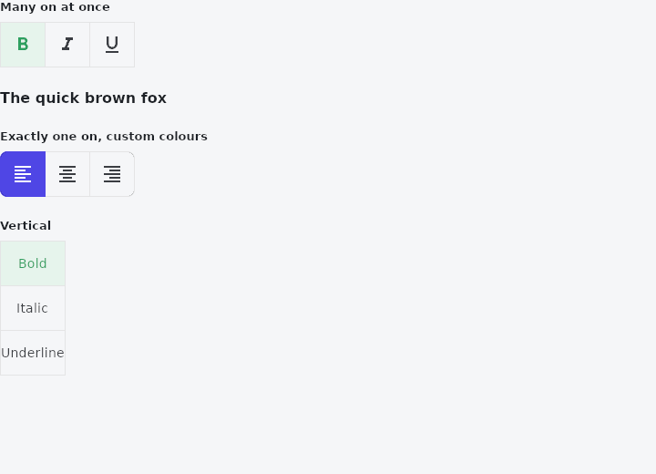
From frus-examples/widgets/src/features/buttons/widgets/toggle_buttons.rs:
//! `ToggleButtons` — a bank of buttons sharing their edges, each one on or off on its
//! own. Unlike a segmented button, any number can be on at once (bold + italic).

use frus::{
    Color, FontWeight, Icon, Icons, State, StateContext, StatefulWidget, Text, ToggleAxis,
    ToggleButtons, Widget, WidgetState, WidgetStateProperty,
};

use crate::common::shared::{section, sections};

pub fn example() -> Box<dyn Widget> {
    Box::new(ToggleDemo.into_widget())
}

struct ToggleDemo;

struct ToggleDemoState {
    /// Bold, italic, underline: three independent answers.
    format: Vec<bool>,
    /// Text alignment: the application keeps exactly one on.
    align: usize,
}

impl StatefulWidget for ToggleDemo {
    type State = ToggleDemoState;

    fn create_state(&self) -> ToggleDemoState {
        ToggleDemoState {
            format: vec![true, false, false],
            align: 0,
        }
    }
}

impl State for ToggleDemoState {
    type Widget = ToggleDemo;

    fn build(&self, cx: &StateContext<Self>) -> Box<dyn Widget> {
        let mut sample = Text::new("The quick brown fox");
        if self.format[0] {
            sample = sample.weight(FontWeight::Bold);
        }
        if self.format[1] {
            sample = sample.italic();
        }
        if self.format[2] {
            sample = sample.underline();
        }

        sections(vec![
            // The widget tells you which button was pressed; what that means is yours to
            // decide. Here each press flips its own flag.
            Box::new(section(
                "Many on at once",
                ToggleButtons::new(
                    self.format.clone(),
                    cx.handler(|s: &mut ToggleDemoState, i: usize| s.format[i] = !s.format[i]),
                )
                .child(Icon::new(Icons::FORMAT_BOLD))
                .child(Icon::new(Icons::FORMAT_ITALIC))
                .child(Icon::new(Icons::FORMAT_UNDERLINED)),
            )),
            Box::new(sample),
            // One-of-many: the handler turns the others off.
            Box::new(section(
                "Exactly one on, custom colours",
                ToggleButtons::new(
                    (0..3).map(|i| i == self.align).collect(),
                    cx.handler(|s: &mut ToggleDemoState, i: usize| s.align = i),
                )
                .child(Icon::new(Icons::FORMAT_ALIGN_LEFT))
                .child(Icon::new(Icons::FORMAT_ALIGN_CENTER))
                .child(Icon::new(Icons::FORMAT_ALIGN_RIGHT))
                .selected_color(Color::hex("#FFFFFF"))
                .fill_color(
                    WidgetStateProperty::new().when(WidgetState::Selected, Color::hex("#4F46E5")),
                )
                .selected_border_color(Color::hex("#4F46E5"))
                .border_radius(8.0),
            )),
            // Stacked vertically.
            Box::new(section(
                "Vertical",
                ToggleButtons::new(
                    self.format.clone(),
                    cx.handler(|s: &mut ToggleDemoState, i: usize| s.format[i] = !s.format[i]),
                )
                .direction(ToggleAxis::Vertical)
                .child(Text::new("Bold"))
                .child(Text::new("Italic"))
                .child(Text::new("Underline")),
            )),
        ])
    }
}
Properties
| Method | Argument | Effect |
|---|---|---|
.child() | child: impl Widget<Msg> + 'static | — |
.child_boxed() | child: Box<dyn Widget<Msg>> | The same, for a child that is already boxed. |
.enabled() | enabled: bool | Whether the bank can be pressed at all. |
.direction() | axis: ToggleAxis | A row by default. |
.vertical_direction() | direction: VerticalDirection | Ignored by a row, whose order is the reading direction's to decide and which mirrors with the rest of the frame. |
.render_border() | render: bool | — |
.border_width() | width: f32 | Untold, TOGGLE_BUTTONS_BORDER_WIDTH. |
.border_radius() | radius: impl Into<BorderRadius> | — |
.border_color() | color: Color | — |
.selected_border_color() | color: Color | A seam between an on button and an off one takes this, from either side. |
.disabled_border_color() | color: Color | — |
.color() | color: Color | — |
.selected_color() | color: Color | — |
.disabled_color() | color: Color | — |
.fill_color() | fill: WidgetStateProperty<Color> | — |
.text_style() | style: TextStyle | — |
.min_size() | width: f32, height: f32 | Untold, TOGGLE_BUTTON_MIN_SIZE both ways — the tap target, which is a floor and not a size: a wider child makes a wider button. |
.max_size() | width: f32, height: f32 | The largest a button may be. Untold, unbounded. |
Behaviour
A bank of buttons sharing their edges, any number of which may be on.
See also
- FloatingActionButton: the screen's main action, floating above it: small, regular, large or extended.
- SegmentedButton: one outlined control with a few segments, exactly one of them chosen.
- PopupMenuButton & MenuItem: a list of actions floating over a button: icons, ticks, shortcuts and rules.
- MenuAnchor: a floating panel with any content, anchored to a widget.
- MenuBar & SubmenuButton: a desktop window's menus along the top, with submenus inside them.
- The guide: Taking input
- API reference:
ToggleButtons
Source: crates/frus-widgets/src/togglebuttons.rs @ e6fba33f5b42