CircleAvatar
Purpose
A circle that stands for a person: a picture, initials or an icon.
Signature
pub struct CircleAvatar<Msg = crate::callback::Callback> { .. }

impl CircleAvatar {
    pub fn new() -> Self;
    pub fn initials(name: impl Into<String>) -> Self
    where
        Msg: Clone + 'static,;
}
Example
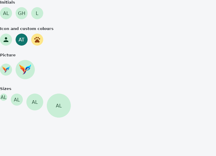
From frus-examples/widgets/src/features/display/widgets/avatar.rs:
//! `CircleAvatar` — a circle that stands for a person: their picture, or failing that
//! their initials or an icon, on a colour.

use frus::{CircleAvatar, Color, Colors, Icon, Icons, Row, Widget, Wrap};

use crate::common::shared::{section, sections};

pub fn example() -> Box<dyn Widget> {
    // `asset!` embeds a file in the binary at compile time (the path is relative to this
    // source file), and decodes it once per process. `handle()` is the decoded picture,
    // or `None` if the bytes were not an image — the avatar then shows its colour.
    let photo = frus::asset!("../../../../res/mipmap-xxxhdpi/ic_launcher.png").handle();

    sections(vec![
        // `initials` takes a full name and shows the first letters of its first two words.
        Box::new(section(
            "Initials",
            Row::new()
                .spacing(12.0)
                .child(CircleAvatar::initials("Ada Lovelace"))
                .child(CircleAvatar::initials("Grace Hopper"))
                .child(CircleAvatar::initials("Linus")),
        )),
        // Any widget can sit in the circle; an icon is the usual anonymous placeholder.
        Box::new(section(
            "Icon and custom colours",
            Row::new()
                .spacing(12.0)
                .child(CircleAvatar::new().child(Icon::new(Icons::PERSON)))
                .child(
                    CircleAvatar::initials("Alan Turing")
                        .background_color(Color::hex("#0F766E"))
                        .foreground_color(Colors::WHITE),
                )
                .child(
                    CircleAvatar::new()
                        .background_color(Color::hex("#FDE68A"))
                        .foreground_color(Color::hex("#92400E"))
                        .child(Icon::new(Icons::PETS)),
                ),
        )),
        // A picture covers the circle. `foreground_image` is the photo; a background image
        // is the fallback shown under it.
        Box::new(section(
            "Picture",
            Row::new()
                .spacing(12.0)
                .child(CircleAvatar::new().foreground_image(photo.clone()))
                .child(CircleAvatar::new().radius(32.0).foreground_image(photo)),
        )),
        // `radius` (or `size`, the diameter) sets how big it is, whatever it holds.
        Box::new(section(
            "Sizes",
            Wrap::new()
                .gap(12.0)
                .run_gap(12.0)
                .child(CircleAvatar::initials("Ada Lovelace").radius(12.0))
                .child(CircleAvatar::initials("Ada Lovelace").radius(20.0))
                .child(CircleAvatar::initials("Ada Lovelace").size(56.0))
                .child(CircleAvatar::initials("Ada Lovelace").size(80.0)),
        )),
    ])
}
Properties
| Method | Argument | Effect |
|---|---|---|
.child() | child: impl Widget<Msg> + 'static | What is shown in the circle, centred: usually a text, or an icon. |
.background_color() | color: Color | The colour the circle is filled with; the scheme's primary_container otherwise. |
.foreground_color() | color: Color | The colour of the child's text and icons; the scheme's on_primary_container otherwise. |
.background_image() | image: impl Into<Option<ImageHandle>> | A picture under the child, covering the circle: the fallback for Self::foreground_image. None — a picture not yet arrived — shows the colour. |
.foreground_image() | image: impl Into<Option<ImageHandle>> | A picture over the child, covering the circle: usually the user's photo. |
.radius() | radius: f32 | The radius, in logical pixels: the avatar is this big, whatever it holds. |
.min_radius() | radius: f32 | The smallest radius it may have; nought by default once a bound is set. |
.max_radius() | radius: f32 | The largest radius it may have; unbounded by default once a bound is set. |
.size() | diameter: f32 | The size as a diameter: Self::radius of half of it. |
Behaviour
A circle that represents a user: a picture cropped to the circle, or, without one, a child — usually their initials — centred on a colour.
CircleAvatar::initials("Ada Lovelace")                       // "AL" on the theme's colour
CircleAvatar::new().child(Icon::new(icons::PERSON))          // any widget
CircleAvatar::new().background_image(photo).radius(32.0)     // a picture
A change of colour or of radius is animated.
The foreground picture is painted over the child and the background one under it.
See also
- Card: a themed surface that groups one piece of content: elevated, filled or outlined.
- Chip: compact elements for filters, choices, entries and actions.
- Badge: a small count or dot that says there is something new.
- Icon: vector icons from the bundled set, or your own, sized and coloured.
- Image & ImageIcon: bitmaps from assets, pixels or the network, fitted into a box.
- The guide: Text, colour and the theme
- API reference:
CircleAvatar
Source: crates/frus-widgets/src/avatar.rs @ e6fba33f5b42