DataTable
Purpose
A table that sorts, searches, pages and selects its rows for you.
Signature
pub struct DataTable<Msg = crate::callback::Callback> { .. }

impl DataTable {
    pub fn new(
        headers: impl IntoIterator<Item = impl Into<String>>,
        rows: impl IntoIterator<Item = Vec<String>>,
    ) -> Self;
    pub fn lazy(
        headers: impl IntoIterator<Item = impl Into<String>>,
        count: usize,
        row: impl Fn(usize) -> Vec<String> + 'static,
    ) -> Self;
}
Example
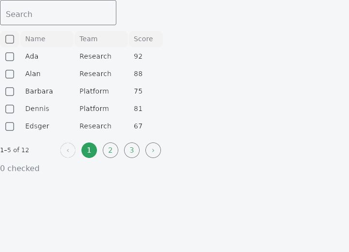
From frus-examples/widgets/src/features/display/widgets/datatable.rs:
//! `DataTable` — a table of text rows that sorts, filters, paginates and selects for
//! you, while the state it shows (sort, page, query, selection) stays in your app.

use frus::{
    Align, Button, Column, DataTable, State, StateContext, StatefulWidget, Text, Variant, Widget,
};

pub const PEOPLE: [(&str, &str, u32); 12] = [
    ("Ada", "Research", 92),
    ("Alan", "Research", 88),
    ("Barbara", "Platform", 75),
    ("Dennis", "Platform", 81),
    ("Edsger", "Research", 67),
    ("Frances", "Compilers", 95),
    ("Grace", "Compilers", 99),
    ("Ken", "Platform", 72),
    ("Linus", "Kernel", 84),
    ("Margaret", "Flight", 97),
    ("Niklaus", "Compilers", 70),
    ("Radia", "Networks", 90),
];

pub const PER_PAGE: usize = 5;

pub fn example() -> Box<dyn Widget> {
    Box::new(PeopleTable.into_widget())
}

/// The demo is a small `StatefulWidget`: the table's whole state lives in one struct, and
/// each handler changes it through a method — the same shape as a real page.
pub struct PeopleTable;

#[derive(Default)]
pub struct PeopleTableState {
    /// The sorted column and its direction; `None` keeps the source order.
    pub sort: Option<(usize, bool)>,
    /// 1-based page.
    page: usize,
    query: String,
    /// Checked rows, as indices into `PEOPLE` (the table translates through sorting).
    pub checked: Vec<usize>,
}

impl PeopleTableState {
    /// A click on a header: a new column sorts ascending, the same one flips.
    pub fn sort_by(&mut self, column: usize) {
        let ascending = match self.sort {
            Some((current, ascending)) if current == column => !ascending,
            _ => true,
        };
        self.sort = Some((column, ascending));
        self.page = 1;
    }

    fn search(&mut self, query: String) {
        self.query = query;
        self.page = 1;
    }

    pub fn toggle(&mut self, row: usize) {
        if let Some(at) = self.checked.iter().position(|&r| r == row) {
            self.checked.remove(at);
        } else {
            self.checked.push(row);
        }
    }

    /// The header box: everything, or nothing if everything was already checked.
    pub fn toggle_all(&mut self) {
        if self.checked.len() == PEOPLE.len() {
            self.checked.clear();
        } else {
            self.checked = (0..PEOPLE.len()).collect();
        }
    }
}

impl StatefulWidget for PeopleTable {
    type State = PeopleTableState;

    fn create_state(&self) -> PeopleTableState {
        PeopleTableState {
            page: 1,
            ..PeopleTableState::default()
        }
    }
}

impl State for PeopleTableState {
    type Widget = PeopleTable;

    fn build(&self, cx: &StateContext<Self>) -> Box<dyn Widget> {
        let rows = PEOPLE
            .iter()
            .map(|(name, team, score)| vec![name.to_string(), team.to_string(), score.to_string()]);

        let mut table = DataTable::new(["Name", "Team", "Score"], rows)
            .column_widths(&[110.0, 110.0, 70.0])
            // Searching filters every column, before sorting and paging.
            .searchable(
                self.query.as_str(),
                cx.handler(|s: &mut Self, q: String| s.search(q)),
            )
            .empty_text("Nobody matches that search")
            // A header click reports the column; the app decides the direction.
            .on_sort(cx.handler(|s: &mut Self, column: usize| s.sort_by(column)))
            // Checkboxes for multi-selection, with a "check all" box in the header.
            .checkboxes(
                cx.handler(|s: &mut Self, row: usize| s.toggle(row)),
                cx.callback(Self::toggle_all),
            )
            .selected(&self.checked)
            // Shown above the table only while rows are checked.
            .bulk_actions({
                let clear = cx.callback(|s: &mut Self| s.checked.clear());
                move || {
                    vec![Box::new(
                        Button::new("Clear")
                            .variant(Variant::Text)
                            .on_press(clear.clone()),
                    ) as Box<dyn Widget>]
                }
            })
            .paginated(
                self.page,
                PER_PAGE,
                cx.handler(|s: &mut Self, page: usize| s.page = page),
            );
        if let Some((column, ascending)) = self.sort {
            table = table.sorted(column, ascending);
        }

        Box::new(
            Column::new()
                .spacing(8.0)
                .cross_axis_alignment(Align::Start)
                .child(table)
                .child(
                    Text::new(format!("{} checked", self.checked.len())).color(cx.theme().muted),
                ),
        )
    }
}
Properties
| Method | Argument | Effect |
|---|---|---|
.column_widths() | widths: &[f32] | The fixed width of each column, in pixels (0 or less = a flexible column). |
.sorted() | column: usize, ascending: bool | The sorted column and its direction (true = ascending): it sorts the rows for display and shows the direction indicator. |
.on_sort() | on_sort: impl Fn(usize) -> R + 'static | Makes the headers clickable: on_sort(column) on click (the application then flips the direction and passes sorted(...) back). |
.paginated() | current: usize, per_page: usize, on_page: impl Fn(usize) -> R1 + 'static | Paginates the table: it shows only the slice of page current (1-indexed) with a size of per_page, and places a Pagination selector beneath it. on_page(page) when a page is clicked (the application updates current). The slicing follows the sort. |
.page_sizes() | sizes: &[usize], on_page_size: impl Fn(usize) -> R1 + 'static | Adds a page size selector (a SegmentedButton of the sizes offered) to the footer. on_page_size(size) on change (the app updates the size and, usually, returns to page 1). It has no effect if the table is not paginated. |
.on_select_row() | on_select: impl Fn(usize) -> R + 'static | Makes the rows clickable: on_select_row(source_row) when a row is clicked. The index passed is that of the source row (before sorting and pagination) — the DataTable translates the displayed position into the original index. |
.selected() | rows: &[usize] | The selected rows (highlighted, or checked), designated by their source row index. The DataTable only highlights (and checks) those visible in the current slice. |
.checkboxes() | on_check: impl Fn(usize) -> R1 + 'static, on_check_all: Msg | Enables multiple selection: a column of checkboxes capped by a "check all". on_check(source_row) toggles one row (the source row index, translated from the displayed position), and on_check_all toggles the header box. The checked state reflects selected. It combines with on_select_row: the box handles group selection, and a click on the row's body stays a row click. |
.searchable() | query: impl Into<String>, on_query: impl Fn(String) -> R1 + 'static | Makes the table searchable: a search field (with value query) caps the table, and the source rows are filtered (row_matches, a case-insensitive substring across every column) before sorting and pagination. on_query(text) on each keystroke (the application updates query and usually returns to page 1). The filter acts upstream of the sort, the page and the selection: boxes and highlighting stay in source indices, over the visible subset. |
.bulk_actions() | make: impl Fn() -> Vec<Box<dyn Widget<Msg>>> + 'static | Adds a bulk actions bar above the table, visible only when rows are selected. The make factory produces the action widgets (typically Buttons — the app chooses variants and messages); the bar precedes them with an "N selected" label. Called again on every rebuild (fresh widgets). The number shown is that of the selected rows, across all pages. |
.empty_text() | text: impl Into<String> | Overrides the empty state's text (default "No results") — "No people match your search", say. Shown centred under the header when no row is visible (milestone 244). |
.sort_with() | col: usize, cmp: impl Fn(&str, &str) -> Ordering + 'static | Gives column col a custom comparator: cmp(a, b) orders two of its (text) cells. It replaces the default sort (compare_cells) for that column — useful when the values sort badly as they stand: formatted dates ("Mar 2024"), amounts ("$1.2M"), priorities ("High"/"Medium"/"Low"). The direction (sorted(_, ascending)) applies on top (the comparator defines the ascending order). |
Behaviour
A text data table that sorts its own rows according to the sort state supplied, then delegates the rendering to a Table.
use frus_widgets::DataTable;
let rows = vec![vec!["Bob".to_string(), "9".to_string()], vec!["Ada".to_string(), "10".to_string()]];
let table: DataTable = DataTable::new(["Name", "Score"], rows).sorted(1, true);
See also
- ListTile: one row of a list: leading, title, subtitle and trailing slots.
- GridTile & GridTileBar: a cell of an image grid with a caption bar laid over it.
- Table: a controlled grid of text or widget cells; the app sorts and selects.
- BarChart & LineChart: themed charts for comparing amounts and reading trends.
- Timeline: a vertical chronology of events joined by a line.
- The guide: Text, colour and the theme
- API reference:
DataTable
Source: crates/frus-widgets/src/datatable.rs @ e6fba33f5b42