Divider and VerticalDivider
Purpose
Thin rules that separate content across a column or down a row.
Signature
pub struct Divider { .. }

impl Divider {
    pub fn new() -> Self;
}
pub struct VerticalDivider { .. }

impl VerticalDivider {
    pub fn new() -> Self;
}
Example
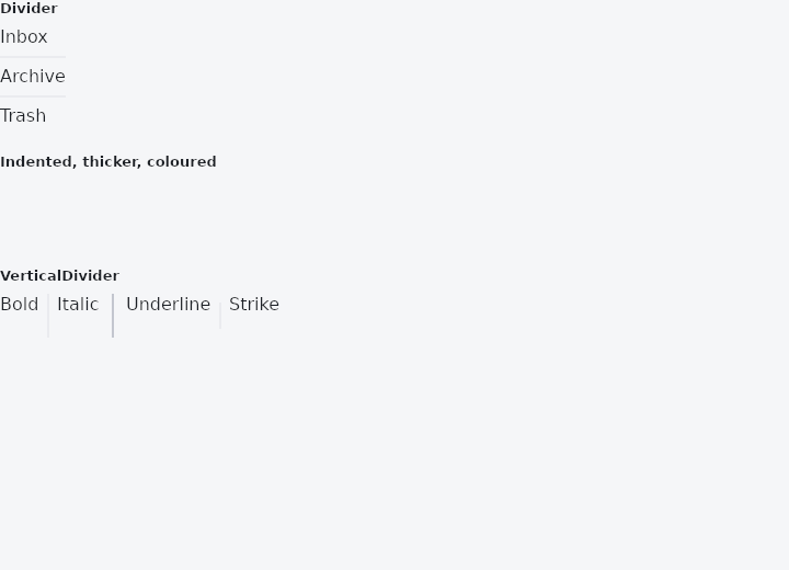
From frus-examples/widgets/src/features/display/widgets/divider.rs:
//! `Divider` and `VerticalDivider` — a thin rule in the theme's colours, across a column
//! or down a row.

use frus::{Align, Color, Column, Container, Divider, Row, Text, VerticalDivider, Widget};

use crate::common::shared::{section, sections};

pub fn example() -> Box<dyn Widget> {
    sections(vec![
        // A divider is as wide as it is allowed to be, inside a band of `height` (16 by
        // default) that leaves room above and below. A column centres its children
        // unless told to stretch them, so `Align::Stretch` is what lets it run across.
        Box::new(section(
            "Divider",
            Container::new().width(300.0).child(
                Column::new()
                    .cross_axis_alignment(Align::Stretch)
                    .child(Text::new("Inbox"))
                    .child(Divider::new())
                    .child(Text::new("Archive"))
                    .child(Divider::new())
                    .child(Text::new("Trash")),
            ),
        )),
        // Indents line a rule up with the text of a list rather than with its edge.
        Box::new(section(
            "Indented, thicker, coloured",
            Container::new().width(300.0).child(
                Column::new()
                    .cross_axis_alignment(Align::Stretch)
                    .child(Divider::new().indent(56.0))
                    .child(Divider::new().indent(16.0).end_indent(16.0))
                    .child(
                        Divider::new()
                            .height(24.0)
                            .thickness(4.0)
                            .radius(2.0)
                            .color(Color::hex("#6366F1")),
                    ),
            ),
        )),
        // A vertical divider separates items in a row; the row needs a height for the
        // rule to run down.
        Box::new(section(
            "VerticalDivider",
            Container::new().height(40.0).child(
                Row::new()
                    .cross_axis_alignment(Align::Stretch)
                    .child(Text::new("Bold"))
                    .child(VerticalDivider::new())
                    .child(Text::new("Italic"))
                    .child(VerticalDivider::new().width(24.0).thickness(2.0))
                    .child(Text::new("Underline"))
                    .child(VerticalDivider::new().indent(8.0).end_indent(8.0))
                    .child(Text::new("Strike")),
            ),
        )),
    ])
}
Properties
| Type | Method | Argument | Effect |
|---|---|---|---|
Divider | .height() | height: f32 | The room the separator takes in the layout, line and air together. Defaults to DIVIDER_SPACE. |
Divider | .thickness() | thickness: f32 | The thickness of the line itself. Defaults to DIVIDER_THICKNESS. |
Divider | .indent() | indent: f32 | Insets the line from the leading edge, leaving the box where it is — how a list separates rows without cutting through their leading icons. |
Divider | .end_indent() | end_indent: f32 | Insets the line from the trailing edge. |
Divider | .radius() | radius: impl Into<BorderRadius> | A thick rule reads as a bar, and a bar with square ends is the only thing in an interface that still has them. |
Divider | .color() | color: Color | Overrides the line's colour. Defaults to the theme's discreet outline. |
VerticalDivider | .width() | width: f32 | The room the separator takes across the row, line and air together. Defaults to DIVIDER_SPACE — the same figure a horizontal one takes, and the same theme field, which is why one number covers both. |
VerticalDivider | .thickness() | thickness: f32 | The thickness of the line itself. Defaults to DIVIDER_THICKNESS. |
VerticalDivider | .indent() | indent: f32 | Insets the line from the top, leaving the box where it is. |
VerticalDivider | .end_indent() | end_indent: f32 | Insets the line from the bottom. |
VerticalDivider | .color() | color: Color | Overrides the line's colour. Defaults to the theme's discreet outline. |
VerticalDivider | .radius() | radius: impl Into<BorderRadius> | — |
Behaviour
Divider
A separator: a thin line, centred in a taller box that gives it room to breathe.
The box and the line are two different measurements, and conflating them is the usual mistake: Divider::height is how much room the separator takes in the layout, Divider::thickness is how thick the line drawn inside it is. A divider with no space around it reads as a border on the row above, not as a separator.
Divider::new()                                   // 16 px of room, a 1 px line
Divider::new().height(1.0)                       // no air: a hairline, flush
Divider::new().indent(16.0)                      // inset, the way a list insets one
Divider::new().thickness(2.0).color(theme.primary)
VerticalDivider
A vertical separator: a thin line, centred in a wider box that gives it room.
Everything else is the same question turned ninety degrees: thickness is the line, indent is measured from the top here rather than from the leading edge, and end_indent from the bottom.
Flex::row()
    .child(left_pane)
    .child(VerticalDivider::new())     // 16 px of room, a 1 px line
    .child(right_pane)
It takes its row's full height, whatever the row said about alignment. A row that centres its children would otherwise give this one the height of its content, and its content is nothing — so a rule in a centred row would be a rule nobody can see, which is the first thing anybody hits.
It still needs a height to fill: a row is as tall as its tallest child, so a rule between two things that size themselves is as tall as they are, and one standing alone in a row of nothing else is nothing at all.
thickness: VerticalDivider::thickness indent: VerticalDivider::indent end_indent: VerticalDivider::end_indent
See also
- Icon: vector icons from the bundled set, or your own, sized and coloured.
- Image & ImageIcon: bitmaps from assets, pixels or the network, fitted into a box.
- ListTile: one row of a list: leading, title, subtitle and trailing slots.
- GridTile & GridTileBar: a cell of an image grid with a caption bar laid over it.
- DataTable: a table that sorts, searches, pages and selects its rows for you.
- The guide: Text, colour and the theme
- API reference:
Divider - API reference:
VerticalDivider
Source: crates/frus-widgets/src/divider.rs, crates/frus-widgets/src/divider.rs @ e6fba33f5b42