GridTile and GridTileBar
Purpose
A cell of an image grid with a caption bar laid over it.
Signature
pub struct GridTile<Msg = crate::callback::Callback> { .. }

impl GridTile {
    pub fn new(child: impl Widget<Msg> + 'static) -> Self;
    pub fn new_boxed(child: Box<dyn Widget<Msg>>) -> Self;
}
pub struct GridTileBar<Msg = crate::callback::Callback> { .. }

impl GridTileBar {
    pub fn new() -> Self;
}
Example
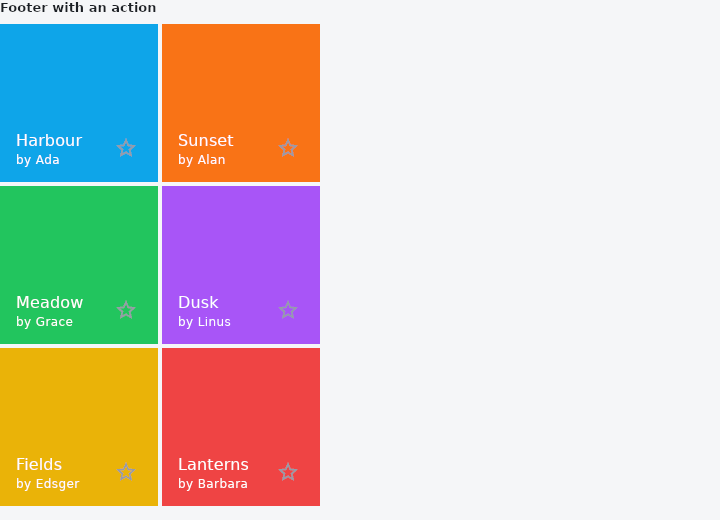
From frus-examples/widgets/src/features/display/widgets/gridtile.rs:
//! `GridTile` and `GridTileBar` — a cell of an image grid, with a strip of text laid
//! **over** it rather than under it, so every row of the grid stays the same height.

use frus::{
    Color, Colors, Container, GridTile, GridTileBar, GridView, Icon, IconButton, Icons, Text,
    Widget,
};

use crate::common::shared::{section, sections};

/// Stand-ins for photos: a colour and a caption each.
const PHOTOS: [(&str, &str, &str); 6] = [
    ("#0EA5E9", "Harbour", "Ada"),
    ("#F97316", "Sunset", "Alan"),
    ("#22C55E", "Meadow", "Grace"),
    ("#A855F7", "Dusk", "Linus"),
    ("#EAB308", "Fields", "Edsger"),
    ("#EF4444", "Lanterns", "Barbara"),
];

pub fn example() -> Box<dyn Widget> {
    Box::new(frus::component(|cx| {
        let starred = cx.use_state(|| vec![false; PHOTOS.len()]);

        // A footer bar: a title and a subtitle over the bottom of the picture, and a
        // trailing action that keeps its own tap.
        let footers = PHOTOS.iter().enumerate().fold(
            GridView::new(2).width(320.0).gap(4.0).aspect(1.0),
            |grid, (i, (color, title, author))| {
                let star = starred.clone();
                let on = starred.with(|s| s[i]);
                grid.cell(
                    GridTile::new(photo(color)).footer(
                        GridTileBar::new()
                            .title(Text::new(*title))
                            .subtitle(Text::new(format!("by {author}")))
                            .trailing(
                                IconButton::new(if on { Icons::STAR } else { Icons::STAR_BORDER })
                                    .label("Star")
                                    .on_press(move || star.update(|s| s[i] = !s[i])),
                            ),
                    ),
                )
            },
        );

        sections(vec![
            Box::new(section(
                "Footer with an action",
                Container::new().width(320.0).child(footers),
            )),
            // A header bar sits over the top instead; colours are overridable.
            Box::new(section(
                "Header, custom colours",
                Container::new().width(320.0).child(
                    GridView::new(2)
                        .width(320.0)
                        .gap(4.0)
                        .aspect(1.5)
                        .cell(
                            GridTile::new(photo("#14B8A6")).header(
                                GridTileBar::new()
                                    .leading(Icon::new(Icons::PHOTO_CAMERA).color(Colors::WHITE))
                                    .title(Text::new("Coast")),
                            ),
                        )
                        .cell(
                            GridTile::new(photo("#F43F5E")).header(
                                GridTileBar::new()
                                    .background_color(Color::rgba(1.0, 1.0, 1.0, 0.7))
                                    .foreground_color(Colors::BLACK)
                                    .title(Text::new("Roses")),
                            ),
                        ),
                ),
            )),
        ])
    }))
}

/// A coloured block standing in for a picture. In an app this is an `Image`.
fn photo(hex: &str) -> Container {
    Container::new().color(Color::hex(hex))
}
Properties
| Type | Method | Argument | Effect |
|---|---|---|---|
GridTile | .header() | header: impl Widget<Msg> + 'static | Typically a GridTileBar. |
GridTile | .footer() | footer: impl Widget<Msg> + 'static | — |
GridTileBar | .background_color() | color: Color | Untold, nothing — the picture shows through, which is the arrangement the widget is for. |
GridTileBar | .foreground_color() | color: Color | The colour of the words and glyphs in the bar. |
GridTileBar | .leading() | leading: impl Widget<Msg> + 'static | — |
GridTileBar | .title() | title: impl Widget<Msg> + 'static | Typically a Text, which takes the bar's type and colour without being told. |
GridTileBar | .subtitle() | subtitle: impl Widget<Msg> + 'static | Its presence is what makes the bar 68 rather than 48, so this is a size decision as much as a content one. |
GridTileBar | .trailing() | trailing: impl Widget<Msg> + 'static | — |
GridTileBar | .height() | height: f32 | The bar's height, over the two the content would have chosen. |
GridTileBar | .title_style() | style: TextStyle | The title's type. |
GridTileBar | .subtitle_style() | style: TextStyle | The subtitle's. |
Behaviour
GridTile
A cell of an image list: a child, with a strip laid over its top or its bottom.
GridTileBar
The strip of words laid over a GridTile: up to two lines, with a slot at each end.
See also
- Divider & VerticalDivider: thin rules that separate content across a column or down a row.
- ListTile: one row of a list: leading, title, subtitle and trailing slots.
- DataTable: a table that sorts, searches, pages and selects its rows for you.
- Table: a controlled grid of text or widget cells; the app sorts and selects.
- BarChart & LineChart: themed charts for comparing amounts and reading trends.
- The guide: Text, colour and the theme
- API reference:
GridTile - API reference:
GridTileBar
Source: crates/frus-widgets/src/gridtile.rs, crates/frus-widgets/src/gridtile.rs @ e6fba33f5b42