Image and ImageIcon
Purpose
Bitmaps from assets, pixels or the network, fitted into a box.
Signature
pub struct Image { .. }

impl Image {
    pub fn new(image: ImageHandle) -> Self;
    pub fn memory(bytes: &'static [u8]) -> Self;
    pub fn network(url: impl AsRef<str>) -> Self;
}
pub struct ImageIcon { .. }

impl ImageIcon {
    pub fn new(image: Image) -> Self;
}
Example
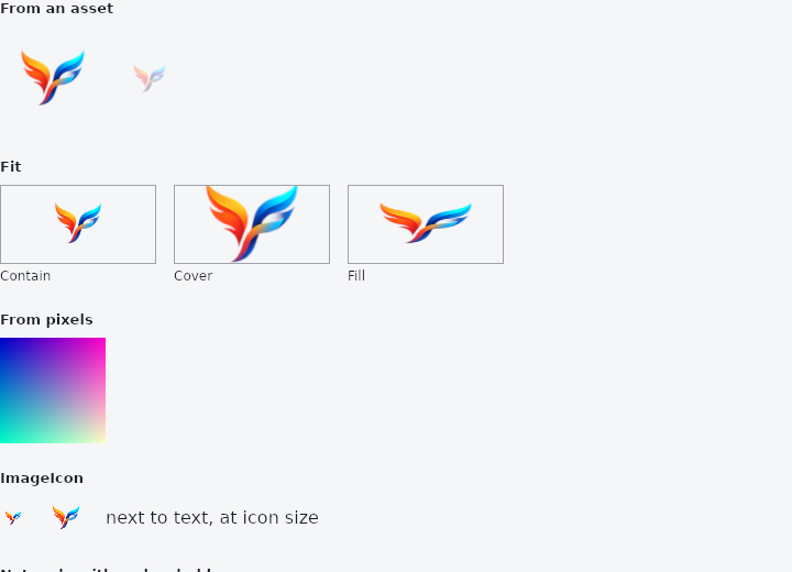
From frus-examples/widgets/src/features/display/widgets/image.rs:
//! `Image` — a bitmap fitted into a box: embedded with `asset!`, made from pixels, or
//! fetched over the network. `ImageIcon` puts a picture where an icon goes.

use frus::{
    Align, BoxFit, Color, Column, Container, Expanded, Icon, Icons, Image, ImageData, ImageIcon,
    ImageState, Row, Skeleton, Text, Widget, Wrap,
};

use crate::common::shared::{section, sections};

pub fn example() -> Box<dyn Widget> {
    Box::new(frus::component(|cx| {
        let theme = cx.theme();

        // Pixels you make yourself become an image with `ImageData::from_rgba`. The
        // renderer caches a picture by its identity, so make it once (`use_memo`) rather
        // than on every build, which would upload a new texture each frame.
        let gradient = cx.use_memo((), || {
            let (w, h) = (64u32, 64u32);
            let mut rgba = Vec::with_capacity((w * h * 4) as usize);
            for y in 0..h {
                for x in 0..w {
                    rgba.extend_from_slice(&[(x * 4) as u8, (y * 4) as u8, 200, 255]);
                }
            }
            ImageData::from_rgba(w, h, rgba).into_handle()
        });

        // A network image is in one of three states, and the view says what each looks
        // like. This gallery is built without the `net` feature, so there is no fetcher
        // and the request reports why it failed instead of waiting for ever.
        let remote = Image::network("https://example.com/photo.png")
            .size(120.0, 80.0)
            .placeholder(Skeleton::new().radius(8.0));
        let remote: Box<dyn Widget> = match remote.state() {
            ImageState::Ready => Box::new(remote),
            ImageState::Loading => Box::new(Skeleton::new().width(120.0).height(80.0)),
            ImageState::Failed(why) => Box::new(
                Row::new()
                    .spacing(8.0)
                    .child(Icon::new(Icons::BROKEN_IMAGE).color(theme.error))
                    // The reason can be long: `Expanded` keeps it to the room the icon
                    // leaves, so it wraps rather than overflows.
                    .child(Expanded::new(
                        Text::new(format!("Could not load: {why}"))
                            .wrap()
                            .color(theme.muted),
                    )),
            ),
        };

        sections(vec![
            // `asset!` embeds the file at compile time — no path to get wrong at run time.
            // The path is relative to this source file. Give one side and the other
            // follows the picture's own ratio.
            Box::new(section(
                "From an asset",
                Row::new()
                    .spacing(16.0)
                    .child(
                        frus::asset!("../../../../res/mipmap-xxxhdpi/ic_launcher.png").width(96.0),
                    )
                    .child(
                        frus::asset!("../../../../res/mipmap-xxxhdpi/ic_launcher.png")
                            .width(48.0)
                            .opacity(0.5)
                            .semantic_label("frus logo, faded"),
                    ),
            )),
            // `fit` decides how the picture fills a box of another shape.
            Box::new(section(
                "Fit",
                Wrap::new()
                    .gap(16.0)
                    .run_gap(16.0)
                    .child(fitted("Contain", BoxFit::Contain))
                    .child(fitted("Cover", BoxFit::Cover))
                    .child(fitted("Fill", BoxFit::Fill)),
            )),
            Box::new(section(
                "From pixels",
                Image::new((*gradient).clone()).size(96.0, 96.0),
            )),
            // An image as an icon: same size rules as `Icon`, in its own colours unless
            // tinted (tinting suits white or grey artwork).
            Box::new(section(
                "ImageIcon",
                Row::new()
                    .spacing(16.0)
                    .child(ImageIcon::new(frus::asset!(
                        "../../../../res/mipmap-xxxhdpi/ic_launcher.png"
                    )))
                    .child(
                        ImageIcon::new(frus::asset!(
                            "../../../../res/mipmap-xxxhdpi/ic_launcher.png"
                        ))
                        .size(40.0),
                    )
                    .child(Text::new("next to text, at icon size")),
            )),
            // While a network picture is on its way, `placeholder` fills its box with a
            // colour, a shimmering skeleton or a smaller picture.
            Box::new(section("Network, with a placeholder", remote)),
        ])
    }))
}

/// The logo in a wide 140 × 70 box, fitted one way, with the box outlined so the
/// difference shows.
fn fitted(label: &str, fit: BoxFit) -> Column {
    Column::new()
        .cross_axis_alignment(Align::Start)
        .spacing(4.0)
        .child(
            Container::new().border(1.0, Color::hex("#A1A1AA")).child(
                frus::asset!("../../../../res/mipmap-xxxhdpi/ic_launcher.png")
                    .size(140.0, 70.0)
                    .fit(fit),
            ),
        )
        .child(Text::new(label).size(12.0))
}
Properties
| Type | Method | Argument | Effect |
|---|---|---|---|
Image | .width() | width: f32 | Sets the width, in logical pixels. With no height, the height follows from the image's own ratio. |
Image | .height() | height: f32 | Sets the height, in logical pixels. With no width, the width follows from the image's own ratio. |
Image | .size() | width: f32, height: f32 | Both at once. |
Image | .cache_width() | pixels: u32 | Decodes the picture this many physical pixels wide, whatever the file's own width; the height follows from the image's own ratio unless cache_height is given too, in which case the picture is decoded at the smallest size, at its own ratio, that covers both. Never larger than the file. |
Image | .cache_height() | pixels: u32 | cache_width, for the height. |
Image | .full_resolution() | — | Decodes the file at its own size, however small the box: for a picture that is shown larger than its box says — under a zoom, a scale transform, a hero flight to a full-screen view — and must stay sharp there. |
Image | .fit() | fit: BoxFit | Changes the fit mode. |
Image | .alignment() | alignment: impl Into<AlignmentGeometry> | Where the image sits in a box it does not fill, and which part of it survives a box it overflows. |
Image | .tint() | tint: Color | A multiplied tint, white leaving it unchanged — for bitmap icons, say. |
Image | .opacity() | opacity: f32 | Draws the image at a fraction of its opacity, 1.0 being fully opaque. |
Image | .semantic_label() | label: impl Into<String> | What a screen reader says instead of the picture. |
Image | .exclude_from_semantics() | exclude: bool | Leaves the image out of the tree a screen reader walks. |
Image | .match_text_direction() | match_direction: bool | Mirrors the image horizontally when the reading direction is right-to-left. |
Image | .placeholder() | placeholder: impl Into<ImagePlaceholder> | What stands in while the pixels are on their way, and what the picture crosses over when they arrive. |
Image | .fade_duration() | seconds: f32 | How long the crossing takes, in seconds. 0.0 is a hard cut with a placeholder before it. |
Image | .fade_curve() | curve: Curve | The crossing's curve; Curve::ease_out by default, so the picture arrives quickly and settles. |
ImageIcon | .size() | size: f32 | The square's side, in logical pixels. Outranks the theme. |
ImageIcon | .color() | color: Color | Tints the picture, the way an icon is coloured. |
Behaviour
Image
An image, fitted by fit into whatever box it ends up with.
ImageIcon
A picture used where an icon would go: a brand mark, a flag, a custom glyph that is artwork rather than a path.
It is an icon in every way that matters to the layout and the theme — the ambient size from IconTheme, the same square box, the same place in a row of them — and a picture in the one way that matters to the painter. So it sits in an IconButton, a list tile's leading slot or an app bar action without any of them knowing.
Untinted by default, which is the one place it parts from crate::Icon. An icon is a silhouette and takes the foreground colour; a picture usually has colours of its own, and a brand mark flattened to on_surface the first time an application themes its icons is a brand mark nobody recognises.
ImageIcon::new(Image::memory(include_bytes!("../assets/mark.png")))
See also
- Badge: a small count or dot that says there is something new.
- Icon: vector icons from the bundled set, or your own, sized and coloured.
- Divider & VerticalDivider: thin rules that separate content across a column or down a row.
- ListTile: one row of a list: leading, title, subtitle and trailing slots.
- GridTile & GridTileBar: a cell of an image grid with a caption bar laid over it.
- The guide: Text, colour and the theme
- API reference:
Image - API reference:
ImageIcon
Source: crates/frus-widgets/src/image.rs, crates/frus-widgets/src/image.rs @ e6fba33f5b42