Alert
Purpose
A message box in the flow of the page: info, success, warning or error.
Signature
pub struct Alert { .. }

impl Alert {
    pub fn new(text: impl Into<String>) -> Self;
}
Example
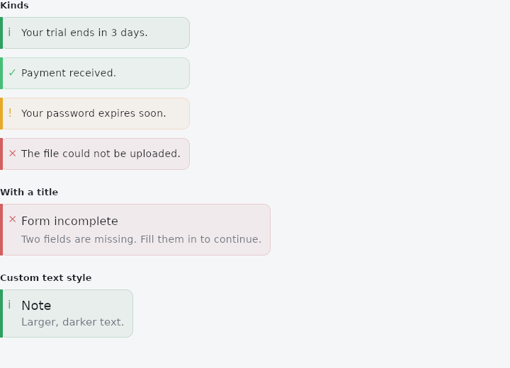
From frus-examples/widgets/src/features/feedback/widgets/alert.rs:
//! `Alert` — a message box that sits **in the flow** of the page and stays: info,
//! success, warning or error, with an optional title. No actions, no overlay — for
//! context next to what it is about.

use frus::{Alert, Align, Color, Column, TextStyle, Widget};

use crate::common::shared::{section, sections};

pub fn example() -> Box<dyn Widget> {
    sections(vec![
        // The kind sets the accent colour and the icon.
        Box::new(section(
            "Kinds",
            Column::new()
                .spacing(12.0)
                .cross_axis_alignment(Align::Stretch)
                .child(Alert::new("Your trial ends in 3 days."))
                .child(Alert::new("Payment received.").success())
                .child(Alert::new("Your password expires soon.").warning())
                .child(Alert::new("The file could not be uploaded.").error()),
        )),
        // A title above the message, for something that needs a heading.
        Box::new(section(
            "With a title",
            Alert::new("Two fields are missing. Fill them in to continue.")
                .title("Form incomplete")
                .error(),
        )),
        // The text styles can be changed like every other widget's.
        Box::new(section(
            "Custom text style",
            Alert::new("Larger, darker text.")
                .title("Note")
                .title_text_style(TextStyle::new(18.0).color(Color::hex("#1E3A8A")))
                .content_text_style(TextStyle::new(15.0)),
        )),
    ])
}
Properties
| Method | Argument | Effect |
|---|---|---|
.title_text_style() | style: TextStyle | — |
.content_text_style() | style: TextStyle | — |
.title() | title: impl Into<String> | Adds a title. |
.success() | — | The success variant. |
.warning() | — | Variante avertissement. |
.error() | — | Variante erreur. |
Behaviour
A message box.
See also
- DraggableScrollableSheet: a panel along the bottom that follows the finger between resting heights.
- MaterialBanner: a message across the top of the content that stays until it is answered.
- LinearProgressIndicator & CircularProgressIndicator: how far along some work is, or that it is under way.
- Skeleton: a pulsing placeholder in the shape of content that is still loading.
- Tooltip: a short label that appears while the pointer rests on a widget.
- The guide: Screens, navigation and dialogs
- API reference:
Alert
Source: crates/frus-widgets/src/alert.rs @ e6fba33f5b42