AlertDialog
Purpose
A modal box that asks a question and waits for the answer.
Signature
pub struct AlertDialog<Msg = crate::callback::Callback> { .. }

impl AlertDialog {
    pub fn new(open: bool) -> Self;
}
Example
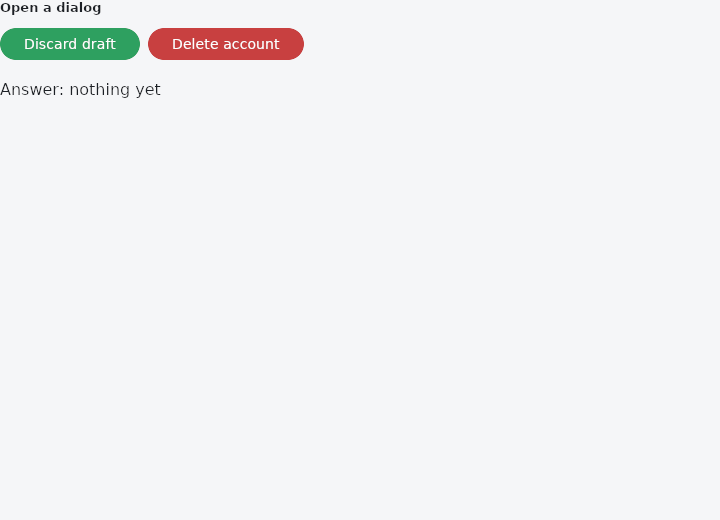
From frus-examples/widgets/src/features/feedback/widgets/alert_dialog.rs:
//! `AlertDialog` — a modal box that asks a question and waits for the answer: an
//! optional icon, a title, some content and the buttons that answer it.
//!
//! There is no "show dialog" call. A dialog is **controlled** like every overlay: it is
//! built around a body (`.body(..)`), the application keeps whether it is open, and the
//! buttons change that flag.

use frus::{
    AlertDialog, Align, Button, Column, Icon, Icons, State, StateContext, StatefulWidget, Text,
    Variant, Widget, Wrap,
};

use crate::common::shared::section;

pub fn example() -> Box<dyn Widget> {
    Box::new(AlertDialogDemo.into_widget())
}

struct AlertDialogDemo;

#[derive(Clone, Copy, PartialEq)]
enum Open {
    None,
    Discard,
    Delete,
}

struct AlertDialogDemoState {
    open: Open,
    answer: &'static str,
}

impl AlertDialogDemoState {
    /// Every button of a dialog closes it, and says what was answered.
    fn answer(&mut self, answer: &'static str) {
        self.answer = answer;
        self.open = Open::None;
    }
}

impl StatefulWidget for AlertDialogDemo {
    type State = AlertDialogDemoState;

    fn create_state(&self) -> AlertDialogDemoState {
        AlertDialogDemoState {
            open: Open::None,
            answer: "nothing yet",
        }
    }
}

impl State for AlertDialogDemoState {
    type Widget = AlertDialogDemo;

    fn build(&self, cx: &StateContext<Self>) -> Box<dyn Widget> {
        let answer =
            |what: &'static str| cx.callback(move |s: &mut AlertDialogDemoState| s.answer(what));

        // What the dialogs open over: the buttons that open them.
        let body = Column::new()
            .spacing(16.0)
            .cross_axis_alignment(Align::Start)
            .child(section(
                "Open a dialog",
                Wrap::new()
                    .gap(8.0)
                    .run_gap(8.0)
                    .child(Button::new("Discard draft").on_press(
                        cx.callback(|s: &mut AlertDialogDemoState| s.open = Open::Discard),
                    ))
                    .child(
                        Button::new("Delete account")
                            .variant(Variant::Danger)
                            .on_press(
                                cx.callback(|s: &mut AlertDialogDemoState| s.open = Open::Delete),
                            ),
                    ),
            ))
            .child(Text::new(format!("Answer: {}", self.answer)));

        // A title, a sentence, two text buttons. A tap on the scrim around it sends
        // `on_dismiss`, so this one can be left without answering.
        let discard = AlertDialog::new(self.open == Open::Discard)
            .title("Discard draft?")
            .content("Your message has not been sent.")
            .action(
                Button::new("Keep editing")
                    .variant(Variant::Text)
                    .on_press(answer("kept")),
            )
            .action(
                Button::new("Discard")
                    .variant(Variant::Text)
                    .on_press(answer("discarded")),
            )
            .on_dismiss(answer("dismissed"))
            .body(body);

        // An icon centres the title. No `on_dismiss`: the scrim is inert, and the
        // question must be answered with a button.
        let delete = AlertDialog::new(self.open == Open::Delete)
            .icon(Icon::new(Icons::WARNING))
            .title("Delete your account?")
            .content("Everything you stored will be removed. This cannot be undone.")
            .action(
                Button::new("Cancel")
                    .variant(Variant::Text)
                    .on_press(answer("cancelled")),
            )
            .action(
                Button::new("Delete")
                    .variant(Variant::Danger)
                    .on_press(answer("deleted")),
            )
            .body(discard);

        Box::new(delete)
    }
}
Properties
| Method | Argument | Effect |
|---|---|---|
.on_dismiss() | message: impl Into<Msg> | What a click on the scrim sends. |
.icon() | icon: impl Widget<Msg> + 'static | A glyph above the title, centred. Having one centres the title too. |
.icon_color() | color: Color | The icon's colour. |
.title() | title: impl Into<String> | The heading, as text. |
.title_widget() | title: impl Widget<Msg> + 'static | The heading, as a widget. |
.title_text_style() | style: TextStyle | The heading's type. headlineSmall by default. |
.content() | content: impl Into<String> | What the dialog says, as text. |
.content_widget() | content: impl Widget<Msg> + 'static | What the dialog says, as a widget. |
.content_text_style() | style: TextStyle | The content's type. bodyMedium by default. |
.action() | action: impl Widget<Msg> + 'static | Adds a button to the row along the bottom. |
.actions_alignment() | alignment: ActionsAlignment | Where the buttons sit along that row. |
.actions_overflow_alignment() | alignment: Align | Which edge the buttons line up on once they have stacked — see OverflowBar::overflow_alignment. |
.actions_overflow_direction() | direction: VerticalDirection | Which way that column runs — see OverflowBar::overflow_direction. Downwards by default, so the buttons stack in the order they were given. |
.actions_overflow_button_spacing() | spacing: f32 | — |
.background() | color: Color | The surface's colour — see Dialog::background. |
.elevation() | elevation: f32 | How far off the page it sits — see Dialog::elevation. |
.shadow_color() | color: Color | The shadow's colour — see Dialog::shadow_color. |
.surface_tint() | color: Color | The tint for its elevation — see Dialog::surface_tint. |
.shape() | shape: ShapeBorder | What shape it is — see Dialog::shape. |
.inset_padding() | padding: Insets | How far off the window's edges — see Dialog::inset_padding. |
.min_width() | width: f32 | The narrowest it gets — see Dialog::min_width. |
.max_width() | width: f32 | The widest it gets — see Dialog::max_width. |
Behaviour
A dialog that asks something: an optional icon, an optional title, some content, and the buttons that answer it.
See also
- Dialog: the modal surface on its own, with any content in it.
- SimpleDialog: a modal list of choices, answered by picking one.
- AboutDialog, AboutListTile & LicensePage: the "about this app" box, and the page listing the licences it ships.
- The guide: Screens, navigation and dialogs
- API reference:
AlertDialog
Source: crates/frus-widgets/src/dialog.rs @ e6fba33f5b42