MaterialBanner
Purpose
A message across the top of the content that stays until it is answered.
Signature
pub struct MaterialBanner<Msg = crate::callback::Callback> { .. }

impl MaterialBanner {
    pub fn new(content: impl Into<String>) -> Self;
    pub fn with_content(content: impl Widget<Msg> + 'static) -> Self;
}
Example
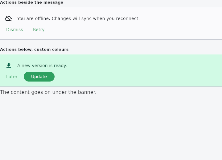
From frus-examples/widgets/src/features/feedback/widgets/material_banner.rs:
//! `MaterialBanner` — a message across the top of the content that stays until one of its
//! actions is taken. Between a snack bar (gone in seconds) and a dialog (blocks
//! everything): for something important that can wait, like "you are offline".

use frus::{
    Align, Button, Color, Column, Icon, Icons, MaterialBanner, State, StateContext, StatefulWidget,
    Text, TextStyle, Variant, Widget,
};

use crate::common::shared::{section, sections};

pub fn example() -> Box<dyn Widget> {
    Box::new(BannerDemo.into_widget())
}

struct BannerDemo;

struct BannerDemoState {
    offline: bool,
    update: bool,
}

impl StatefulWidget for BannerDemo {
    type State = BannerDemoState;

    fn create_state(&self) -> BannerDemoState {
        BannerDemoState {
            offline: true,
            update: true,
        }
    }
}

impl State for BannerDemoState {
    type Widget = BannerDemo;

    fn build(&self, cx: &StateContext<Self>) -> Box<dyn Widget> {
        // A banner is in the flow, not over it: showing it is simply building it.
        let offline: Box<dyn Widget> = if self.offline {
            MaterialBanner::new("You are offline. Changes will sync when you reconnect.")
                .leading(Icon::new(Icons::CLOUD_OFF))
                .action(
                    Button::new("Dismiss")
                        .variant(Variant::Text)
                        .on_press(cx.callback(|s: &mut BannerDemoState| s.offline = false)),
                )
                .action(
                    Button::new("Retry")
                        .variant(Variant::Text)
                        .on_press(cx.callback(|s: &mut BannerDemoState| s.offline = false)),
                )
                .build()
        } else {
            Box::new(
                Button::new("Show again")
                    .variant(Variant::Outlined)
                    .on_press(cx.callback(|s: &mut BannerDemoState| s.offline = true)),
            )
        };

        // Colours, padding and where the actions go are yours to change.
        let update: Box<dyn Widget> = if self.update {
            MaterialBanner::new("A new version is ready.")
                .leading(Icon::new(Icons::DOWNLOAD).color(Color::hex("#065F46")))
                .background(Color::hex("#D1FAE5"))
                .content_text_style(TextStyle::new(14.0).color(Color::hex("#064E3B")))
                .force_actions_below(true)
                .action(
                    Button::new("Later")
                        .variant(Variant::Text)
                        .on_press(cx.callback(|s: &mut BannerDemoState| s.update = false)),
                )
                .action(
                    Button::new("Update")
                        .on_press(cx.callback(|s: &mut BannerDemoState| s.update = false)),
                )
                .build()
        } else {
            Box::new(
                Button::new("Show again")
                    .variant(Variant::Outlined)
                    .on_press(cx.callback(|s: &mut BannerDemoState| s.update = true)),
            )
        };

        sections(vec![
            Box::new(section("Actions beside the message", offline)),
            Box::new(section(
                "Actions below, custom colours",
                Column::new()
                    .spacing(8.0)
                    .cross_axis_alignment(Align::Stretch)
                    .child_boxed(update)
                    .child(Text::new("The content goes on under the banner.")),
            )),
        ])
    }
}
Properties
| Method | Argument | Effect |
|---|---|---|
.leading() | leading: impl Widget<Msg> + 'static | A glyph before the message. |
.action() | action: impl Widget<Msg> + 'static | Adds an action. |
.force_actions_below() | force: bool | Puts the actions on a line of their own even when there is only one. |
.content_text_style() | style: TextStyle | What the message is set in. bodyMedium by default. |
.background() | color: Color | The banner's colour. A low container tone by default. |
.surface_tint() | color: Color | What the surface is tinted towards for its elevation. |
.shadow_color() | color: Color | The shadow's colour. Unset, there is none. |
.divider_color() | color: Color | The rule along the bottom, which is drawn only when the banner is flat — see Self::elevation. |
.elevation() | elevation: f32 | How far off the page it sits. 0 by default — see BANNER_ELEVATION. |
.padding() | padding: Insets | The padding around the message row. |
.margin() | margin: Insets | The margin around the banner. |
.leading_padding() | padding: Insets | What the leading slot is held off the message by. |
.min_action_bar_height() | height: f32 | The shortest the actions bar gets. 52 by default. |
Behaviour
A message across the top of the screen with the actions that answer it.
It sits in the flow, not over it: a banner is put above the content it is about, usually as the first child of a screen's column. Nothing hides it on a timer, which is the whole difference from a snack bar — an action does.
See also
- BottomSheet: a modal panel sliding up from the bottom, for contextual actions.
- DraggableScrollableSheet: a panel along the bottom that follows the finger between resting heights.
- Alert: a message box in the flow of the page: info, success, warning or error.
- LinearProgressIndicator & CircularProgressIndicator: how far along some work is, or that it is under way.
- Skeleton: a pulsing placeholder in the shape of content that is still loading.
- The guide: Screens, navigation and dialogs
- API reference:
MaterialBanner
Source: crates/frus-widgets/src/banner.rs @ e6fba33f5b42