SimpleDialog
Purpose
A modal list of choices, answered by picking one.
Signature
pub struct SimpleDialog<Msg = crate::callback::Callback> { .. }

impl SimpleDialog {
    pub fn new(open: bool) -> Self;
}
Example
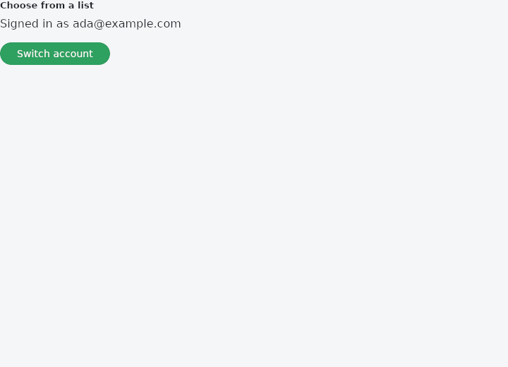
From frus-examples/widgets/src/features/feedback/widgets/simple_dialog.rs:
//! `SimpleDialog` and `SimpleDialogOption` — a modal list of choices, answered by
//! picking one row. No buttons: choosing **is** the answer.
use frus::{
Align, Button, Column, Icon, Icons, Row, SimpleDialog, SimpleDialogOption, State, StateContext,
StatefulWidget, Text, Widget,
};
use crate::common::shared::section;
pub fn example() -> Box<dyn Widget> {
Box::new(SimpleDialogDemo.into_widget())
}
struct SimpleDialogDemo;
struct SimpleDialogDemoState {
open: bool,
account: usize,
}
impl StatefulWidget for SimpleDialogDemo {
type State = SimpleDialogDemoState;
fn create_state(&self) -> SimpleDialogDemoState {
SimpleDialogDemoState {
open: false,
account: 0,
}
}
}
impl State for SimpleDialogDemoState {
type Widget = SimpleDialogDemo;
fn build(&self, cx: &StateContext<Self>) -> Box<dyn Widget> {
let body = section(
"Choose from a list",
Column::new()
.spacing(12.0)
.cross_axis_alignment(Align::Start)
.child(Text::new(format!(
"Signed in as {}",
ACCOUNTS[self.account]
)))
.child(
Button::new("Switch account")
.on_press(cx.callback(|s: &mut SimpleDialogDemoState| s.open = true)),
),
);
// Each option sends its own message; `build()` turns it into the full-width row.
let dialog = ACCOUNTS.iter().enumerate().fold(
SimpleDialog::new(self.open).title("Switch account"),
|dialog, (i, account)| {
dialog.option(
SimpleDialogOption::with_child(
Row::new()
.spacing(16.0)
.cross_axis_alignment(Align::Center)
.child(Icon::new(Icons::PERSON))
.child(Text::new(*account)),
)
.on_press(cx.callback(move |s: &mut SimpleDialogDemoState| {
s.account = i;
s.open = false;
}))
.build(),
)
},
);
// A plain text row works too.
let dialog = dialog
.option(
SimpleDialogOption::new(
"Cancel",
cx.callback(|s: &mut SimpleDialogDemoState| s.open = false),
)
.build(),
)
.on_dismiss(cx.callback(|s: &mut SimpleDialogDemoState| s.open = false))
.body(body);
Box::new(dialog)
}
}
Properties
| Method | Argument | Effect |
|---|---|---|
.on_dismiss() | message: impl Into<Msg> | What a click on the scrim sends — see Dialog::on_dismiss. |
.title() | title: impl Into<String> | The heading, as text. |
.title_widget() | title: impl Widget<Msg> + 'static | The heading, as a widget. |
.title_text_style() | style: TextStyle | The heading's type. headlineSmall by default, as AlertDialog's is. |
.title_padding() | padding: Insets | The space around the heading. |
.content_padding() | padding: Insets | The space around the list of options. No side padding by default: an option is a full-width row that pads itself. |
.content_text_style() | style: TextStyle | What the options are set in. bodyMedium by default. |
.option() | option: impl Widget<Msg> + 'static | Adds an option — usually a SimpleDialogOption. |
.background() | color: Color | The surface's colour — see Dialog::background. |
.elevation() | elevation: f32 | How far off the page it sits — see Dialog::elevation. |
.shape() | shape: ShapeBorder | What shape it is — see Dialog::shape. |
.inset_padding() | padding: Insets | How far off the window's edges — see Dialog::inset_padding. |
Behaviour
A dialog that offers a choice: a title, and a list of options to pick from.
See also
- AlertDialog: a modal box that asks a question and waits for the answer.
- Dialog: the modal surface on its own, with any content in it.
- AboutDialog, AboutListTile & LicensePage: the "about this app" box, and the page listing the licences it ships.
- SnackBar & ScaffoldMessenger: a short message at the bottom of the screen that goes away by itself.
- BottomSheet: a modal panel sliding up from the bottom, for contextual actions.
- The guide: Screens, navigation and dialogs
- API reference:
SimpleDialog
Source: crates/frus-widgets/src/dialog.rs @ e6fba33f5b42