ColorPicker
Purpose
A grid of colour swatches to pick from.
Signature
pub struct ColorPicker<Msg = crate::callback::Callback> { .. }

impl ColorPicker {
    pub fn new<R1: crate::callback::IntoMsg<Msg>>(
        selected: Option<Color>,
        columns: usize,
        on_pick: impl Fn(Color) -> R1 + 'static,
    ) -> Self;
}
Example
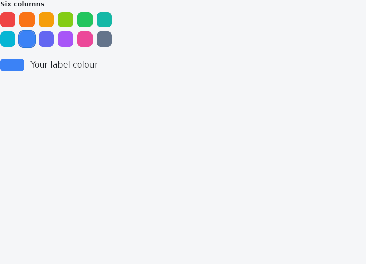
From frus-examples/widgets/src/features/inputs/widgets/color_picker.rs:
//! `ColorPicker` — a grid of colour swatches; the chosen one wears a ring.

use frus::{Color, ColorPicker, Container, Row, State, StateContext, StatefulWidget, Text, Widget};

use crate::common::shared::{section, sections};

pub fn example() -> Box<dyn Widget> {
    Box::new(ColorPickerDemo.into_widget())
}

const PALETTE: [&str; 12] = [
    "#EF4444", "#F97316", "#F59E0B", "#84CC16", "#22C55E", "#14B8A6", "#06B6D4", "#3B82F6",
    "#6366F1", "#A855F7", "#EC4899", "#64748B",
];

struct ColorPickerDemo;

struct ColorPickerDemoState {
    color: Option<Color>,
}

impl StatefulWidget for ColorPickerDemo {
    type State = ColorPickerDemoState;

    fn create_state(&self) -> ColorPickerDemoState {
        ColorPickerDemoState {
            color: Some(Color::hex(PALETTE[7])),
        }
    }
}

impl State for ColorPickerDemoState {
    type Widget = ColorPickerDemo;

    fn build(&self, cx: &StateContext<Self>) -> Box<dyn Widget> {
        // The selection, the number of columns, and what to do with a pick; then one
        // `swatch` per colour, in order.
        let picker = PALETTE.iter().fold(
            ColorPicker::new(
                self.color,
                6,
                cx.handler(|s: &mut ColorPickerDemoState, c: Color| s.color = Some(c)),
            ),
            |picker, hex| picker.swatch(Color::hex(hex)),
        );

        let preview = match self.color {
            Some(color) => Row::new()
                .spacing(12.0)
                .child(
                    Container::new()
                        .width(48.0)
                        .height(24.0)
                        .radius(6.0)
                        .color(color),
                )
                .child(Text::new("Your label colour")),
            None => Row::new().child(Text::new("No colour")),
        };

        sections(vec![
            Box::new(section("Six columns", picker)),
            Box::new(preview),
        ])
    }
}
Properties
| Method | Argument | Effect |
|---|---|---|
.swatch() | color: Color | Adds a color swatch. |
Behaviour
A controlled colour picker, laid out as a grid of swatches.
See also
- DateTimePicker: a calendar above a time picker, for one moment.
- DateTimeRange: a date range over two months and a start and end time, for booking a slot.
- AutofillGroup & AutofillHint: tell the platform what each field holds so it can be filled in.
- The guide: Taking input
- API reference:
ColorPicker
Source: crates/frus-widgets/src/colorpicker.rs @ e6fba33f5b42