RangeSlider
Purpose
Two thumbs on one track, for picking an interval.
Signature
pub struct RangeSlider<Msg = crate::callback::Callback> { .. }

impl RangeSlider {
    pub fn new(start: f32, end: f32) -> Self;
}
Example
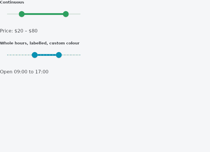
From frus-examples/widgets/src/features/inputs/widgets/range_slider.rs:
//! `RangeSlider` — two thumbs on one track, for picking an interval (a price range, a
//! time window).

use frus::{Color, RangeSlider, State, StateContext, StatefulWidget, Text, Widget};

use crate::common::shared::{section, sections};

pub fn example() -> Box<dyn Widget> {
    Box::new(RangeDemo.into_widget())
}

struct RangeDemo;

struct RangeDemoState {
    price: (f32, f32),
    hours: (f32, f32),
}

impl StatefulWidget for RangeDemo {
    type State = RangeDemoState;

    fn create_state(&self) -> RangeDemoState {
        RangeDemoState {
            price: (20.0, 80.0),
            hours: (9.0, 17.0),
        }
    }
}

impl State for RangeDemoState {
    type Widget = RangeDemo;

    fn build(&self, cx: &StateContext<Self>) -> Box<dyn Widget> {
        sections(vec![
            // The handler gets both ends at once. `cx.handler` takes one value, so this
            // one changes the state through a handle: a closure that returns nothing is
            // run when the change is delivered.
            Box::new(section(
                "Continuous",
                RangeSlider::new(self.price.0, self.price.1)
                    .range(0.0, 100.0)
                    .width(300.0)
                    .on_change({
                        let handle = cx.handle();
                        move |start, end| handle.set_state(|s| s.price = (start, end))
                    }),
            )),
            Box::new(Text::new(format!(
                "Price: ${:.0} – ${:.0}",
                self.price.0, self.price.1
            ))),
            Box::new(section(
                "Whole hours, labelled, custom colour",
                RangeSlider::new(self.hours.0, self.hours.1)
                    .range(0.0, 24.0)
                    .divisions(24)
                    .value_label(|v| format!("{v:02.0}:00"))
                    .active_color(Color::hex("#0891B2"))
                    .width(300.0)
                    .on_change({
                        let handle = cx.handle();
                        move |start, end| handle.set_state(|s| s.hours = (start, end))
                    }),
            )),
            Box::new(Text::new(format!(
                "Open {:02.0}:00 to {:02.0}:00",
                self.hours.0, self.hours.1
            ))),
        ])
    }
}
Properties
| Method | Argument | Effect |
|---|---|---|
.range() | min: f32, max: f32 | The travel the two values cover; 0.0..=1.0 by default. Everything the application sees is in these units. |
.divisions() | n: usize | Splits the travel into n steps: the values snap to them, a tick marks each, and an arrow moves a thumb by one. |
.width() | width: f32 | The width, in logical pixels. Unset, the slider takes the width it is offered, and 220 where none can be. |
.value_label() | label: impl Fn(f32) -> String + 'static | A screen reader hears it too, unless semantic_formatter says otherwise. |
.semantic_formatter() | format: impl Fn(f32) -> String + 'static | How a screen reader is told each thumb's value. |
.show_value_indicator() | when: ShowValueIndicator | When the tooltips show. Unset, the theme's, then only on a slider with divisions. |
.active_color() | color: Color | The span between the thumbs, and the thumbs; the scheme's primary otherwise. |
.inactive_color() | color: Color | The track outside the span; primary at 24 % otherwise. |
.thumb_color() | color: Color | The thumbs' fill; the active colour otherwise. |
.overlay_color() | color: WidgetStateProperty<Color> | The halo around a thumb, per state; the active colour at 12 % otherwise. |
.thumb_elevation() | elevation: f32 | How far a thumb sits off the track at rest. |
.pressed_thumb_elevation() | elevation: f32 | How far it rises while it is held. |
.track_shape() | shape: impl SliderTrackShape + 'static | Paints the track with shape, given both thumbs. |
.tick_mark_shape() | shape: impl SliderTickMarkShape + 'static | Paints the tick marks with shape. |
.thumb_shape() | shape: impl SliderThumbShape + 'static | Paints both thumbs with shape. |
.overlay_shape() | shape: impl SliderOverlayShape + 'static | Paints the halo with shape. |
.value_indicator_shape() | shape: impl SliderValueIndicatorShape + 'static | Paints the value indicators with shape. |
.enabled() | enabled: bool | Whether the slider can be moved. Disabled it takes no drag, no key and no focus, and still shows its interval. |
.on_change() | on_change: impl Fn(f32, f32) -> R + 'static | A closure producing a message from the new interval, (start, end), in the slider's units. |
.on_change_start() | on_start: impl Fn(f32, f32) -> R + 'static | — |
.on_change_end() | on_end: impl Fn(f32, f32) -> R + 'static | Sent once when the drag ends, with the interval it settled on. |
Behaviour
Like Slider it takes the width it is offered and is as tall as its halo, its track inset by the halo's radius, running from the right in a right-to-left reading direction.
A press on both, where they meet, waits for the first movement: leftwards takes the start. Each thumb takes the keyboard's focus and tells a screen reader its own value.
See also
- CheckboxListTile, RadioListTile & SwitchListTile: list rows whose whole width works one control, for settings screens.
- Slider: a value picked by dragging along a track, continuous or in steps.
- Rating: a score given by tapping stars.
- Stepper: a whole number with − and + buttons on either side.
- DatePicker: a month calendar: one day, allowed days only, or a range.
- The guide: Taking input
- API reference:
RangeSlider
Source: crates/frus-widgets/src/slider.rs @ e6fba33f5b42