SearchAnchor
Purpose
A search bar that opens a search view with suggestions.
Signature
pub struct SearchAnchor<Msg = crate::callback::Callback> { .. }

impl SearchAnchor {
    pub fn new(open: bool, query: impl Into<String>) -> Self;
}
Example
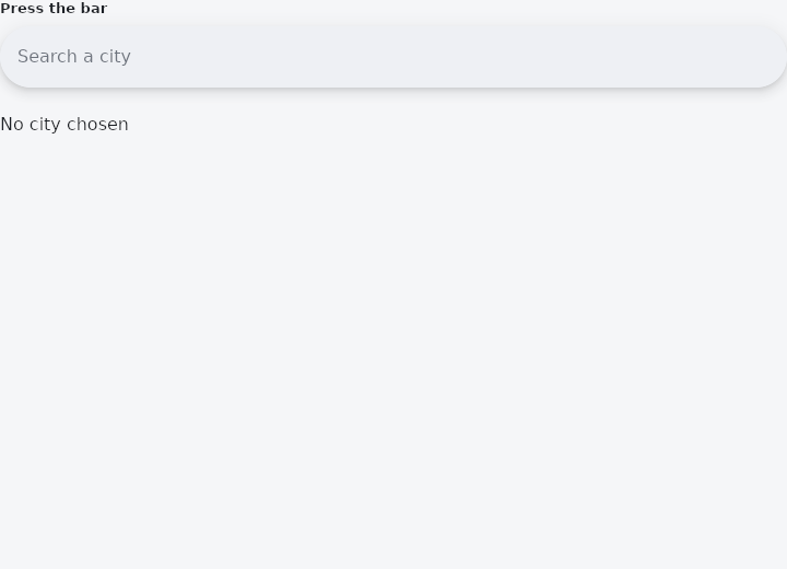
From frus-examples/widgets/src/features/inputs/widgets/search_anchor.rs:
//! `SearchAnchor` — a search bar that opens a **search view** when pressed: the same
//! query, and a list of suggestions under it. Full screen on a phone, a panel under the
//! bar on a desktop.

use frus::{ListTile, SearchAnchor, State, StateContext, StatefulWidget, Text, Widget};

use crate::common::shared::{section, sections};

pub fn example() -> Box<dyn Widget> {
    Box::new(SearchAnchorDemo.into_widget())
}

const CITIES: [&str; 8] = [
    "Amsterdam",
    "Berlin",
    "Dakar",
    "Lisbon",
    "Lomé",
    "Nairobi",
    "Oslo",
    "Tokyo",
];

struct SearchAnchorDemo;

#[derive(Default)]
struct SearchAnchorDemoState {
    /// The view is open because the application says so.
    open: bool,
    query: String,
    chosen: Option<&'static str>,
}

impl StatefulWidget for SearchAnchorDemo {
    type State = SearchAnchorDemoState;

    fn create_state(&self) -> SearchAnchorDemoState {
        SearchAnchorDemoState::default()
    }
}

impl State for SearchAnchorDemoState {
    type Widget = SearchAnchorDemo;

    fn build(&self, cx: &StateContext<Self>) -> Box<dyn Widget> {
        let needle = self.query.to_lowercase();
        let anchor = CITIES
            .iter()
            .filter(|city| city.to_lowercase().contains(&needle))
            .fold(
                SearchAnchor::new(self.open, self.query.clone())
                    .hint("Search a city")
                    .on_open(cx.callback(|s: &mut SearchAnchorDemoState| s.open = true))
                    .on_close(cx.callback(|s: &mut SearchAnchorDemoState| s.open = false))
                    .on_input(cx.handler(|s: &mut SearchAnchorDemoState, t: String| s.query = t))
                    .on_clear(cx.callback(|s: &mut SearchAnchorDemoState| s.query.clear())),
                |anchor, city| {
                    let city: &'static str = city;
                    // Each suggestion is any widget; a list tile that closes the view and
                    // keeps the choice is the usual one.
                    anchor.suggestion(ListTile::new().title(city).on_tap(cx.callback(
                        move |s: &mut SearchAnchorDemoState| {
                            s.chosen = Some(city);
                            s.query = city.to_string();
                            s.open = false;
                        },
                    )))
                },
            );

        sections(vec![
            Box::new(section("Press the bar", anchor)),
            Box::new(Text::new(match self.chosen {
                Some(city) => format!("Chosen: {city}"),
                None => "No city chosen".to_string(),
            })),
        ])
    }
}
Properties
| Method | Argument | Effect |
|---|---|---|
.hint() | hint: impl Into<String> | What the bar says while it is empty. |
.view_hint() | hint: impl Into<String> | What the view's header says, when it differs. Unset, the bar's — a view that renamed the thing being searched the moment it opened would be answering a different question. |
.anchor() | anchor: impl Widget<Msg> + 'static | A bar is the usual anchor and not the only one: an icon button in an app bar is a search anchor too. |
.anchor_boxed() | anchor: Box<dyn Widget<Msg>> | Self::anchor, for a widget already boxed. |
.suggestion() | suggestion: impl Widget<Msg> + 'static | Here the application owns it, so these are simply what it decided the query meant. |
.suggestion_boxed() | suggestion: Box<dyn Widget<Msg>> | Self::suggestion, for a widget already boxed. |
.view_leading() | leading: impl Widget<Msg> + 'static | — |
.view_leading_boxed() | leading: Box<dyn Widget<Msg>> | Self::view_leading, for a widget already boxed. |
.view_trailing() | trailing: impl Widget<Msg> + 'static | Adds a widget after the view's field, in place of the clear cross it builds by default. |
.view_trailing_boxed() | trailing: Box<dyn Widget<Msg>> | Self::view_trailing, for a widget already boxed. |
.on_open() | message: impl Into<Msg> | What the bar emits when it is pressed. Without it the anchor opens nothing, which is a bar and not an anchor. |
.on_close() | message: impl Into<Msg> | What the back arrow and the scrim emit. |
.on_clear() | message: impl Into<Msg> | What the clear cross emits. |
.on_input() | on_input: impl Fn(String) -> R + 'static | What the view's field emits on every keystroke. |
.on_submit() | message: impl Into<Msg> | What it emits when the search is confirmed. |
.enabled() | enabled: bool | Whether the anchor can be used at all. |
.full_screen() | full_screen: bool | Whether the view takes the whole screen. |
.view_background_color() | color: Color | The view's fill. |
.view_elevation() | elevation: f32 | How far off the page the view sits. Unset, 6. |
.view_shape() | shape: ShapeBorder | The view's shape. Unset, corners of SEARCH_VIEW_RADIUS floating and square full-screen. |
.view_radius() | radius: impl Into<BorderRadius> | Its corners, for the ordinary case. See Self::view_shape. |
.view_side() | width: f32, color: Color | An outline around it. |
.divider_color() | color: Color | The rule under the header. |
.header_height() | height: f32 | The header's height. Unset, SEARCH_VIEW_FULL_SCREEN_HEADER full-screen and the bar's own height floating. |
.header_text_style() | style: TextStyle | The header's type. Unset, bodyLarge in on_surface. |
.header_hint_style() | style: TextStyle | The header hint's type. Unset, bodyLarge in on_surface_variant. |
.view_min_width() | width: f32 | The narrowest the view goes. Unset, SEARCH_VIEW_MIN_WIDTH. |
.view_min_height() | height: f32 | The shortest. Unset, SEARCH_VIEW_MIN_HEIGHT. |
.view_bar_padding() | padding: Insets | The room either side of the header's contents. Unset, 8. |
Behaviour
A search bar and the view it opens.
See also
- Autocomplete: a text field that suggests completions in a floating list.
- SearchBar: the raised pill an application searches from.
- Checkbox: a yes/no choice with an optional label, and a three-state version.
- RadioGroup & Radio: one choice out of a few, all visible at once.
- Switch: an on/off toggle that takes effect at once.
- The guide: Taking input
- API reference:
SearchAnchor
Source: crates/frus-widgets/src/searchview.rs @ e6fba33f5b42