SearchBar
Purpose
The raised pill an application searches from.
Signature
pub struct SearchBar<Msg = crate::callback::Callback> { .. }

impl SearchBar {
    pub fn new(value: impl Into<String>) -> Self;
}
Example
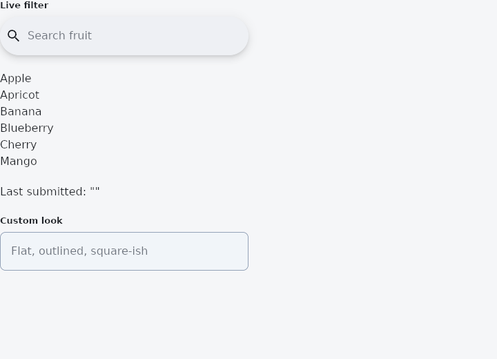
From frus-examples/widgets/src/features/inputs/widgets/search_bar.rs:
//! `SearchBar` — the raised pill an application searches from: a borderless field with
//! room for a leading and trailing widget.

use frus::{
    Align, Color, Column, Icon, IconButton, Icons, SearchBar, State, StateContext, StatefulWidget,
    Text, Widget,
};

use crate::common::shared::{section, sections};

pub fn example() -> Box<dyn Widget> {
    Box::new(SearchBarDemo.into_widget())
}

const FRUITS: [&str; 6] = ["Apple", "Apricot", "Banana", "Blueberry", "Cherry", "Mango"];

struct SearchBarDemo;

#[derive(Default)]
struct SearchBarDemoState {
    query: String,
    searched: String,
    other: String,
}

impl StatefulWidget for SearchBarDemo {
    type State = SearchBarDemoState;

    fn create_state(&self) -> SearchBarDemoState {
        SearchBarDemoState::default()
    }
}

impl State for SearchBarDemoState {
    type Widget = SearchBarDemo;

    fn build(&self, cx: &StateContext<Self>) -> Box<dyn Widget> {
        let mut bar = SearchBar::new(&self.query)
            .hint("Search fruit")
            .leading(Icon::new(Icons::SEARCH))
            .on_input(cx.handler(|s: &mut SearchBarDemoState, t: String| s.query = t))
            // Enter confirms the search.
            .on_submit(cx.callback(|s: &mut SearchBarDemoState| s.searched = s.query.clone()))
            .max_width(320.0);
        // A clear button, only when there is something to clear.
        if !self.query.is_empty() {
            bar = bar.trailing(
                IconButton::new(Icons::CLOSE)
                    .label("Clear")
                    .on_press(cx.callback(|s: &mut SearchBarDemoState| s.query.clear())),
            );
        }

        // The results are filtered live from the query.
        let needle = self.query.to_lowercase();
        let results = FRUITS
            .iter()
            .filter(|fruit| fruit.to_lowercase().contains(&needle))
            .fold(
                Column::new()
                    .cross_axis_alignment(Align::Start)
                    .spacing(4.0),
                |column, fruit| column.child(Text::new(*fruit)),
            );

        sections(vec![
            Box::new(section("Live filter", bar)),
            Box::new(results),
            Box::new(Text::new(format!("Last submitted: \"{}\"", self.searched))),
            // Fill, outline, corners and elevation are all overridable.
            Box::new(section(
                "Custom look",
                SearchBar::new(&self.other)
                    .hint("Flat, outlined, square-ish")
                    .elevation(0.0)
                    .background_color(Color::hex("#F1F5F9"))
                    .side(1.0, Color::hex("#94A3B8"))
                    .radius(8.0)
                    .max_width(320.0)
                    .on_input(cx.handler(|s: &mut SearchBarDemoState, t: String| s.other = t)),
            )),
        ])
    }
}
Properties
| Method | Argument | Effect |
|---|---|---|
.controller() | controller: &crate::TextEditingController | Drives the bar from controller: it shows the controller's text, and what is typed in it is written to the controller. |
.hint() | hint: impl Into<String> | — |
.leading() | leading: impl Widget<Msg> + 'static | The widget before the field — usually a menu button, a back arrow or a magnifier. |
.leading_boxed() | leading: Box<dyn Widget<Msg>> | Self::leading, for a widget already boxed. |
.trailing() | trailing: impl Widget<Msg> + 'static | Adds a widget after the field. |
.trailing_boxed() | trailing: Box<dyn Widget<Msg>> | Self::trailing, for a widget already boxed. |
.on_input() | on_input: impl Fn(String) -> R + 'static | What to emit on every keystroke. |
.on_submit() | message: impl Into<Msg> | What to emit when the search is confirmed. |
.on_tap() | message: impl Into<Msg> | It goes with Self::read_only. |
.enabled() | enabled: bool | Whether the bar can be used at all. A disabled one is inert and fades. |
.read_only() | read_only: bool | The bar takes no typing, only presses — a bar whose real search happens somewhere else. It is not disabled: it still lights, still answers a press, and still reads as available, because it is. |
.background_color() | color: Color | The bar's fill. |
.shadow_color() | color: Color | The colour its shadow is cast in, used as it is given, alpha included — so Color::TRANSPARENT casts none. Unset, the scheme's shadow at 30 %. |
.elevation() | elevation: f32 | How far off the page it sits. Unset, 6 — and 0.0 is the flat bar an application that separates by colour wants. |
.shape() | shape: ShapeBorder | Its shape. |
.radius() | radius: impl Into<BorderRadius> | Its corners, for the ordinary case of a rounded rectangle. See Self::shape. |
.side() | width: f32, color: Color | An outline around it. |
.padding() | padding: Insets | The room inside it. Unset, 8 either side. |
.min_width() | width: f32 | The narrowest it will go. Unset, SEARCH_BAR_MIN_WIDTH. |
.max_width() | width: f32 | The widest. Unset, SEARCH_BAR_MAX_WIDTH. |
.height() | height: f32 | Its height. Unset, SEARCH_BAR_HEIGHT. |
.text_style() | style: TextStyle | The value's type. |
.hint_style() | style: TextStyle | The hint's type. |
Behaviour
A raised pill holding a search field, with a slot before it and any number after.
See also
- Form, Rule & ErrorSummary: validation as a plain function of the state, shown on the fields and in a summary.
- Autocomplete: a text field that suggests completions in a floating list.
- SearchAnchor: a search bar that opens a search view with suggestions.
- Checkbox: a yes/no choice with an optional label, and a three-state version.
- RadioGroup & Radio: one choice out of a few, all visible at once.
- The guide: Taking input
- API reference:
SearchBar
Source: crates/frus-widgets/src/searchbar.rs @ e6fba33f5b42