Switch
Purpose
An on/off toggle that takes effect at once.
Signature
pub struct Switch<Msg = crate::callback::Callback> { .. }

impl Switch {
    pub fn new(on: bool) -> Self;
}
Example
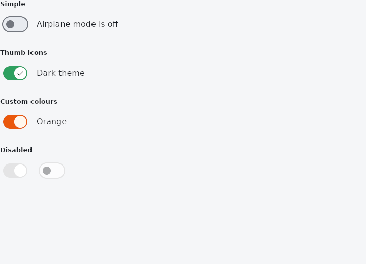
From frus-examples/widgets/src/features/inputs/widgets/switch.rs:
//! `Switch` — an on/off toggle that takes effect at once (a setting), as opposed to a
//! checkbox, which is usually confirmed later (a form).

use frus::{Align, Color, Icons, Row, State, StateContext, StatefulWidget, Switch, Text, Widget};

use crate::common::shared::{section, sections};

pub fn example() -> Box<dyn Widget> {
    Box::new(SwitchDemo.into_widget())
}

struct SwitchDemo;

struct SwitchDemoState {
    airplane: bool,
    dark: bool,
    custom: bool,
}

impl StatefulWidget for SwitchDemo {
    type State = SwitchDemoState;

    fn create_state(&self) -> SwitchDemoState {
        SwitchDemoState {
            airplane: false,
            dark: true,
            custom: true,
        }
    }
}

/// A switch with its label, the way a settings row shows one.
fn labelled(label: &str, switch: Switch) -> Row {
    Row::new()
        .spacing(12.0)
        .cross_axis_alignment(Align::Center)
        .child(switch)
        .child(Text::new(label))
}

impl State for SwitchDemoState {
    type Widget = SwitchDemo;

    fn build(&self, cx: &StateContext<Self>) -> Box<dyn Widget> {
        sections(vec![
            // `on_toggle` reports the new value.
            Box::new(section(
                "Simple",
                labelled(
                    if self.airplane {
                        "Airplane mode is on"
                    } else {
                        "Airplane mode is off"
                    },
                    Switch::new(self.airplane)
                        .on_toggle(cx.handler(|s: &mut SwitchDemoState, on: bool| s.airplane = on)),
                ),
            )),
            // An icon in the thumb makes the state readable without colour.
            Box::new(section(
                "Thumb icons",
                labelled(
                    "Dark theme",
                    Switch::new(self.dark)
                        .thumb_icon(Icons::CHECK)
                        .inactive_thumb_icon(Icons::CLOSE)
                        .on_toggle(cx.handler(|s: &mut SwitchDemoState, on: bool| s.dark = on)),
                ),
            )),
            Box::new(section(
                "Custom colours",
                labelled(
                    "Orange",
                    Switch::new(self.custom)
                        .track_color(Color::hex("#EA580C"))
                        .thumb_color(Color::hex("#FFF7ED"))
                        .inactive_track_color(Color::hex("#FED7AA"))
                        .on_toggle(cx.handler(|s: &mut SwitchDemoState, on: bool| s.custom = on)),
                ),
            )),
            Box::new(section(
                "Disabled",
                Row::new()
                    .spacing(12.0)
                    .child(Switch::new(true).enabled(false))
                    .child(Switch::new(false).enabled(false)),
            )),
        ])
    }
}
Properties
| Method | Argument | Effect |
|---|---|---|
.tap_target() | target: TapTarget | How much room it reserves for a finger (TapTarget). Unset, the theme's answer, which is Padded — at least 48 pixels either way, whatever this control paints inside it. |
.track_color() | color: Color | The track's colour when the switch is on, in every state; the theme's primary otherwise. |
.inactive_track_color() | color: Color | — |
.thumb_icon() | icon: IconData | — |
.inactive_thumb_icon() | icon: IconData | The same while the switch is off — a cross beside the tick. |
.thumb_color() | color: Color | — |
.inactive_thumb_color() | color: Color | — |
.thumb_colors() | colors: WidgetStateProperty<Color> | — |
.track_colors() | colors: WidgetStateProperty<Color> | See Self::thumb_colors. |
.track_outline_color() | colors: WidgetStateProperty<Color> | Unset, outline round an off track, none round an on one, and the disabled container colour round a disabled off one. |
.track_outline_width() | width: f32 | How wide that rule is. Unset, the theme's, then 2 pixels. |
.overlay_color() | colors: WidgetStateProperty<Color> | Unset, the theme's, then primary round an on switch and on_surface round an off one, at 8 % under a pointer and 10 % focused or pressed. |
.splash_radius() | radius: f32 | The halo's radius. Unset, the theme's, then 20. |
.padding() | padding: Insets | Unset, the theme's, then 4 pixels left and right — which is what lets the halo spill past the track. |
.on_toggle() | on_toggle: impl Fn(bool) -> R + 'static | A closure producing a message from the new state. |
.enabled() | enabled: bool | Whether the switch can be flipped. Disabled it is inert — no message, out of the tab order, announced as unavailable — and it still shows which way it is set. |
Behaviour
An on/off switch.
See also
- Checkbox: a yes/no choice with an optional label, and a three-state version.
- RadioGroup & Radio: one choice out of a few, all visible at once.
- CheckboxListTile, RadioListTile & SwitchListTile: list rows whose whole width works one control, for settings screens.
- Slider: a value picked by dragging along a track, continuous or in steps.
- RangeSlider: two thumbs on one track, for picking an interval.
- The guide: Taking input
- API reference:
Switch
Source: crates/frus-widgets/src/switch.rs @ e6fba33f5b42