TextField
Purpose
A text input: labels, hints, errors, icons, passwords, several lines and filters.
Signature
pub struct TextField<Msg = crate::callback::Callback> { .. }

impl TextField {
    pub fn new(value: impl Into<String>) -> Self;
}
Example
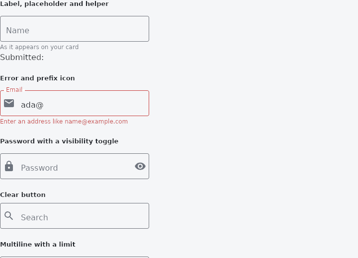
From frus-examples/widgets/src/features/inputs/widgets/text_field.rs:
//! `TextField` — a text input. It is **controlled**: the application holds the text, the
//! field shows it and reports every change through `on_input`.
use frus::{
Align, Color, Column, Icons, KeyboardType, State, StateContext, StatefulWidget, Text,
TextAlign, TextField, TextFieldStyle, TextInputAction, Widget,
};
use crate::common::shared::{section, sections};
pub fn example() -> Box<dyn Widget> {
Box::new(TextFieldDemo.into_widget())
}
/// Wide enough to read, narrow enough for a phone.
const WIDTH: f32 = 300.0;
struct TextFieldDemo;
#[derive(Default)]
struct TextFieldDemoState {
name: String,
email: String,
password: String,
show_password: bool,
search: String,
notes: String,
amount: String,
phone: String,
code: String,
plain: String,
styled: String,
submitted: String,
}
impl StatefulWidget for TextFieldDemo {
type State = TextFieldDemoState;
fn create_state(&self) -> TextFieldDemoState {
TextFieldDemoState {
email: "ada@".into(),
..Default::default()
}
}
}
impl State for TextFieldDemoState {
type Widget = TextFieldDemo;
fn build(&self, cx: &StateContext<Self>) -> Box<dyn Widget> {
// The error is computed from the state on every build: the field only shows it.
let email_error = (!self.email.is_empty() && !self.email.contains('.'))
let mut email = TextField::new(&self.email)
.label("Email")
.keyboard_type(KeyboardType::Email)
.prefix_icon(Icons::EMAIL)
.width(WIDTH)
.on_input(cx.handler(|s: &mut TextFieldDemoState, t: String| s.email = t));
if let Some(message) = email_error {
email = email.error(message);
}
sections(vec![
// Label above the value, placeholder while empty, helper text below.
// `on_submit` fires on Enter.
Box::new(section(
"Label, placeholder and helper",
Column::new()
.cross_axis_alignment(Align::Start)
.spacing(4.0)
.child(
TextField::new(&self.name)
.label("Name")
.placeholder("Ada Lovelace")
.helper("As it appears on your card")
.width(WIDTH)
.action(TextInputAction::Done)
.on_input(
cx.handler(|s: &mut TextFieldDemoState, t: String| s.name = t),
)
.on_submit(cx.callback(|s: &mut TextFieldDemoState| {
s.submitted = s.name.clone()
})),
)
.child(Text::new(format!("Submitted: {}", self.submitted))),
)),
// An error replaces the helper and turns the field red.
Box::new(section("Error and prefix icon", email)),
// `obscure` masks the value; a clickable suffix icon toggles it.
Box::new(section(
"Password with a visibility toggle",
TextField::new(&self.password)
.label("Password")
.obscure(!self.show_password)
.prefix_icon(Icons::LOCK)
.suffix_icon(if self.show_password {
Icons::VISIBILITY_OFF
} else {
Icons::VISIBILITY
})
.on_suffix(
cx.callback(|s: &mut TextFieldDemoState| {
s.show_password = !s.show_password
}),
)
.width(WIDTH)
.on_input(cx.handler(|s: &mut TextFieldDemoState, t: String| s.password = t)),
)),
// A clear button: the suffix only shows once there is something to clear.
Box::new(section("Clear button", {
let field = TextField::new(&self.search)
.placeholder("Search")
.prefix_icon(Icons::SEARCH)
.width(WIDTH)
.on_input(cx.handler(|s: &mut TextFieldDemoState, t: String| s.search = t));
if self.search.is_empty() {
field
} else {
field
.suffix_icon(Icons::CLOSE)
.on_suffix(cx.callback(|s: &mut TextFieldDemoState| s.search.clear()))
}
})),
// Several lines, and a character limit with its counter.
Box::new(section(
"Multiline with a limit",
TextField::new(&self.notes)
.label("Notes")
.rows(4)
.max_length(200)
.width(WIDTH)
.on_input(cx.handler(|s: &mut TextFieldDemoState, t: String| s.notes = t)),
)),
// The keyboard type picks the phone's keyboard; `digits_only` and
// `input_filter` decide what may be typed at all.
Box::new(section(
"Keyboard types and input filters",
Column::new()
.cross_axis_alignment(Align::Start)
.spacing(12.0)
.child(
TextField::new(&self.amount)
.label("Amount")
.keyboard_type(KeyboardType::Decimal)
.text_align(TextAlign::Right)
.width(WIDTH)
.on_input(
cx.handler(|s: &mut TextFieldDemoState, t: String| s.amount = t),
),
)
.child(
TextField::new(&self.phone)
.label("Phone")
.keyboard_type(KeyboardType::Phone)
.digits_only()
.width(WIDTH)
.on_input(
cx.handler(|s: &mut TextFieldDemoState, t: String| s.phone = t),
),
)
.child(
TextField::new(&self.code)
.label("Code (upper case)")
.input_filter(|c| {
c.is_ascii_alphanumeric().then(|| c.to_ascii_uppercase())
})
.max_length(6)
.width(WIDTH)
.on_input(
cx.handler(|s: &mut TextFieldDemoState, t: String| s.code = t),
),
),
)),
// Outlined (the default), filled, or borderless — the last one for a field
// inside something that is already a container.
Box::new(section(
"Variants, disabled and read-only",
Column::new()
.cross_axis_alignment(Align::Start)
.spacing(12.0)
.child(
TextField::new(&self.plain)
.label("Filled")
.filled()
.width(WIDTH)
.on_input(
cx.handler(|s: &mut TextFieldDemoState, t: String| s.plain = t),
),
)
.child(
TextField::new(&self.plain)
.placeholder("Borderless")
.borderless()
.width(WIDTH)
.on_input(
cx.handler(|s: &mut TextFieldDemoState, t: String| s.plain = t),
),
)
.child(
TextField::new("Cannot edit")
.label("Disabled")
.enabled(false)
.width(WIDTH),
)
.child(
TextField::new("Select me, but no typing")
.label("Read-only")
.read_only()
.width(WIDTH),
),
)),
// `TextFieldStyle` overrides any colour or measurement; unset ones come from
// the theme.
Box::new(section(
"Custom style",
TextField::new(&self.styled)
.label("Styled")
.style(TextFieldStyle {
fill: Some(Color::hex("#FEF3C7")),
border_color: Some(Color::hex("#F59E0B")),
focused_border_color: Some(Color::hex("#B45309")),
label_color: Some(Color::hex("#92400E")),
focused_label_color: Some(Color::hex("#B45309")),
text_color: Some(Color::hex("#451A03")),
radius: Some(16.0),
..Default::default()
})
.width(WIDTH)
.on_input(cx.handler(|s: &mut TextFieldDemoState, t: String| s.styled = t)),
)),
])
}
}
Properties
| Method | Argument | Effect |
|---|---|---|
.controller() | controller: &crate::TextEditingController | Drives the field from controller: it shows the controller's text, and what is typed in it is written to the controller. |
.outlined() | — | Outlined: a box the caller can see all the way round, the floating label notching its top border. The default. |
.borderless() | — | Filled: a tinted container with a single line under it, the label floating inside the box rather than on its edge. For a field inside something that is already a container. See TextFieldVariant::None. |
.filled() | — | The filled variant: a tinted container with a single line under it, the label floating inside. See TextFieldVariant::Filled. |
.variant() | variant: TextFieldVariant | Chooses the variant directly, for a caller holding one in a variable. |
.enabled() | enabled: bool | Greys the field out and makes it inert. |
.style() | style: TextFieldStyle | Overrides part of the styling for this field alone. Anything left None falls to the theme's TextFieldTheme, then to the framework's defaults. |
.dense() | dense: bool | The shape, the label and the border are unchanged — only the room around the content. |
.autofill() | hints: impl IntoIterator<Item = AutofillHint> | What the field is for — a username, a new password, a one-time code, a postal code — so that the platform's autofill service can fill it, and save it once the form is submitted. See AutofillHint. |
.multiline() | — | Switches the field to multi-line: Enter inserts a line break (instead of submitting), and the box shows rows lines (see rows). |
.rows() | rows: u16 | Number of visible lines in multi-line mode (at least 1). Implies multiline. |
.min_lines() | lines: u16 | Implies multiline; with a max_lines, the box grows from these to those as the value wraps. |
.max_lines() | lines: impl Into<Option<u16>> | None grows without a limit. |
.obscure() | obscure: bool | Masks the value (a password field): every character becomes a dot. Editing stays normal; only the display is masked. |
.obscuring_character() | character: char | A dot unless told. |
.cursor_color() | color: Color | The caret's colour (milestone 659). Unset, the theme's, then the scheme's primary. |
.cursor_error_color() | color: Color | The caret's colour while an error is showing. Unset, the error colour. |
.cursor_width() | width: f32 | — |
.cursor_height() | height: f32 | The caret's height, centred on the line; the line's own unless told. |
.cursor_radius() | radius: f32 | The radius of the caret's corners. |
.show_cursor() | show: bool | A field that hides it still takes keys and selections. |
.autofocus() | autofocus: bool | Where the focus came from is given back when it goes (milestone 605). |
.text_align() | align: TextAlign | Where the text sits inside the field: an amount to the right, a code centred. |
.keyboard_type() | keyboard: KeyboardType | Which keys the software keyboard should offer — a phone keypad, an email address, a number. |
.action() | action: TextInputAction | What the keyboard's action key does, and what it says — Next in a form, Search over a query, Send on a message. |
.prefix_icon() | icon: IconData | Decorative icon on the left inside the field. |
.suffix_icon() | icon: IconData | Decorative icon on the right inside the field. |
.icon() | icon: IconData | It is 24 pixels (18 dense) with 16 before the box, in the icon colour. |
.prefix_text() | text: impl Into<String> | Its room is kept whether it shows or not, and it shows while the label is floated: once the field is focused or holds something, at once if the label always floats. |
.suffix_text() | text: impl Into<String> | Shown as prefix_text is. |
.floating_label_behavior() | behavior: FloatingLabelBehavior | When the label floats above the value. Unset, the theme's, then FloatingLabelBehavior::Auto. |
.floating_label_alignment() | alignment: FloatingLabelAlignment | Where the floated label sits along the field's top. Unset, the theme's, then FloatingLabelAlignment::Start. |
.counter_text() | text: impl Into<String> | An empty text hides the counter, limit or not. |
.on_suffix() | message: impl Into<Msg> | Makes the suffix icon clickable: a click on it emits message (a clear button, a reveal-password button…) instead of placing the caret. Implies a suffix icon (to be set through suffix_icon). |
.on_tap_outside() | message: impl Into<Msg> | — |
.label() | label: impl Into<String> | Label displayed above the field. |
.placeholder() | placeholder: impl Into<String> | Hint displayed inside the field while it is empty — and, for a field with no label, the name a screen reader gives it. |
.helper() | helper: impl Into<String> | Helper text below the field (replaced by the error, if present). |
.error() | message: impl Into<String> | Marks the field in error: red border and label, message displayed below the field. Chain it only when the application's validation fails. |
.width() | width: f32 | Sets the width, in logical pixels. |
.size() | size: f32 | Sets the font size, in pixels. |
.max_length() | max: usize | The most characters the field will hold. |
.input_filter() | filter: impl Fn(char) -> Option<char> + 'static | What each typed character becomes before it reaches the value: None drops it, Some(c) puts c in instead of what was typed. |
.digits_only() | — | Digits, and nothing else. |
.capitalization() | capitalization: Capitalization | Which letters the software keyboard capitalises by itself. |
.read_only() | — | A field whose value can be read, selected and copied — but not changed. |
.selection_toolbar() | build: impl Fn(&ToolbarContext, Vec<ToolbarItem<Msg>>) -> Vec<ToolbarItem<Msg>> + 'static | What the bar over a selection offers — Cut, Copy, Paste, Select all — decided by the application (milestone 568, [#23]). |
.on_input() | on_input: impl Fn(String) -> R + 'static | Closure producing a message from the field's new value. |
.on_submit() | message: impl Into<Msg> | Message emitted on submission (the Enter key), without changing the value. |
.announce() | message: impl Into<String> | Text to speak through the screen reader's live region when Self::on_submit fires — the field's own counterpart to a button's Widget::announce, which only ever fires on a click or a plain Enter and so never sees a field's submit (#18). Compute it from the value the caller already has — TextField::new(draft).announce(format!("{draft} added")) — since by the time this fires, the widget it is read from is the one built before the keystroke, still holding what is about to be cleared. |
Behaviour
A single-line text input field, with optional form decoration (label, hint, helper text, error). Validity stays decided by the application (a pure function of the state); the field only displays its result through error.
error: TextField::error
See also
- TextEditingController: a field's text held outside the field, to read, fill and clear it from code.
- Form, Rule & ErrorSummary: validation as a plain function of the state, shown on the fields and in a summary.
- Autocomplete: a text field that suggests completions in a floating list.
- The guide: Taking input
- API reference:
TextField
Source: crates/frus-widgets/src/textinput.rs @ e6fba33f5b42