Center and Aligned
Purpose
Places one child somewhere inside the room it is given.
Signature
pub struct Center<Msg = crate::callback::Callback> { .. }

impl Center {
    pub fn new(child: impl Widget<Msg> + 'static) -> Self;
}
pub struct Aligned<Msg = crate::callback::Callback> { .. }

impl Aligned {
    pub fn new(alignment: impl Into<AlignmentGeometry>, child: impl Widget<Msg> + 'static) -> Self;
}
Example
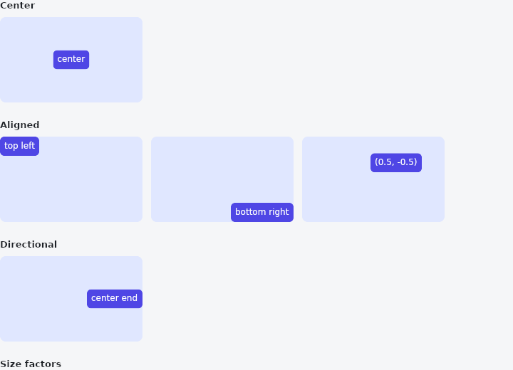
From frus-examples/widgets/src/features/layout/widgets/align.rs:
//! `Center` and `Aligned` — place one child somewhere inside the room it is given.

use frus::{
    Aligned, Alignment, AlignmentDirectional, Center, Color, Container, Text, Widget, Wrap,
};

use crate::common::shared::{section, sections};

pub fn example() -> Box<dyn Widget> {
    sections(vec![
        // `Center` takes all the room it is offered and puts its child in the middle.
        Box::new(section("Center", frame(Center::new(dot("center"))))),
        // `Aligned` does the same at any of the nine named spots — or anywhere between
        // them: `Alignment::new(x, y)` runs from -1 (left/top) to 1 (right/bottom).
        Box::new(section(
            "Aligned",
            Wrap::new()
                .gap(12.0)
                .run_gap(12.0)
                .child(frame(Aligned::new(Alignment::TOP_LEFT, dot("top left"))))
                .child(frame(Aligned::new(
                    Alignment::BOTTOM_RIGHT,
                    dot("bottom right"),
                )))
                .child(frame(Aligned::new(
                    Alignment::new(0.5, -0.5),
                    dot("(0.5, -0.5)"),
                ))),
        )),
        // Directional alignment says "start" and "end": the child moves to the right in a
        // right-to-left language without any change to the code.
        Box::new(section(
            "Directional",
            frame(Aligned::new(
                AlignmentDirectional::CENTER_END,
                dot("center end"),
            )),
        )),
        // A size factor makes the box a multiple of its child instead of taking the whole
        // room: here twice as wide and three times as tall as the label.
        Box::new(section(
            "Size factors",
            Container::new().color(Color::hex("#E0E7FF")).child(
                Center::new(dot("2× wide, 3× tall"))
                    .width_factor(2.0)
                    .height_factor(3.0),
            ),
        )),
    ])
}

/// A fixed box, so you can see where inside it the child ends up.
fn frame(child: impl Widget + 'static) -> Container {
    Container::new()
        .width(200.0)
        .height(120.0)
        .radius(8.0)
        .color(Color::hex("#E0E7FF"))
        .child(child)
}

fn dot(text: &str) -> Container {
    Container::new()
        .padding(6.0)
        .radius(6.0)
        .color(Color::hex("#4F46E5"))
        .child(Text::new(text).size(12.0).color(Color::hex("#FFFFFF")))
}
Properties
| Type | Method | Argument | Effect |
|---|---|---|---|
Center | .width_factor() | factor: f32 | The box is factor times as wide as its child. See Aligned::width_factor. |
Center | .height_factor() | factor: f32 | The box is factor times as tall as its child. See Aligned::height_factor. |
Aligned | .width_factor() | factor: f32 | The box is factor times as wide as its child, rather than as wide as the room. |
Aligned | .height_factor() | factor: f32 | The box is factor times as tall as its child, rather than as tall as the room. |
Behaviour
Center
Centres its child in the room it is given — an Aligned at Alignment::CENTER, and the same room.
use frus_widgets::{Center, Text};

let _empty: Center<()> = Center::new(Text::new("Nothing here yet"));
Aligned
Places its child at alignment in the room it is given, at the child's own size.
The box takes all the room on offer, and the child sits at the anchor inside it: centred, in a corner, against an edge, or at any fraction between. The anchor can be Alignment or AlignmentDirectional, which mirrors in a right-to-left script.
use frus_core::Alignment;
use frus_widgets::{Aligned, Text};

let _signature: Aligned<()> = Aligned::new(Alignment::BOTTOM_RIGHT, Text::new("— the team"));
How much room it takes. All of what its parent hands down: a whole page, a whole card, the whole cell of a grid. The exception is along a row's or a column's own direction when the line holds other children. The line is shared there, so the box is only as long as its child, and the child is centred across the line only. Wrap it in Expanded to give it the rest of the line.
A size of its own. Aligned::width_factor and Aligned::height_factor make the box a multiple of its child on that axis instead: 2.0 is twice as tall as the child, with the child at the anchor inside; 0.5 is half as tall, and the child spills past the box, which does not cut it. On an axis with no factor, the box still takes the room.
To animate a change of anchor, use AnimatedAlign.
(Named for what it does to its child, as Positioned and Expanded are: Align is the cross-axis alignment of a row or a column.)
See also
- Container: one box that sizes, pads, colours, rounds, borders and shadows its child.
- Padding: empty space around a child, on every side or each side on its own.
- Row & Column: children in a line, across or down, with alignment on both axes and spacing.
- Flex: the flexbox line under Row and Column: shrink-wraps, stretches, wraps, reverses.
- Expanded, Flexible & Spacer: share the free room of a row or a column between some of its children.
- The guide: Laying out a screen
- API reference:
Center - API reference:
Aligned
Source: crates/frus-widgets/src/align.rs, crates/frus-widgets/src/align.rs @ e6fba33f5b42