FittedBox
Purpose
Scales its child to fit its box, following a BoxFit rule.
Signature
pub struct FittedBox<Msg = crate::callback::Callback> { .. }

impl FittedBox {
    pub fn new(fit: BoxFit) -> Self;
}
Example
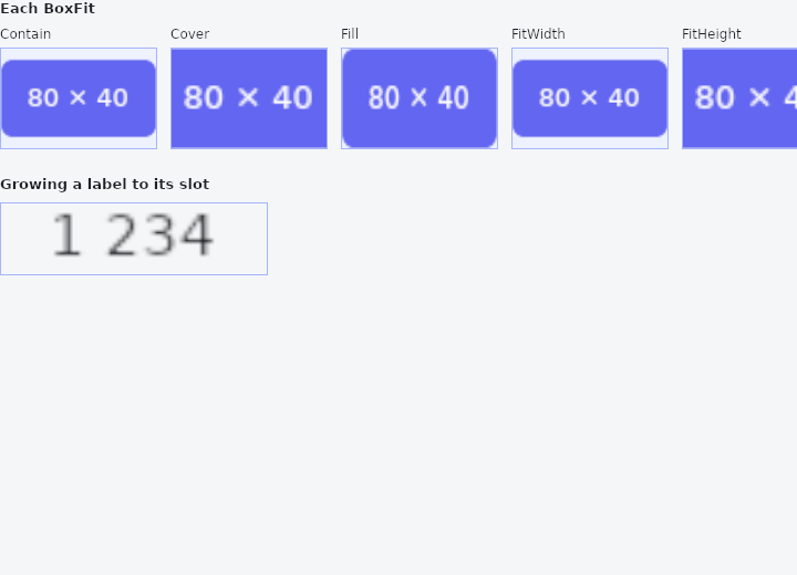
From frus-examples/widgets/src/features/layout/widgets/fitted_box.rs:
//! `FittedBox` — scales its child to fit its box, following a `BoxFit` rule.
//!
//! Unlike `Transform::scale`, the scale is worked out from the layout: put the same
//! child in a bigger box and it grows with it.

use frus::{Align, Alignment, BoxFit, Color, Column, Container, FittedBox, Text, Widget, Wrap};

use crate::common::shared::{section, sections};

pub fn example() -> Box<dyn Widget> {
    sections(vec![
        // The same 80 × 40 badge in a 140 × 90 box under each rule. `Contain` shows all
        // of it, `Cover` fills the box and crops, `Fill` stretches it out of shape,
        // `ScaleDown` only ever shrinks, `None` leaves it at its own size.
        Box::new(section(
            "Each BoxFit",
            Wrap::new()
                .gap(12.0)
                .run_gap(12.0)
                .child(fitted("Contain", BoxFit::Contain))
                .child(fitted("Cover", BoxFit::Cover))
                .child(fitted("Fill", BoxFit::Fill))
                .child(fitted("FitWidth", BoxFit::FitWidth))
                .child(fitted("FitHeight", BoxFit::FitHeight))
                .child(fitted("ScaleDown", BoxFit::ScaleDown))
                .child(fitted("None", BoxFit::None)),
        )),
        // The everyday use: a label scaled to fill a slot whatever its own size — a big
        // figure on a dashboard tile.
        Box::new(section(
            "Growing a label to its slot",
            Container::new().border(1.0, Color::hex("#A5B4FC")).child(
                FittedBox::new(BoxFit::Contain)
                    .width(240.0)
                    .height(64.0)
                    .child(Text::new("1 234").size(14.0)),
            ),
        )),
    ])
}

fn fitted(name: &str, fit: BoxFit) -> Column {
    Column::new()
        .cross_axis_alignment(Align::Start)
        .spacing(4.0)
        .child(Text::new(name).size(12.0))
        .child(
            Container::new()
                .color(Color::hex("#EEF2FF"))
                .border(1.0, Color::hex("#A5B4FC"))
                .clip()
                .child(FittedBox::new(fit).width(140.0).height(90.0).child(badge())),
        )
}

fn badge() -> Container {
    Container::new()
        .width(80.0)
        .height(40.0)
        .radius(6.0)
        .color(Color::hex("#6366F1"))
        .alignment(Alignment::CENTER)
        .child(Text::new("80 × 40").size(13.0).color(Color::hex("#FFFFFF")))
}
Properties
| Method | Argument | Effect |
|---|---|---|
.width() | width: f32 | Fixed box width, in logical pixels. |
.height() | height: f32 | Fixed box height, in logical pixels. |
.flex() | grow: f32 | Flex growth factor along the parent's main axis. |
.child() | child: impl Widget<Msg> + 'static | Sets the fitted child. |
Behaviour
Scales its child to fit its own box according to a BoxFit (like CSS object-fit), then centres it. The child is measured at its natural size; the scale factor follows from that — hence the effect on layout (unlike Transform, where the scale is set by hand).
Ideal for making intrinsically sized content (text, an icon, a drawing) fill or fit a given frame with no manual arithmetic. The box needs a size (as crate::SingleChildScrollView does): a fixed width/height, or flex.
FittedBox::new(BoxFit::Contain).width(120.0).height(40.0).child(Text::new("Big"))
See also
- UnconstrainedBox & OverflowBox: let a child be a size its parent did not offer.
- AspectRatio: a box whose height follows from its width.
- FractionallySizedBox: a box sized as a fraction of the room its parent offers.
- Wrap & ListBody: a row that flows onto new lines when it runs out of room.
- Stack & Positioned: children layered in the same box, pinned to its edges or aligned in it.
- The guide: Laying out a screen
- API reference:
FittedBox
Source: crates/frus-widgets/src/fittedbox.rs @ e6fba33f5b42