TwoPane and responsive
Purpose
A list and its detail side by side when wide, one at a time when narrow.
Signature
pub struct TwoPane<Msg = crate::callback::Callback> { .. }

impl TwoPane {
    pub fn new(class: SizeClass) -> Self;
}
pub fn responsive<Msg>(width: f32) -> Responsive<Msg>
Example
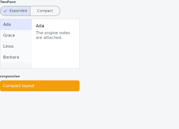
From frus-examples/widgets/src/features/layout/widgets/two_pane.rs:
//! `TwoPane` and `responsive` — adapt a screen to its size class: a list and its detail
//! side by side on a wide window, one at a time on a phone.
//!
//! The size class (`Compact` under 600 px, `Medium` up to 840, `Expanded` above) is a
//! plain value: take it from the window, or, as here, from the room a `LayoutBuilder`
//! reports — or from a switch, to show both arrangements on one screen.

use frus::{
    component, responsive, Align, Button, Color, Column, Container, Expanded, LayoutBuilder,
    OverflowBox, SegmentedButton, SizeClass, SizedBox, Text, TwoPane, Variant, Widget,
};

use crate::common::shared::{section, sections};

const MAILS: [(&str, &str); 4] = [
    ("Ada", "The engine notes are attached."),
    ("Grace", "Can we move the review to Monday?"),
    ("Linus", "Patch v3 is on the list."),
    ("Barbara", "Slides for Thursday's talk."),
];

pub fn example() -> Box<dyn Widget> {
    sections(vec![
        // Switch the size class: `Expanded` shows both panes, anything smaller shows the
        // list, or the detail once an item is opened (`show_detail`), with a way back.
        Box::new(section("TwoPane", mail())),
        // `responsive(width)` picks the variant for the width's size class, falling back
        // to the nearest one given. Resize the window to change it.
        Box::new(section(
            "responsive",
            LayoutBuilder::new(|size| {
                responsive(size.width)
                    .compact(badge("Compact layout", "#F59E0B"))
                    .medium(badge("Medium layout", "#6366F1"))
                    .expanded(badge("Expanded layout", "#10B981"))
            }),
        )),
    ])
}

fn mail() -> impl Widget {
    component(|cx| {
        let wide = cx.use_state(|| true);
        let open = cx.use_state(|| 0_usize);
        let showing_detail = cx.use_state(|| false);

        let class = if wide.get() {
            SizeClass::Expanded
        } else {
            SizeClass::Compact
        };

        // The list: tapping an item opens it.
        let list = MAILS.iter().enumerate().fold(
            Column::new().cross_axis_alignment(Align::Stretch),
            |list, (i, (from, _))| {
                let (open, showing_detail) = (open.clone(), showing_detail.clone());
                let selected = i == open.get();
                list.child(
                    Container::new()
                        .padding(12.0)
                        .color(if selected {
                            Color::hex("#E0E7FF")
                        } else {
                            Color::hex("#F8FAFC")
                        })
                        .on_click(move || {
                            open.set(i);
                            showing_detail.set(true);
                        })
                        .child(Text::new(*from).color(Color::hex("#0F172A"))),
                )
            },
        );

        let (from, body) = MAILS[open.get()];
        let back = showing_detail.clone();
        let detail = Container::new()
            .padding(16.0)
            .color(Color::hex("#FFFFFF"))
            .child(
                Column::new()
                    .spacing(8.0)
                    .cross_axis_alignment(Align::Start)
                    .child(Text::new(from).size(18.0).color(Color::hex("#0F172A")))
                    .child(Text::new(body).color(Color::hex("#334155")).wrap())
                    // Only the single-pane arrangement needs a way back to the list.
                    .child(if wide.get() {
                        Box::new(SizedBox::empty()) as Box<dyn Widget>
                    } else {
                        Box::new(
                            Button::new("Back to the list")
                                .variant(Variant::Text)
                                .on_press(move || back.set(false)),
                        )
                    }),
            );

        let on_select = move |segment: usize| wide.set(segment == 0);
        Box::new(
            Column::new()
                .spacing(12.0)
                .cross_axis_alignment(Align::Start)
                .child(
                    SegmentedButton::new(usize::from(class != SizeClass::Expanded), on_select)
                        .segment("Expanded")
                        .segment("Compact"),
                )
                // A two-pane shell fills the room it is given; in a scrolling page that
                // room has to be bounded.
                .child(
                    SizedBox::new(
                        Container::new().border(1.0, Color::hex("#CBD5E1")).child(
                            TwoPane::new(class)
                                .ratio(0.4)
                                .show_detail(showing_detail.get())
                                .list(pane(list))
                                .detail(pane(detail)),
                        ),
                    )
                    .width(320.0)
                    .height(200.0),
                ),
        )
    })
}

/// A pane's content, asking for no width of its own.
///
/// `TwoPane` lets each pane start from its content's natural width before it shares out
/// the room by `ratio`, so a long unwrapped line in the detail would push both panes
/// past the frame. `OverflowBox` takes no size from its child, and `Expanded` then grows
/// it to the whole pane, so the ratio alone decides the widths and the text wraps
/// inside them.
fn pane(content: impl Widget + 'static) -> Expanded {
    Expanded::new(OverflowBox::new(content))
}

fn badge(label: &str, color: &str) -> Container {
    Container::new()
        .padding(12.0)
        .radius(8.0)
        .color(Color::hex(color))
        .child(Text::new(label).color(Color::hex("#FFFFFF")))
}
Properties
| Type | Method | Argument | Effect |
|---|---|---|---|
TwoPane | .ratio() | ratio: f32 | Fraction of the width given to the list in side-by-side mode (0.1..=0.9). Set this before detail. |
TwoPane | .show_detail() | show: bool | In single-pane mode, shows the detail rather than the list (the app sets this to true when it navigates to an item). |
TwoPane | .list() | list: impl Widget<Msg> + 'static | Sets the list (the master pane). Call before detail. |
TwoPane | .detail() | detail: impl Widget<Msg> + 'static | Sets the detail and finalises the layout (call this last). |
Behaviour
TwoPane
An adaptive master-detail layout.
responsive
A responsive selector for a given width, in logical px.
responsive(w).compact(a).medium(b).expanded(c) — see Responsive.
See also
- CustomMultiChildLayout: children measured and placed by a function you write.
- OverflowBar: a row of buttons that becomes a column when they stop fitting.
- Placeholder: a crossed box standing in for a widget not written yet.
- The guide: Laying out a screen
- API reference:
TwoPane - API reference:
responsive
Source: crates/frus-widgets/src/twopane.rs, crates/frus-widgets/src/responsive.rs @ e6fba33f5b42