AppBar
Purpose
The bar at the top of a screen: leading button, title, actions and a bottom.
Signature
pub struct AppBar<Msg = crate::callback::Callback> { .. }

impl AppBar {
    pub fn new() -> Self;
}
Example
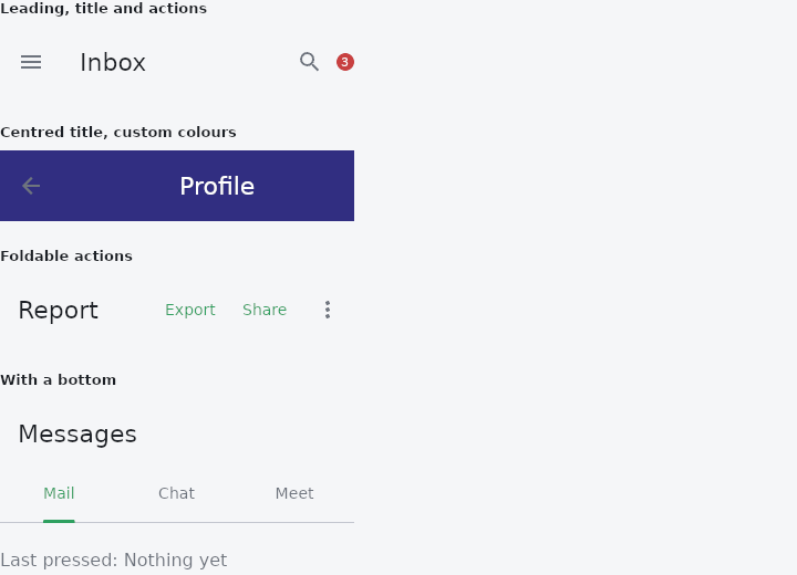
From frus-examples/widgets/src/features/navigation/widgets/appbar.rs:
//! `AppBar` — the bar at the top of a screen: a leading button, a title, actions, and
//! optionally a widget under it (tabs, a search field). Actions can fold into an
//! overflow menu when the bar runs out of width.

use frus::{
    AppBar, Badge, Color, Colors, Column, Container, IconButton, Icons, TabBar, Text, Widget,
};

use crate::common::shared::{section, sections};

pub fn example() -> Box<dyn Widget> {
    Box::new(frus::component(|cx| {
        let last = cx.use_state(|| "Nothing yet".to_string());
        let overflow_open = cx.use_state(|| false);
        let tab = cx.use_state(|| 0usize);

        // Every handler here records what was pressed, so the demo shows it.
        let said = |what: &'static str| {
            let last = last.clone();
            move || last.set(what.to_string())
        };

        // `primary(false)` because these bars sit inside a page: a primary bar is the one
        // at the very top of the screen, and makes room for the status bar on a phone.
        let standard = AppBar::new()
            .primary(false)
            .leading(
                IconButton::new(Icons::MENU)
                    .label("Menu")
                    .on_press(said("Menu")),
            )
            .title(Text::new("Inbox"))
            .action(
                IconButton::new(Icons::SEARCH)
                    .label("Search")
                    .on_press(said("Search")),
            )
            .action(Badge::new("3"))
            .build();

        // A centred title, and custom colours and depth.
        let centred = AppBar::new()
            .primary(false)
            .center_title(true)
            .background(Color::hex("#312E81"))
            .foreground(Colors::WHITE)
            .elevation(4.0)
            .leading(
                IconButton::new(Icons::ARROW_BACK)
                    .label("Back")
                    .on_press(said("Back")),
            )
            .title(Text::new("Profile"))
            .build();

        // Foldable actions are text buttons shown inline while they fit, and moved into
        // the `⋯` menu when the bar is too narrow. The menu's open state is the app's.
        let toggle = overflow_open.clone();
        let close_after = |what: &'static str| {
            let last = last.clone();
            let open = overflow_open.clone();
            frus::Callback::new(move || {
                last.set(what.to_string());
                open.set(false);
            })
        };
        let folding = AppBar::new()
            .primary(false)
            // The folding budget is the bar's width; a bar outside a full-width
            // screen says how wide it is.
            .width(320.0)
            .title(Text::new("Report"))
            .overflow(
                overflow_open.get(),
                frus::Callback::new(move || toggle.update(|o| *o = !*o)),
            )
            .foldable_action("Export", close_after("Export"))
            .foldable_action("Share", close_after("Share"))
            .foldable_action("Print", close_after("Print"))
            .foldable_action("Archive", close_after("Archive"))
            .build();

        // `bottom` puts a widget under the bar, inside its background — usually tabs.
        let pick = tab.clone();
        let tabs = TabBar::new(tab.get(), move |i: usize| {
            let pick = pick.clone();
            frus::Callback::new(move || pick.set(i))
        })
        .tab("Mail", Column::new())
        .tab("Chat", Column::new())
        .tab("Meet", Column::new());
        let with_bottom = AppBar::new()
            .primary(false)
            .title(Text::new("Messages"))
            .bottom(tabs)
            .build();

        sections(vec![
            Box::new(section("Leading, title and actions", framed(standard))),
            Box::new(section("Centred title, custom colours", framed(centred))),
            Box::new(section("Foldable actions", framed(folding))),
            Box::new(section("With a bottom", framed(with_bottom))),
            Box::new(Text::new(format!("Last pressed: {}", last.get())).color(cx.theme().muted)),
        ])
    }))
}

/// A bar is as wide as its screen; here the "screen" is a 320-pixel frame.
fn framed(bar: Box<dyn Widget>) -> Container {
    Container::new().width(320.0).child(bar)
}
Properties
| Method | Argument | Effect |
|---|---|---|
.width() | width: f32 | The available width for the bar, in logical pixels: what drives the folding. It is a size, not a platform indicator. |
.title_style() | style: TextStyle | The text title's style (size/weight/italic/color). |
.title() | widget: impl Widget<Msg> + 'static | The title, as any widget — a text, a logo, a composed row. |
.leading() | widget: impl Widget<Msg> + 'static | The leading element (a menu or back button…), optional. |
.automatically_imply_leading() | imply: bool | Whether a bar with no leading of its own may take one from the shell it stands in. |
.automatically_imply_actions() | imply: bool | Whether a bar with no actions of its own may take one from the shell it stands in. |
.overflow() | open: bool, toggle: Msg | Enables the overflow menu: its open state (controlled by the app) and the toggle message (emitted by the ⋯ button and on an outside click). |
.action() | widget: impl Widget<Msg> + 'static | Adds an action: any widget, at the bar's trailing end, after those already added. Typically an IconButton, or a PopupMenuButton for a menu of its own. |
.actions() | actions: impl IntoIterator<Item = Box<dyn Widget<Msg>>> | The same as AppBar::action for each, in order. |
.foldable_action() | label: impl Into<String>, message: Msg | Adds an action that folds: a text button with label, shown inline while it fits and moved into the overflow menu (AppBar::overflow) when the bar is too narrow for it. The last ones fold first. |
.action_widget() | widget: impl Widget<Msg> + 'static | Adds a widget action: AppBar::action, under its former name. |
.action_size() | size: f32 | The foldable actions' font size (the theme's label_large by default). |
.primary() | primary: bool | Whether this bar sits at the top of the screen, and so has to keep its content out of the status bar. |
.gap() | gap: f32 | The space between the bar's elements (8 px by default). |
.background() | color: Color | The bar's background color (transparent by default: the parent decides). |
.height() | height: f32 | An imposed bar height (by default, the content's natural height). |
.center_title() | centered: bool | Centres the title in the space left between the leading and the actions, rather than starting it flush after the leading. |
.bottom() | widget: impl Widget<Msg> + 'static | A widget under the bar, spanning its width — a row of tabs, a search field, a progress bar. It belongs to the bar, so it sits inside the background. |
.leading_width() | width: f32 | The width reserved for the leading slot. Unset, it is the Material slot width; a leading wider than that would otherwise push the title without the folding budget knowing, and the actions would run off the edge. |
.title_spacing() | spacing: f32 | The gap between the leading and the title. |
.foreground() | color: Color | The colour of the bar's own text — the title, and the labelled actions. Unset, each follows the theme. |
.elevation() | elevation: f32 | How far off the page the bar sits. 0 — the default — is flat, which is what a bar sitting on a surface of the same colour wants. |
.shape() | shape: ShapeBorder | — |
.radius() | radius: impl Into<BorderRadius> | The corner radii — the shorthand for a rounded rectangle, writing into the same one field shape does. The last of the two called is the one that counts. |
.shadow_color() | color: Color | The colour of the shadow the bar casts. Only visible with an elevation. |
.surface_tint() | color: Color | — |
.force_material_transparency() | force: bool | Draws the bar with no surface at all: no background, no tint, no shadow — only what it holds. |
.toolbar_opacity() | opacity: f32 | The opacity of the toolbar row — the leading, the title and the actions — without touching the bar's surface. 1.0 by default. |
.bottom_opacity() | opacity: f32 | The opacity of the bottom slot, independently of the toolbar. 1.0 by default. |
.actions_padding() | padding: f32 | Padding across the actions as a group, at its two ends, on top of the gap between them. |
.exclude_header_semantics() | exclude: bool | Stops the title being announced as a heading. |
.flexible_space() | widget: impl Widget<Msg> + 'static | A widget stacked behind the toolbar and the bottom, filling the bar's whole box. |
.icon_theme() | icons: IconTheme | — |
.actions_icon_theme() | icons: IconTheme | — |
.toolbar_text_style() | style: TextStyle | The type worn by the words in the bar that are not the title — a label beside the back arrow, a "Save" in the actions, anything a caller handed over already assembled. |
Behaviour
An adaptive application bar. A fluent builder finished by AppBar::build.
See also
- Scaffold: the shell of a screen: app bar, body, navigation, drawer, FAB and footer slots.
- TabBar: tabs and the panel of the selected one: primary, secondary, icons, scrolling, swiping.
- BottomBar: the main destinations along the bottom of a phone screen.
- The guide: Screens, navigation and dialogs
- API reference:
AppBar
Source: crates/frus-widgets/src/appbar.rs @ e6fba33f5b42