CollapsingHeader
Purpose
A tall header that shrinks to a toolbar as the page under it scrolls.
Signature
pub struct CollapsingHeader<Msg = crate::callback::Callback> { .. }

impl CollapsingHeader {
    pub fn new<W: Widget<Msg> + 'static>(
        body: impl Widget<Msg> + 'static,
        build: impl Fn(HeaderState) -> W + 'static,
    ) -> Self;
}
Example
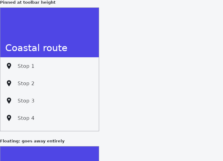
From frus-examples/widgets/src/features/navigation/widgets/collapsingheader.rs:
//! `CollapsingHeader` — a tall header at the top of a scrolling page that shrinks to a
//! toolbar as the page scrolls, then stays pinned (or goes entirely).

use frus::{
    Align, CollapsingHeader, Color, Colors, Container, HeaderState, Icon, Icons, ListTile,
    ListView, Text, Widget,
};

use crate::common::shared::{section, sections};

/// How tall the header is before anything scrolls.
const EXPANDED: f32 = 160.0;
/// The frame the page sits in.
const FRAME_HEIGHT: f32 = 400.0;

pub fn example() -> Box<dyn Widget> {
    sections(vec![
        Box::new(section("Pinned at toolbar height", framed(page(false)))),
        Box::new(section("Floating: goes away entirely", framed(page(true)))),
    ])
}

/// A list under a collapsing header.
fn page(floating: bool) -> Box<dyn Widget> {
    // The list's own top padding **is** the header's room: it scrolls away with the
    // content, and the header shrinks by exactly as much.
    let list = ListView::new(30, 56.0, |i| {
        ListTile::new()
            .leading(Icon::new(Icons::PLACE))
            .title(format!("Stop {}", i + 1))
    })
    .padding_each(EXPANDED, 0.0, 0.0, 0.0)
    // The frame's height less its 1 px border, top and bottom.
    .height(FRAME_HEIGHT - 2.0);

    // The builder runs every frame the header moves, with `fraction` going from 0
    // (expanded) to 1 (collapsed). Interpolate on it rather than on pixels, so the
    // header survives a change of either height.
    let header = CollapsingHeader::new(list, header);
    let header = if floating { header.floating() } else { header };
    Box::new(header.build())
}

fn header(state: HeaderState) -> Container {
    let title_size = 30.0 - 10.0 * state.fraction;
    // The header states its width: the band runs across the page.
    Container::new()
        .width(state.width)
        .height(state.height)
        .color(Color::hex("#4F46E5"))
        .padding_each(0.0, 16.0, 12.0, 16.0)
        .child(
            frus::Column::new()
                .main_axis_alignment(frus::Justify::End)
                .cross_axis_alignment(Align::Start)
                .child(
                    Text::new("Coastal route")
                        .size(title_size)
                        .color(Colors::WHITE),
                ),
        )
}

/// The page sits in a 320 × 400 frame, as it would fill a phone's screen.
fn framed(page: Box<dyn Widget>) -> Container {
    Container::new()
        .width(320.0)
        .height(FRAME_HEIGHT)
        .border(1.0, Color::hex("#A1A1AA"))
        .clip()
        .child(page)
}
Properties
| Method | Argument | Effect |
|---|---|---|
.expanded_height() | height: f32 | The height when nothing has scrolled, overriding the body's top padding. |
.collapsed_height() | height: f32 | The height it stops shrinking at. Ignored by CollapsingHeader::floating. |
.floating() | — | Goes entirely instead of stopping at a toolbar, leaving the whole window to the content — a reading view, where the chrome is worth its room only while somebody is choosing what to read. |
Behaviour
A header over a scroll region, interpolated between two heights by the region's offset.
See also
- BottomAppBar: a bar of actions along the bottom, notched for a docked action button.
- NavigationBar: a simple screen header: a centred title and a back button.
- Steps: the numbered step indicator of a wizard or multi-step form.
- Pagination: a page picker: previous, page numbers, next.
- TabPageSelector: dots that say which of several pages you are on.
- The guide: Screens, navigation and dialogs
- API reference:
CollapsingHeader
Source: crates/frus-widgets/src/collapsingheader.rs @ e6fba33f5b42