Drawer
Purpose
A side panel that slides over the page or sits docked beside it.
Signature
pub struct Drawer<Msg = crate::callback::Callback> { .. }

impl Drawer {
    pub fn new(open: bool) -> Self;
}
Example
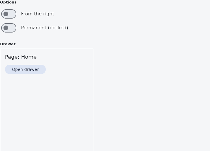
From frus-examples/widgets/src/features/navigation/widgets/drawer.rs:
//! `Drawer` — a side panel that slides over the page (modal) or sits docked beside it
//! (permanent). `DrawerHeader` and `UserAccountsDrawerHeader` are the blocks that go at
//! its top.
use frus::{
Align, Button, CircleAvatar, Color, Colors, Column, Container, Drawer, DrawerHeader, Icon,
Icons, ListTile, State, StateContext, StatefulWidget, Switch, Text, UserAccountsDrawerHeader,
Variant, Widget,
};
use crate::common::shared::{section, sections};
pub fn example() -> Box<dyn Widget> {
Box::new(DrawerDemo.into_widget())
}
struct DrawerDemo;
#[derive(Default)]
struct DrawerDemoState {
open: bool,
from_right: bool,
permanent: bool,
accounts_open: bool,
last: String,
}
impl StatefulWidget for DrawerDemo {
type State = DrawerDemoState;
fn create_state(&self) -> DrawerDemoState {
DrawerDemoState {
last: "Home".to_string(),
..DrawerDemoState::default()
}
}
}
impl State for DrawerDemoState {
type Widget = DrawerDemo;
fn build(&self, cx: &StateContext<Self>) -> Box<dyn Widget> {
let theme = cx.theme();
// An entry that records where it led, and closes a modal drawer.
let entry = |icon, label: &'static str| {
ListTile::new()
.leading(Icon::new(icon))
.title(label)
.selected(self.last == label)
.on_tap(cx.callback(move |s: &mut Self| {
s.last = label.to_string();
s.open = false;
}))
};
// The block at the top of a panel for an account: a picture, a name, an address,
// and an arrow that opens an account switcher (its state is the app's).
let header = UserAccountsDrawerHeader::new()
.account_name("Ada Lovelace")
.current_picture(CircleAvatar::initials("Ada Lovelace"))
.other_picture(CircleAvatar::initials("Charles Babbage"))
.open(self.accounts_open)
.on_details_pressed(cx.callback(|s: &mut Self| s.accounts_open = !s.accounts_open));
let panel = Column::new()
.cross_axis_alignment(Align::Stretch)
.child(header)
.child(entry(Icons::HOME, "Home"))
.child(entry(Icons::BOOKMARK, "Saved"))
.child(entry(Icons::SETTINGS, "Settings"));
let body = Container::new().padding(16.0).child(
Column::new()
.spacing(12.0)
.cross_axis_alignment(Align::Start)
.child(Text::new(format!("Page: {}", self.last)).size(18.0))
.child(
Button::new("Open drawer")
.variant(Variant::Tonal)
.enabled(!self.permanent)
.on_press(cx.callback(|s: &mut Self| s.open = true)),
),
);
// Modal (the default): the panel slides over the body with a scrim, and a tap on
// the scrim sends `on_dismiss`. Permanent: docked beside the body, always shown.
let mut drawer = Drawer::new(self.open)
.width(240.0)
.on_dismiss(cx.callback(|s: &mut Self| s.open = false))
.permanent(self.permanent);
if self.from_right {
drawer = drawer.right();
}
let drawer = drawer.panel(panel).body(body);
// A plain header: a block of fixed height with a rule under it, holding anything.
let plain_header = Container::new().width(240.0).child(
DrawerHeader::new()
.background_color(theme.primary)
.height(120.0)
.child(Text::new("My App").size(22.0).color(Colors::WHITE)),
);
sections(vec![
Box::new(section(
"Options",
Column::new()
.cross_axis_alignment(Align::Start)
.child(option(
"From the right",
self.from_right,
cx.handler(|s: &mut Self, on: bool| s.from_right = on),
))
.child(option(
"Permanent (docked)",
self.permanent,
cx.handler(|s: &mut Self, on: bool| s.permanent = on),
)),
)),
Box::new(section(
"Drawer",
Container::new()
.width(320.0)
.height(420.0)
.border(1.0, Color::hex("#A1A1AA"))
.clip()
.child(drawer),
)),
Box::new(section("DrawerHeader", plain_header)),
])
}
}
/// A labelled switch.
fn option(label: &str, on: bool, toggle: impl Fn(bool) -> frus::Callback + 'static) -> frus::Row {
frus::Row::new()
.spacing(12.0)
.main_axis_size(frus::MainAxisSize::Min)
.child(Switch::new(on).on_toggle(toggle))
.child(Text::new(label))
}
Properties
| Method | Argument | Effect |
|---|---|---|
.width() | width: f32 | Overrides the panel's width, in logical pixels. Defaults to DRAWER_WIDTH. |
.background_color() | color: Color | The panel's fill. Defaults to the theme's drawer.background_color, then to the theme's surface. |
.border_color() | color: Color | The hairline on the panel's inner edge — the one facing the content. |
.border_width() | width: f32 | That hairline's thickness. 0.0 removes it, which is what a drawer told apart from its body by colour or by a shadow wants. |
.radius() | radius: f32 | The rounding of the inner edge's two corners; the outer edge stays square against the window. Defaults to DRAWER_RADIUS, and 0.0 squares it off. |
.shape() | shape: ShapeBorder | — |
.elevation() | elevation: f32 | How far off the surface the panel sits. 0.0 — the default — casts no shadow, and neither does a height without a shadow_color. |
.shadow_color() | color: Color | The colour of the shadow an elevated panel casts, alpha included. |
.scrim_color() | color: Color | The scrim behind a modal panel, alpha included — a scrim's transparency is the colour, so an opaque value here hides the body entirely and Color::TRANSPARENT darkens nothing at all. |
.on_dismiss() | message: impl Into<Msg> | Message emitted on a click on the scrim (outside the panel) — to close it. |
.right() | — | Docks the drawer to the right edge (left by default). |
.permanent() | permanent: bool | Makes the drawer permanent (docked in the flow, no scrim) when permanent is true — typically at the Expanded breakpoint. |
.panel() | content: impl Widget<Msg> + 'static | Sets the drawer's content, usually the navigation. |
.body() | body: impl Widget<Msg> + 'static | Sets the background body: the content that stays visible behind a modal panel, or beside a docked one. |
Behaviour
A retractable side drawer: a background body + a panel, modal or docked.
See also
- NavigationRail: the main destinations down the side of a tablet or desktop window.
- NavScaffold: navigation that becomes a bar, a rail or an extended rail with the size class.
- NavigationDrawer: a side panel's list of destinations, with a header, badges and a footer.
- BottomAppBar: a bar of actions along the bottom, notched for a docked action button.
- NavigationBar: a simple screen header: a centred title and a back button.
- The guide: Screens, navigation and dialogs
- API reference:
Drawer
Source: crates/frus-widgets/src/drawer.rs @ e6fba33f5b42