ExpansionPanelList
Purpose
Panels drawn as one surface that splits apart as one opens.
Signature
pub struct ExpansionPanelList<Msg = crate::callback::Callback> { .. }

impl ExpansionPanelList {
    pub fn new<R1: crate::callback::IntoMsg<Msg>>(
        open: &[usize],
        on_toggle: impl Fn(usize, bool) -> R1 + 'static,
    ) -> Self;
    pub fn radio<R1: crate::callback::IntoMsg<Msg>>(
        open: Option<usize>,
        on_open: impl Fn(Option<usize>) -> R1 + 'static,
    ) -> Self;
}
Example
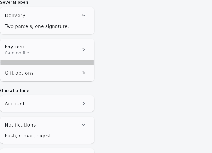
From frus-examples/widgets/src/features/scrolling/widgets/expansionpanel.rs:
//! `ExpansionPanelList` — a column of panels drawn as one surface that splits apart as a
//! panel opens: a settings screen, an FAQ, the steps of a checkout.

use frus::{Callback, Container, ExpansionPanel, ExpansionPanelList, Text, Widget};

use crate::common::shared::{section, sections};

pub fn example() -> Box<dyn Widget> {
    Box::new(frus::component(|cx| {
        let open = cx.use_state(|| vec![0usize]);
        let radio = cx.use_state(|| Some(1usize));

        // `new`: any number open. The message says which panel and whether it is now
        // open; the app keeps the set.
        let toggle = open.clone();
        let free = ExpansionPanelList::new(&open.get(), move |index: usize, now_open: bool| {
            let toggle = toggle.clone();
            Callback::new(move || {
                toggle.update(|set| {
                    set.retain(|&i| i != index);
                    if now_open {
                        set.push(index);
                    }
                })
            })
        })
        .panel(ExpansionPanel::new(
            "Delivery",
            Text::new("Two parcels, one signature."),
        ))
        .panel(
            ExpansionPanel::new("Payment", Text::new("Visa ending 4242.")).subtitle("Card on file"),
        )
        .panel(ExpansionPanel::new(
            "Gift options",
            Text::new("Wrapping and a note."),
        ));

        // `radio`: at most one open. Its message carries the resulting state — `Some(i)`
        // or `None` — so the app just stores it.
        let set = radio.clone();
        let exclusive = ExpansionPanelList::radio(radio.get(), move |state: Option<usize>| {
            let set = set.clone();
            Callback::new(move || set.set(state))
        })
        .panel(ExpansionPanel::new(
            "Account",
            Text::new("Name, e-mail, password."),
        ))
        .panel(ExpansionPanel::new(
            "Notifications",
            Text::new("Push, e-mail, digest."),
        ))
        .panel(ExpansionPanel::new(
            "Privacy",
            Text::new("Who can see your activity."),
        ));

        sections(vec![
            Box::new(section(
                "Several open",
                Container::new().width(320.0).child(free),
            )),
            Box::new(section(
                "One at a time",
                Container::new().width(320.0).child(exclusive),
            )),
        ])
    }))
}
Properties
| Method | Argument | Effect |
|---|---|---|
.panel() | panel: ExpansionPanel<Msg> | Adds a panel, after the ones already there. |
.gap() | gap: f32 | The room an open panel is given either side of it — what makes it read as lifted out of the card rather than merely coloured differently. 16 by default. |
.radius() | radius: f32 | The corner radius of a card — the run's outer corners, and all four of an open panel's. |
.background() | color: Color | The surface the panels are drawn on. |
.divider_color() | color: Color | The hairline between two shut panels of the same card. |
.elevation() | elevation: f32 | How far the cards sit off the page: each run of shut panels, and each open panel, casts one shadow. 2 by default; 0.0 is flat. |
Behaviour
A column of ExpansionPanels drawn as one surface that splits as a panel opens.
A column of ExpansionTiles is already an accordion as far as the state goes. What it is not is one object: it is a stack of independent rows, and nothing about it says the shut ones belong together.
Two modes, and they say two different things because they want two different states: new is the free one (on_toggle(index, now_open), any number open), and radio is the exclusive one, whose message carries the resulting choice rather than the index pressed — so one at a time is a property of what the widget sends rather than a rule the application has to remember.
See also
- Dismissible: swipe a row aside to archive or delete it.
- ExpansionTile: a list row that opens to show more; several make an accordion.
- StickyHeader: section headers that stay at the top while their section is in view.
- ListWheel: a spinning cylinder of values to pick one from.
- Kanban: a board of columns and cards, with drag and drop between columns.
- The guide: Lists and grids
- API reference:
ExpansionPanelList
Source: crates/frus-widgets/src/expansionpanel.rs @ e6fba33f5b42