ExpansionTile
Purpose
A list row that opens to show more; several make an accordion.
Signature
pub struct ExpansionTile<Msg = crate::callback::Callback> { .. }

impl ExpansionTile {
    pub fn new(title: impl Into<String>, open: bool, on_toggle: Msg) -> Self;
}
Example
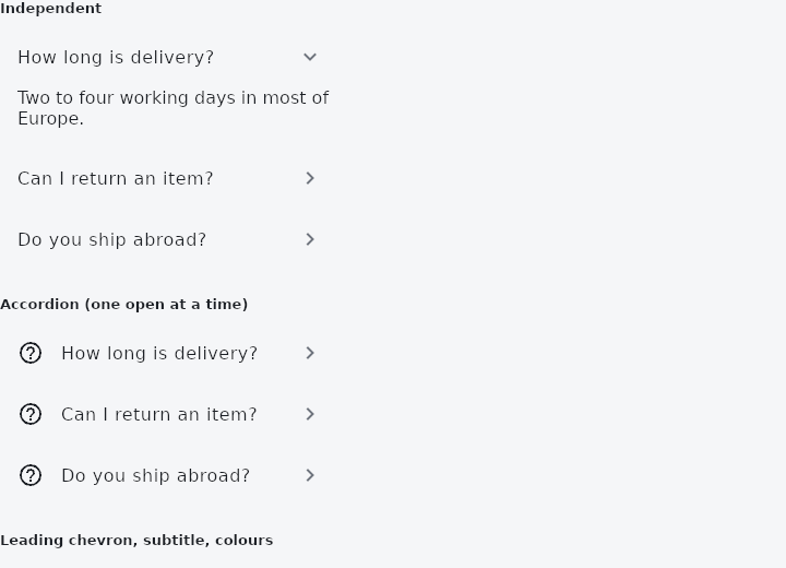
From frus-examples/widgets/src/features/scrolling/widgets/expansiontile.rs:
//! `ExpansionTile` — a list row that opens to show more underneath. It is controlled:
//! it shows the open state it is given and sends a message asking to change it, which
//! is what lets a column of them act as an accordion.

use frus::{Align, Callback, Color, Column, Container, ControlAffinity, Icon, Icons, Text, Widget};

use crate::common::shared::{section, sections};

const FAQ: [(&str, &str); 3] = [
    (
        "How long is delivery?",
        "Two to four working days in most of Europe.",
    ),
    (
        "Can I return an item?",
        "Yes, within thirty days, in its original packaging.",
    ),
    (
        "Do you ship abroad?",
        "We ship to forty countries; the fee is shown at checkout.",
    ),
];

pub fn example() -> Box<dyn Widget> {
    Box::new(frus::component(|cx| {
        let open = cx.use_state(|| [true, false, false]);
        let accordion = cx.use_state(|| None::<usize>);

        // Independent tiles: each keeps its own open flag.
        let independent = FAQ.iter().enumerate().fold(
            Column::new().cross_axis_alignment(Align::Stretch),
            |column, (i, (question, answer))| {
                let toggle = open.clone();
                column.child(
                    frus::ExpansionTile::new(
                        *question,
                        open.get()[i],
                        Callback::new(move || toggle.update(|o| o[i] = !o[i])),
                    )
                    .content(Text::new(*answer).wrap()),
                )
            },
        );

        // An accordion: the app keeps one index, so opening one closes the others.
        let exclusive = FAQ.iter().enumerate().fold(
            Column::new().cross_axis_alignment(Align::Stretch),
            |column, (i, (question, answer))| {
                let pick = accordion.clone();
                let is_open = accordion.get() == Some(i);
                column.child(
                    frus::ExpansionTile::new(
                        *question,
                        is_open,
                        Callback::new(move || pick.set(if is_open { None } else { Some(i) })),
                    )
                    .leading(Icon::new(Icons::HELP_OUTLINE))
                    .content(Text::new(*answer).wrap()),
                )
            },
        );

        // The chevron in front, a subtitle, and colours for the open state.
        let toggle = open.clone();
        let styled = frus::ExpansionTile::new(
            "Advanced settings",
            open.get()[1],
            Callback::new(move || toggle.update(|o| o[1] = !o[1])),
        )
        .subtitle("Proxy, cache, logs")
        .control_affinity(ControlAffinity::Leading)
        .background_color(Color::hex("#EEF2FF"))
        .radius(12.0)
        .content(Text::new(
            "Shares its open flag with the second question above.",
        ));

        sections(vec![
            Box::new(section(
                "Independent",
                Container::new().width(320.0).child(independent),
            )),
            Box::new(section(
                "Accordion (one open at a time)",
                Container::new().width(320.0).child(exclusive),
            )),
            Box::new(section(
                "Leading chevron, subtitle, colours",
                Container::new().width(320.0).child(styled),
            )),
        ])
    }))
}
Properties
| Method | Argument | Effect |
|---|---|---|
.title_child() | title: impl Widget<Msg> + 'static | The first line as a widget, for a header the tile would not have made — a name with a badge beside it, a row of chips. |
.title_child_boxed() | title: Box<dyn Widget<Msg>> | The same, taking an already boxed widget — what a list of panels has to hand. |
.content() | content: impl Widget<Msg> + 'static | The body, shown only while the tile is open. |
.subtitle() | subtitle: impl Into<String> | A second line under the title. |
.leading() | leading: impl Widget<Msg> + 'static | What goes in front of the title: an icon, an avatar, a checkbox. |
.trailing() | trailing: impl Widget<Msg> + 'static | A widget of your own at the end of the row, in place of the chevron: a badge, a count, a switch. It replaces the chevron rather than joining it. |
.show_trailing_icon() | show: bool | Hides the chevron altogether, for a tile whose open state is read from something else on the row. |
.control_affinity() | affinity: ControlAffinity | Which side the chevron sits on; the end of the row by default. |
.dense() | — | A dense tile: the same shape, less room around it. |
.tile_padding() | padding: Insets | The room inside the tile row itself. |
.children_padding() | padding: Insets | The room around the body, inside the tile's width. |
.background_color() | color: Color | The row's background while open. |
.collapsed_background_color() | color: Color | The row's background while shut. |
.text_color() | color: Color | The title's colour while open. |
.collapsed_text_color() | color: Color | The title's colour while shut. |
.icon_color() | color: Color | The chevron's colour while open. |
.collapsed_icon_color() | color: Color | The chevron's colour while shut. |
.shape() | shape: ShapeBorder | What shape the row is while the tile is open, over the theme's and the framework's. The row is a ListTile, which has taken a shape since milestone 457 — its surface and its ink, so a rounded tile does not splash square corners. |
.collapsed_shape() | shape: ShapeBorder | And while it is shut. |
.radius() | radius: impl Into<BorderRadius> | The shorthand for a rounded rectangle on both states, which is what an application usually means. |
Behaviour
A tile that opens to show more.
Controlled, like everything else here: it is told whether it is open and emits a message asking to change, rather than keeping the answer to itself. That is what lets a column of them behave as an accordion — the application decides only one is open — without the widget knowing anything about its siblings.
ExpansionTile::new("Delivery", true, Msg::Toggle)
    .subtitle("Arrives Thursday")
    .content(Text::new("Two parcels, one signature."));
See also
- ReorderableList: a list whose rows can be dragged into a new order.
- Dismissible: swipe a row aside to archive or delete it.
- ExpansionPanelList: panels drawn as one surface that splits apart as one opens.
- StickyHeader: section headers that stay at the top while their section is in view.
- ListWheel: a spinning cylinder of values to pick one from.
- The guide: Lists and grids
- API reference:
ExpansionTile
Source: crates/frus-widgets/src/collapsible.rs @ e6fba33f5b42