GridView
Purpose
Cells in equal columns: a fixed count, as many as fit, or virtualised.
Signature
pub struct GridView<Msg = crate::callback::Callback> { .. }

impl GridView {
    pub fn new(columns: usize) -> Self;
    pub fn extent<W: Widget<Msg> + 'static>(
        max_tile_width: f32,
        count: usize,
        build: impl Fn(usize) -> W + 'static,
    ) -> Self;
    pub fn builder<W: Widget<Msg> + 'static>(
        columns: usize,
        count: usize,
        build: impl Fn(usize) -> W + 'static,
    ) -> Self;
}
Example
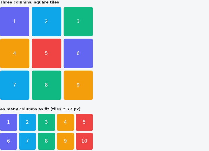
From frus-examples/widgets/src/features/scrolling/widgets/gridview.rs:
//! `GridView` — cells in equal columns, placed row by row: a fixed number of columns,
//! as many as fit a maximum width, or a virtualised grid that only builds the visible
//! rows.

use frus::{Center, Color, Colors, Container, GridView, Text, Widget};

use crate::common::shared::{section, sections};

pub fn example() -> Box<dyn Widget> {
    sections(vec![
        // A fixed number of columns. `aspect` makes every tile the same shape
        // (width / height); without it a row is as tall as its tallest cell.
        Box::new(section(
            "Three columns, square tiles",
            Container::new().width(320.0).child((0..9).fold(
                GridView::new(3).width(320.0).gap(8.0).aspect(1.0),
                |grid, i| grid.cell(tile(i)),
            )),
        )),
        // `extent` takes a maximum tile width and works out how many columns fit — more
        // on a wide window, fewer on a phone, with no breakpoints. Its cells are built
        // from their index once the width is known.
        Box::new(section(
            "As many columns as fit (tiles ≤ 72 px)",
            GridView::extent(72.0, 12, tile).gap(6.0).aspect(1.0),
        )),
        // `builder` virtualises: a thousand tiles, only the visible rows built. It
        // scrolls by itself, so it needs a height here.
        Box::new(section(
            "1 000 tiles, virtualised",
            GridView::builder(4, 1000, tile)
                .gap(4.0)
                .tile_height(56.0)
                .width(320.0)
                .height(240.0),
        )),
    ])
}

/// A numbered, coloured tile. A plain function of the index, which is what the grids
/// that build their cells late (`extent`, `builder`) need.
fn tile(i: usize) -> Container {
    const HUES: [&str; 5] = ["#6366F1", "#0EA5E9", "#10B981", "#F59E0B", "#EF4444"];
    Container::new()
        .radius(6.0)
        .color(Color::hex(HUES[i % HUES.len()]))
        .child(Center::new(
            Text::new(format!("{}", i + 1)).color(Colors::WHITE),
        ))
}
Properties
| Method | Argument | Effect |
|---|---|---|
.gap() | gap: f32 | Spacing between cells (rows and columns), in logical pixels. |
.row_gap() | gap: f32 | Spacing between rows only, in logical pixels. Overrides GridView::gap down the grid and leaves it alone across. |
.column_gap() | gap: f32 | Spacing between columns only, in logical pixels. Overrides GridView::gap across the grid and leaves it alone down. |
.aspect() | ratio: f32 | Gives every cell the same shape: a width / height ratio, so 1.0 is a square tile, 1.5 a landscape one and 0.75 a portrait one. |
.tile_height() | height: f32 | — |
.width() | width: f32 | Sets the width, in logical pixels. |
.height() | height: f32 | Sets the height, in logical pixels. |
.flex() | grow: f32 | Flex growth factor along the parent's main axis. |
.physics() | physics: crate::physics::ScrollPhysics | Overrides how the grid behaves at its edges and after a fling (milestone 655); see crate::scroll::SingleChildScrollView::physics. |
.primary() | primary: bool | A primary view is always scrollable unless physics says otherwise: a drag moves it, and bounces or glows at its edge, even when everything is in sight, so a page that fits still answers the finger as a page. |
.on_scroll() | on_scroll: impl Fn(crate::ScrollPosition) -> R + 'static | Says where this grid is whenever it moves. A gallery that fetches the next page when the end comes into view is what a grid wants it for; see crate::ScrollPosition::remaining_y, and GridView::notify_every for how often that question is worth asking. |
.notify_every() | px: f32 | Reports no more often than every px of movement — and always reports where it comes to rest, however short the last step was. |
.cell() | cell: impl Widget<Msg> + 'static | Adds a cell, placed automatically in the grid. |
Behaviour
A grid of columns equal columns.
See also
- SingleChildScrollView: makes one child scrollable: down, across or both ways.
- ListView: a virtualised list: only the visible rows are built.
- PageView: a scrollable that always comes to rest on a page.
- CarouselView: one slide at a time between arrows, controlled by the app.
- ReorderableList: a list whose rows can be dragged into a new order.
- The guide: Lists and grids
- API reference:
GridView
Source: crates/frus-widgets/src/grid.rs @ e6fba33f5b42