PageView
Purpose
A scrollable that always comes to rest on a page.
Signature
pub struct PageView<Msg = crate::callback::Callback> { .. }

impl PageView {
    pub fn new<W: Widget<Msg> + 'static>(
        count: usize,
        build: impl Fn(usize) -> W + 'static,
    ) -> Self;
}
Example
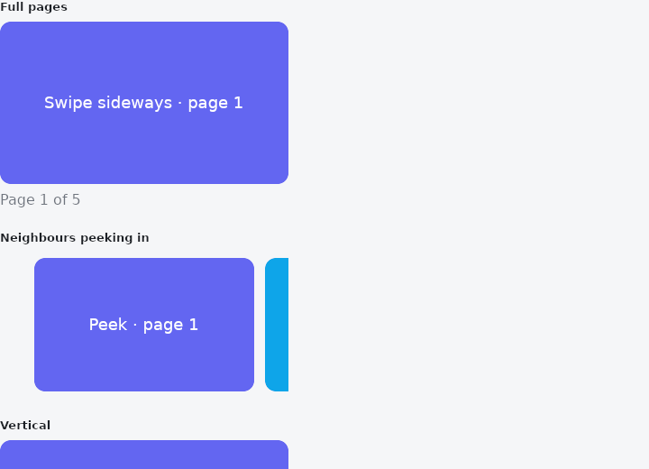
From frus-examples/widgets/src/features/scrolling/widgets/pageview.rs:
//! `PageView` — a scrollable that always comes to rest on a page: onboarding screens, a
//! photo gallery, swipeable panels. Pages are built on demand from their index.

use frus::{Align, Axis, Center, Color, Colors, Column, Container, PageView, Text, Widget};

use crate::common::shared::{section, sections};

const HUES: [&str; 5] = ["#6366F1", "#0EA5E9", "#10B981", "#F59E0B", "#EF4444"];

pub fn example() -> Box<dyn Widget> {
    Box::new(frus::component(|cx| {
        let page = cx.use_state(|| 0usize);

        // `on_page_changed` reports the page a reader would name as the finger moves,
        // so a caption follows the picture rather than trailing it.
        let follow = page.clone();
        let full = PageView::new(HUES.len(), |i| card(i, "Swipe sideways"))
            .height(180.0)
            .width(320.0)
            .on_page_changed(move |i: usize| follow.set(i));

        // `viewport_fraction` below 1 shows a sliver of the neighbours — a hint that
        // there is more to swipe to.
        let peek = PageView::new(HUES.len(), |i| {
            Container::new().padding(6.0).child(card(i, "Peek"))
        })
        .viewport_fraction(0.8)
        .height(160.0)
        .width(320.0);

        // Pages can run down instead of across.
        let vertical = PageView::new(HUES.len(), |i| card(i, "Swipe up"))
            .axis(Axis::Vertical)
            .height(160.0)
            .width(320.0);

        sections(vec![
            Box::new(section(
                "Full pages",
                Column::new()
                    .spacing(8.0)
                    .cross_axis_alignment(Align::Start)
                    .child(full)
                    .child(
                        Text::new(format!("Page {} of {}", page.get() + 1, HUES.len()))
                            .color(cx.theme().muted),
                    ),
            )),
            Box::new(section("Neighbours peeking in", peek)),
            Box::new(section("Vertical", vertical)),
        ])
    }))
}

/// One page: a plain widget made from its index.
fn card(i: usize, hint: &str) -> Container {
    Container::new()
        .radius(12.0)
        .color(Color::hex(HUES[i % HUES.len()]))
        .child(Center::new(
            Text::new(format!("{} · page {}", hint, i + 1))
                .size(18.0)
                .color(Colors::WHITE),
        ))
}
Properties
| Method | Argument | Effect |
|---|---|---|
.axis() | axis: Axis | Lays the pages out along axis. Only Axis::Horizontal and Axis::Vertical mean anything here: a page view pages one way. |
.viewport_fraction() | fraction: f32 | The fraction of the viewport one page occupies; 1.0 — the default — makes each page fill it. |
.pad_ends() | pad: bool | Whether there is room at both ends of the content, so that the first and last pages come to rest centred in the viewport. On by default, and nil at the default viewport_fraction of one, where a page already fills the viewport and there is nothing to centre. |
.page_snapping() | snapping: bool | Whether a release comes to rest on a page. On by default — it is what makes this a page view rather than a scroll. |
.reverse() | — | Pages from the far end: page 0 sits at the edge the axis finishes at — the right of a horizontal view, the bottom of a vertical one — page 1 before it, and the view opens there. |
.page() | page: usize | The page to show. |
.on_page_changed() | message: impl Fn(usize) -> R + 'static | The message sent when the page a reader would name changes — mid-drag, as soon as the rounding tips, not once the motion has settled. A title above a gallery should follow the picture, not trail it. |
.physics() | physics: ScrollPhysics | Overrides how the view behaves at its edges; see crate::SingleChildScrollView::physics. The fling is a page view's own business either way. |
.width() | width: f32 | Sets the viewport width, in logical pixels. |
.height() | height: f32 | Sets the viewport height, in logical pixels. |
.flex() | grow: f32 | Flex growth factor along the parent's main axis. |
Behaviour
A scrollable that rests only on page boundaries.
See also
- ListView: a virtualised list: only the visible rows are built.
- GridView: cells in equal columns: a fixed count, as many as fit, or virtualised.
- CarouselView: one slide at a time between arrows, controlled by the app.
- ReorderableList: a list whose rows can be dragged into a new order.
- Dismissible: swipe a row aside to archive or delete it.
- The guide: Lists and grids
- API reference:
PageView
Source: crates/frus-widgets/src/pageview.rs @ e6fba33f5b42