Responsive and LayoutBuilder and OrientationBuilder
Purpose
One interface, several layouts, by window or by box.
Signature
pub struct Responsive<Msg = crate::callback::Callback> { .. }

impl Responsive {
    pub fn new(class: SizeClass) -> Self;
}
pub struct LayoutBuilder<Msg = crate::callback::Callback> { .. }

impl LayoutBuilder {
    pub fn new<W: Widget<Msg> + 'static>(build: impl Fn(Size) -> W + 'static) -> Self;
}
pub struct OrientationBuilder;
Example
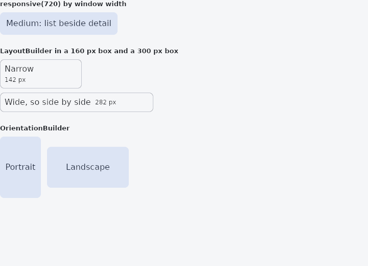
From frus-examples/widgets/src/features/state/widgets/responsive.rs:
//! `Responsive`, `LayoutBuilder` and `OrientationBuilder` — one interface, several
//! layouts.
//!
//! `responsive(width)` picks a subtree by size class (compact < 600 px, medium < 840 px,
//! expanded beyond), usually from the window's width. `LayoutBuilder` builds from the room
//! **this box** is given — a component that adapts wherever it is put, in a sidebar as
//! well as full screen. Resize the window to watch them switch.

use frus::{
    component, responsive, Align, Alignment, Column, Container, LayoutBuilder, MediaQuery,
    Orientation, OrientationBuilder, Row, Text, Widget,
};

use crate::common::shared::{section, sections};

pub fn example() -> Box<dyn Widget> {
    Box::new(component(|cx| {
        let scheme = &cx.theme().scheme;
        let (fill, on_fill) = (scheme.secondary_container, scheme.on_secondary_container);
        let outline = scheme.outline_variant;
        let panel = move |label: &str| {
            Container::new()
                .padding(12.0)
                .radius(8.0)
                .color(fill)
                .child(Text::new(label).color(on_fill))
        };

        // Variants per breakpoint; a missing one falls back to the nearest smaller one.
        let width = MediaQuery::of().size.width;
        let by_window = responsive(width)
            .compact(panel("Compact: one column"))
            .medium(panel("Medium: list beside detail"))
            .expanded(panel("Expanded: three panes"));

        // Built from the box's own width: the same widget, in two boxes of its own size.
        let adaptive = move || {
            LayoutBuilder::new(move |size| -> Box<dyn Widget> {
                if size.width < 220.0 {
                    Box::new(
                        Column::new()
                            .spacing(4.0)
                            .cross_axis_alignment(Align::Start)
                            .child(Text::new("Narrow"))
                            .child(Text::new(format!("{:.0} px", size.width)).size(12.0)),
                    )
                } else {
                    Box::new(
                        Row::new()
                            .spacing(8.0)
                            .child(Text::new("Wide, so side by side"))
                            .child(Text::new(format!("{:.0} px", size.width)).size(12.0)),
                    )
                }
            })
        };
        let frame = |width: f32, child: LayoutBuilder| {
            Container::new()
                .width(width)
                .padding(8.0)
                .radius(8.0)
                .border(1.0, outline)
                // `flex(1.0)` in a row: the builder takes the whole width on offer, so the
                // size it is handed is the room, not the size of what it built.
                .child(Row::new().child(child.flex(1.0)))
        };

        // Portrait or landscape, of this box rather than of the window.
        let shape = |width: f32, height: f32| {
            Container::new()
                .width(width)
                .height(height)
                .child(OrientationBuilder::new(move |orientation| {
                    Container::new()
                        .radius(8.0)
                        .color(fill)
                        .alignment(Alignment::CENTER)
                        .child(
                            Text::new(match orientation {
                                Orientation::Portrait => "Portrait",
                                Orientation::Landscape => "Landscape",
                            })
                            .color(on_fill),
                        )
                }))
        };

        sections(vec![
            Box::new(section(
                format!("responsive({width:.0}) by window width").as_str(),
                by_window,
            )),
            Box::new(section(
                "LayoutBuilder in a 160 px box and a 300 px box",
                Column::new()
                    .spacing(8.0)
                    .cross_axis_alignment(Align::Start)
                    .child(frame(160.0, adaptive()))
                    .child(frame(300.0, adaptive())),
            )),
            Box::new(section(
                "OrientationBuilder",
                Row::new()
                    .spacing(12.0)
                    .child(shape(80.0, 120.0))
                    .child(shape(160.0, 80.0)),
            )),
        ])
    }))
}
Properties
| Type | Method | Argument | Effect |
|---|---|---|---|
Responsive | .compact() | widget: impl Widget<Msg> + 'static | Variant for the Compact breakpoint (< 600 px). |
Responsive | .medium() | widget: impl Widget<Msg> + 'static | Variant for the Medium breakpoint (600–840 px). |
Responsive | .expanded() | widget: impl Widget<Msg> + 'static | Variant for the Expanded breakpoint (≥ 840 px). |
LayoutBuilder | .width() | width: f32 | Sets the width, in logical pixels. |
LayoutBuilder | .height() | height: f32 | Sets the height, in logical pixels. |
LayoutBuilder | .flex() | grow: f32 | Flex growth factor along the parent's main axis. |
Behaviour
Responsive
Selects a subtree from the size class, delegating to whichever is chosen.
LayoutBuilder
Builds its child from the available size (size → widget).
OrientationBuilder
The box, not the window: a panel beside a list on a wide window is portrait if it is taller than wide, whatever the window is. It takes all the room on offer, as an Aligned does, so that the box it decides on is that room and not the size of what it built; along a row's or a column's own direction, shared with other children, the room is only its content's. It is a LayoutBuilder, with what that says about state: the content is built on the fly from the box, and keeps none.
use frus_core::Orientation;
use frus_widgets::{column, row, text, OrientationBuilder};

let _gallery: frus_widgets::LayoutBuilder<()> = OrientationBuilder::new(|orientation| {
    match orientation {
        Orientation::Landscape => row![text("a"), text("b")],
        Orientation::Portrait => column![text("a"), text("b")],
    }
});
See also
- Themed & ThemeBuilder: a different theme, or part of one, for one part of the screen.
- MediaQuery & MediaScope: the screen's size, insets, text scale, brightness and size class.
- Locale & Localizations: the interface's language, and the words the framework says in it.
- The guide: Starting a frus application
- API reference:
Responsive - API reference:
LayoutBuilder - API reference:
OrientationBuilder
Source: crates/frus-widgets/src/responsive.rs, crates/frus-widgets/src/layoutbuilder.rs, crates/frus-widgets/src/listener.rs @ e6fba33f5b42