Text
Purpose
The app's type scale, from display_large to label_small, and headings.
Signature
pub struct Text { .. }

impl Text {
    pub fn new(content: impl Into<String>) -> Self;
    pub fn styled(content: impl Into<String>, style: TextStyle) -> Self;
}
Example
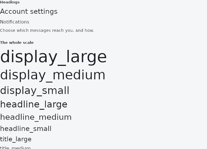
From frus-examples/widgets/src/features/text/widgets/text_theme.rs:
//! The text theme (`theme.text`) — the app's type scale: fifteen named styles from
//! `display_large` down to `label_small`, and `Text::heading` for titles.
//!
//! Use the scale instead of raw sizes, so every screen shares one hierarchy and a theme
//! change restyles the whole app.

use frus::{component, Align, Column, Text, TextStyle, Widget};

use crate::common::shared::{section, sections};

pub fn example() -> Box<dyn Widget> {
    sections(vec![
        // A page title and a section title, from the scale. `heading()` changes nothing
        // drawn: it tells screen readers this is a title, so their users can jump between
        // headings.
        Box::new(section("Headings", headings())),
        Box::new(section("The whole scale", scale())),
    ])
}

/// The theme is read from the build context, so a component is needed to reach it.
fn headings() -> impl Widget {
    component(|cx| {
        let text = &cx.theme().text;
        Box::new(
            Column::new()
                .spacing(8.0)
                .cross_axis_alignment(Align::Start)
                .child(Text::styled("Account settings", text.headline_small).heading())
                .child(Text::styled("Notifications", text.title_medium).heading())
                .child(Text::styled(
                    "Choose which messages reach you, and how.",
                    text.body_medium,
                )),
        )
    })
}

fn scale() -> impl Widget {
    component(|cx| {
        let text = &cx.theme().text;
        let styles: [(&str, TextStyle); 15] = [
            ("display_large", text.display_large),
            ("display_medium", text.display_medium),
            ("display_small", text.display_small),
            ("headline_large", text.headline_large),
            ("headline_medium", text.headline_medium),
            ("headline_small", text.headline_small),
            ("title_large", text.title_large),
            ("title_medium", text.title_medium),
            ("title_small", text.title_small),
            ("body_large", text.body_large),
            ("body_medium", text.body_medium),
            ("body_small", text.body_small),
            ("label_large", text.label_large),
            ("label_medium", text.label_medium),
            ("label_small", text.label_small),
        ];
        let column = Column::new()
            .spacing(6.0)
            .cross_axis_alignment(Align::Start);
        // The display sizes are wide: let them wrap rather than run off a phone screen.
        Box::new(styles.into_iter().fold(column, |column, (name, style)| {
            column.child(Text::styled(name, style).wrap())
        }))
    })
}
Properties
| Method | Argument | Effect |
|---|---|---|
.selectable() | — | Makes this text selectable: a press, a drag, a double click or a long press selects words in it, and Ctrl+C, or the bar that opens over the selection, copies them. Ordinary text is not — it is drawn, and there is nothing under the pointer to select — and choosing which of an application's texts a reader may copy from is the application's business: an order number, an address, a code, an error message. |
.selection_toolbar() | build: impl Fn(&ToolbarContext, Vec<ToolbarItem<Msg>>) -> Vec<ToolbarItem<Msg>> + 'static | Changes what the bar over a selectable text's selection offers — the application's say, as TextField::selection_toolbar is for a field. build is given the context and the default list (Copy when something is selected, Select all unless everything is) and answers with the list to show; an empty one shows no bar. |
.heading() | — | Wraps at the width the parent offers. This is the default, and the call is kept because saying so at the call site is not redundant when it is the whole point of the widget being there. Marks this text as a heading: a landmark assistive technology can jump between, instead of one more run of prose. |
.wrap() | — | Wraps the text at the width it is given: soft_wrap(true). It is what an unset text does already; this says so, and undoes a no_wrap further up a chain. |
.no_wrap() | — | Keeps the text on one line, explicit newlines aside. It then runs past its box rather than folding, and Text::overflow decides what becomes of the part that hangs over. |
.soft_wrap() | soft_wrap: bool | Whether the text wraps at the width it is given. wrap() is soft_wrap(true). |
.align() | align: TextAlign | Where the lines sit inside the box the text was given. |
.max_lines() | max_lines: usize | At most max_lines lines; what is past them is dropped, and Text::overflow decides how the last one ends. |
.overflow() | overflow: TextOverflow | What becomes of text that does not fit: cut, cut with an ellipsis, faded out, or drawn past the box. |
.ellipsis() | — | — |
.size() | size: f32 | Sets the font size, in pixels. |
.weight() | weight: FontWeight | Sets the weight. |
.italic() | — | Switches to italic. |
.family() | family: frus_core::FontFamily | — |
.height() | height: f32 | — |
.color() | color: Color | Sets the text color (otherwise the theme's). |
.underline() | — | Underlines the text. |
.strikethrough() | — | Strikes the text through. |
.decoration() | decoration: frus_core::TextDecoration | Sets the decoration lines (freely combined). |
.decoration_color() | color: Color | Sets the decoration color (otherwise the text's). |
Behaviour
A single-line text widget.
Its layout size comes from a styled measurement (frus-text, weight and italic included); it pushes a text primitive into the scene when painting. The TextStyle's color is inherited from the theme when absent.
See also
- TextStyle & DefaultTextStyle: a style as a value: shared, merged, or given to a whole subtree.
- RichText & TextSpan: one paragraph in several styles, from a tree of spans.
- FontFamily: sans-serif, serif, monospace, or a font registered by name.
- Selectable text & SelectionArea: text the reader can select and copy, alone or across several texts.
- Kbd: a keyboard key cap, for showing shortcuts.
- The guide: Text, colour and the theme
- API reference:
Text
Source: crates/frus-widgets/src/text.rs @ e6fba33f5b42